We conclude our tour of campaign signs from the 2010 Howard County elections by looking at some of my favorites. (For more signs see part 1 and part 2.)
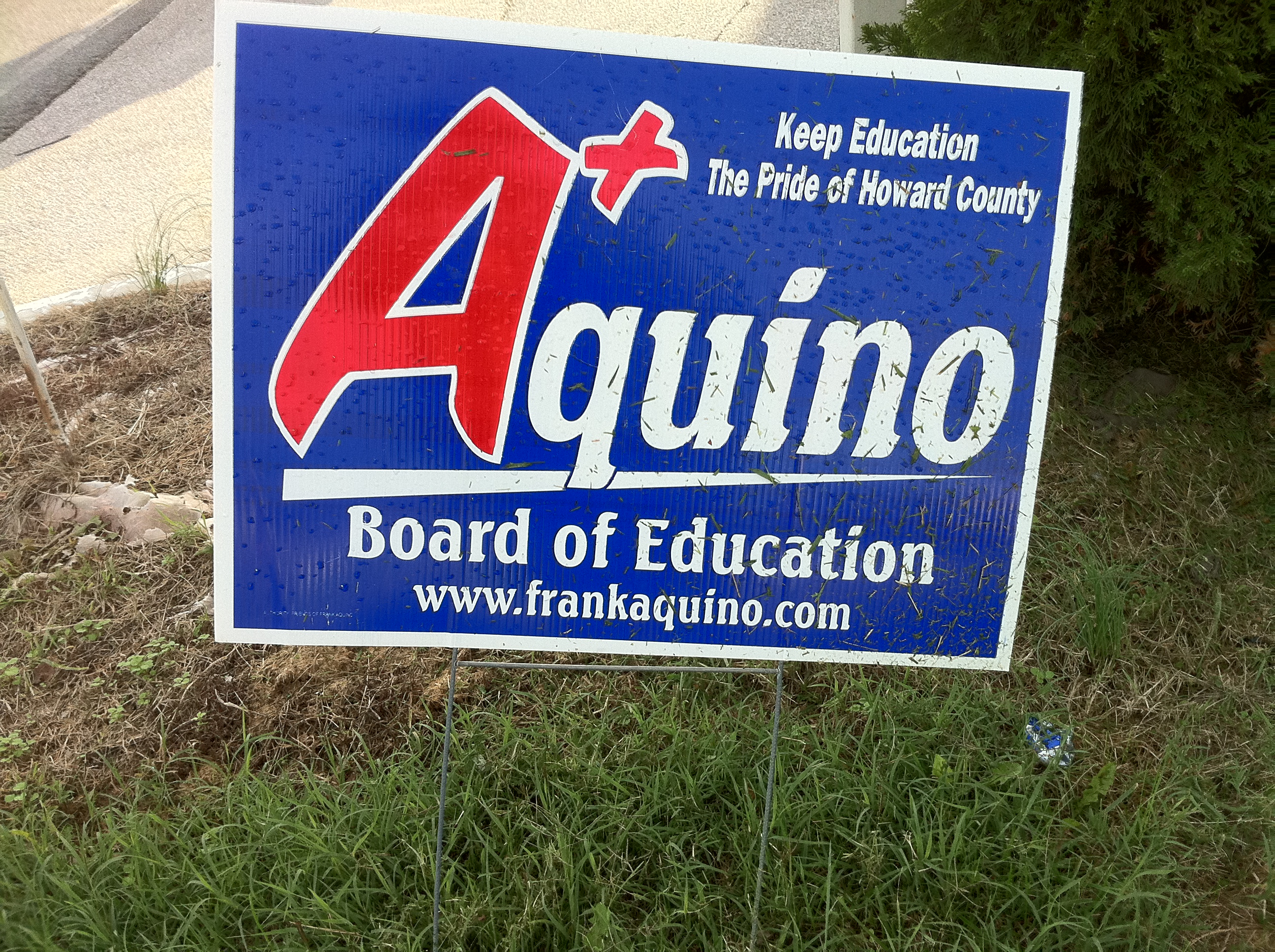
Frank Aquino for Board of Education (2010)
I like this mainly for the obvious but nice “A+” design element. The slogan is too small to read, and the domain name could be ditched in favor of increasing the size of “Board of Education.”
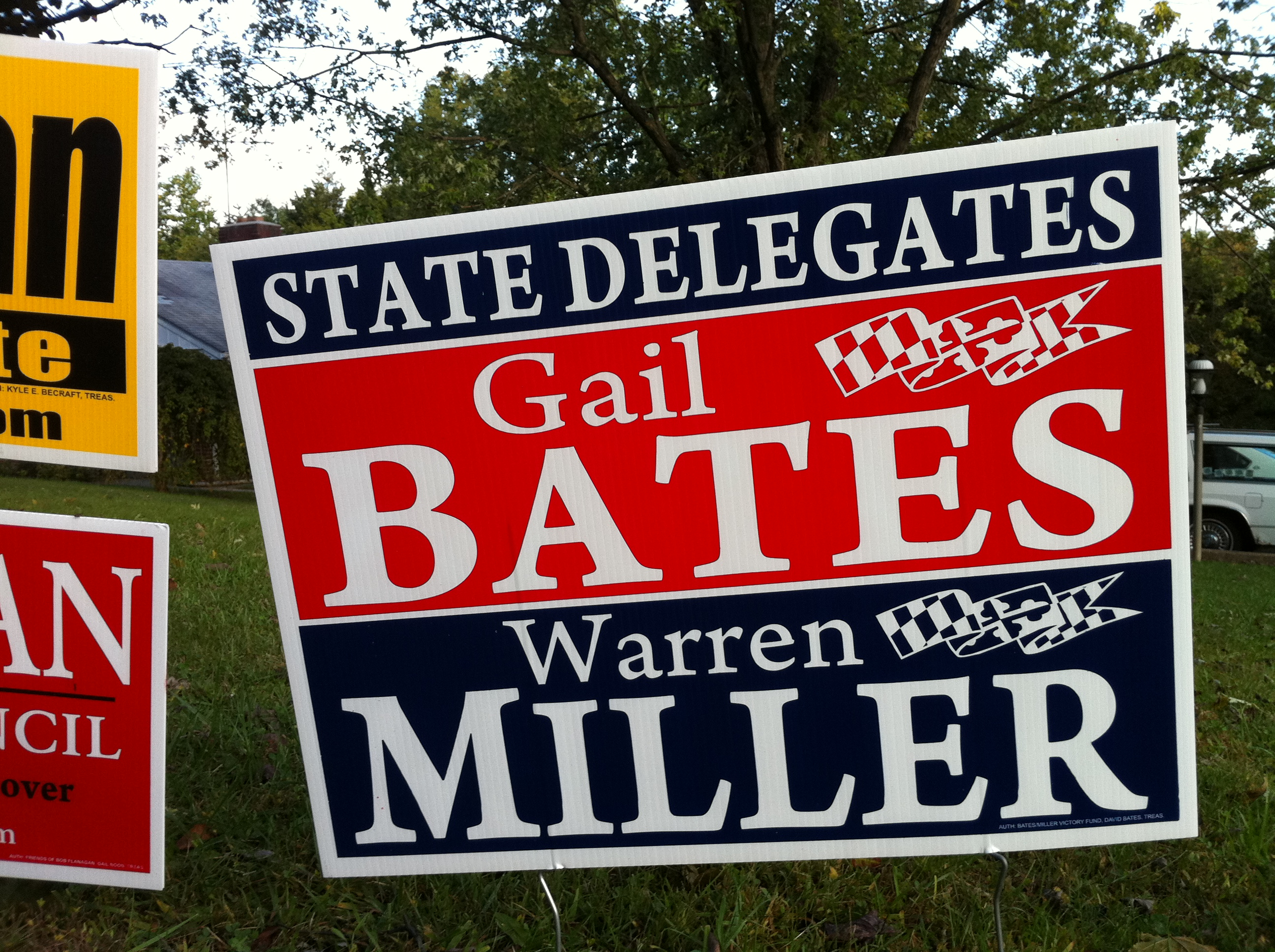
Gail Bates and Warren Miller for Delegate (2010)
As I previously noted, red, white, and blue colors on a campaign sign are usually associated with Republicans, although for some reason Gail Bates and Warren Miller are the only local GOP candidates whose signs I can recall using them. (Eric Wargotz’s sign also used red, white, and blue, though in a very understated way.) Note the attempt to link together “Bates” and “Miller” via the design.
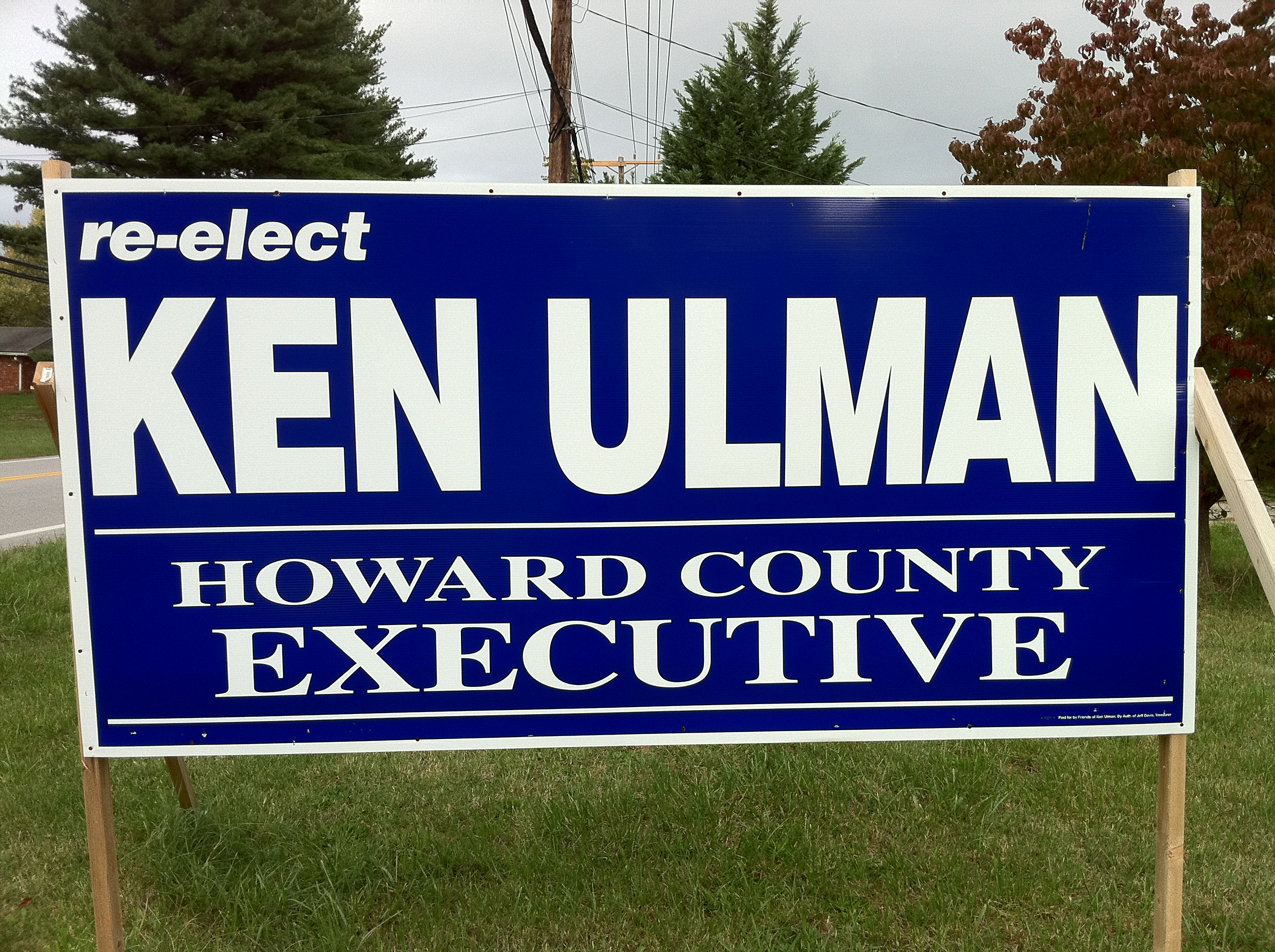
Ken Ulman for County Executive (2010)
Professional, competent, albeit a bit on the bland side.
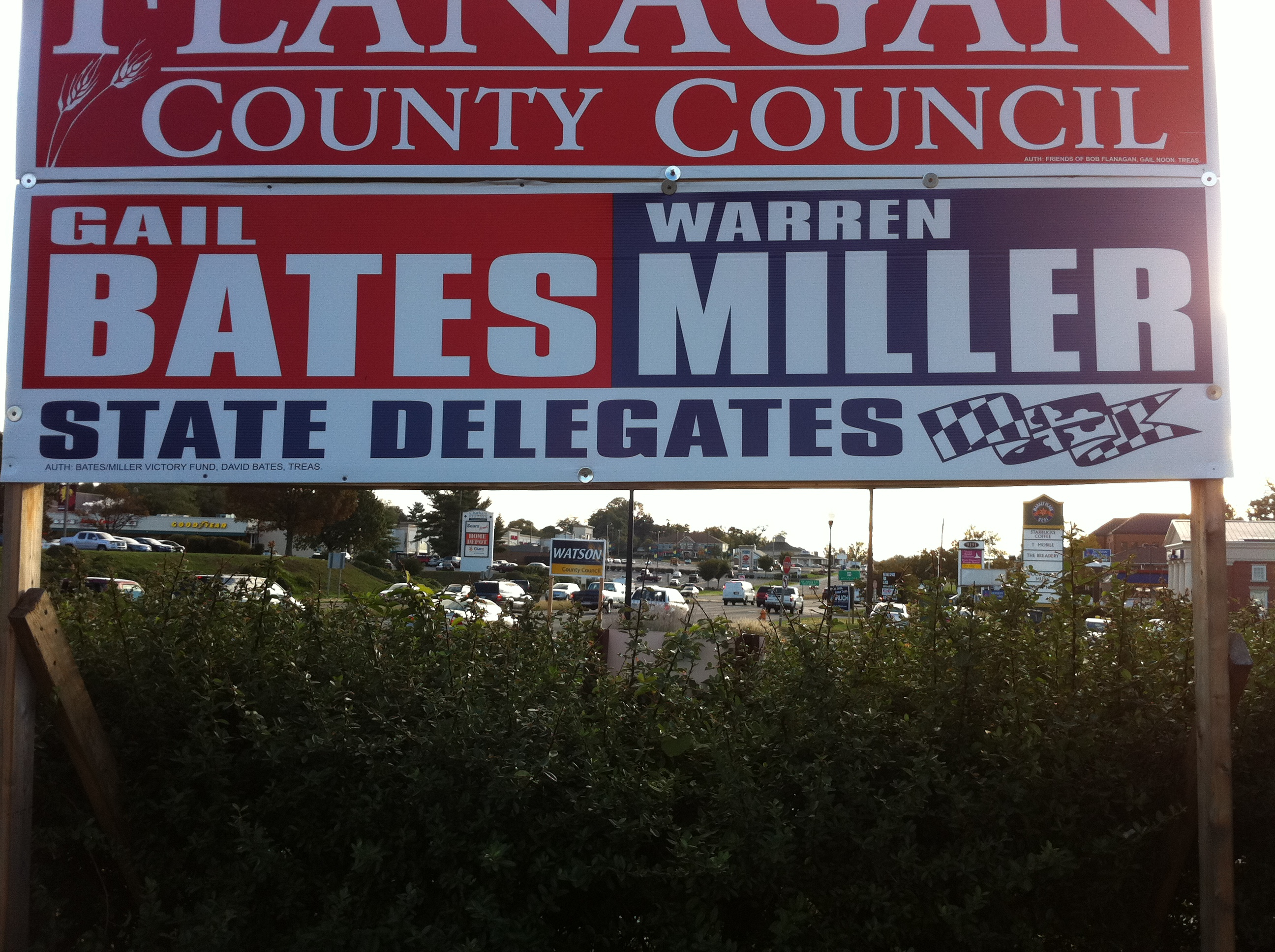
Gail Bates and Warren Miller for Delegate (2010) (large)
Again the colors are a cliché, but here done to really excellent effect. Note that this sign is even more effective in linking Gail Bates and Warren Miller into a single entity “BatesMiller” in the minds of voters. Also note that the small banner works better here as a single design element, as opposed to being duplicated as it was in the sign above. This is such a great sign that it’s a shame it wasn’t displayed more as a standalone sign; most if not all of the times I saw it it was paired with signs for other GOP candidates immediately above it and/or below it.
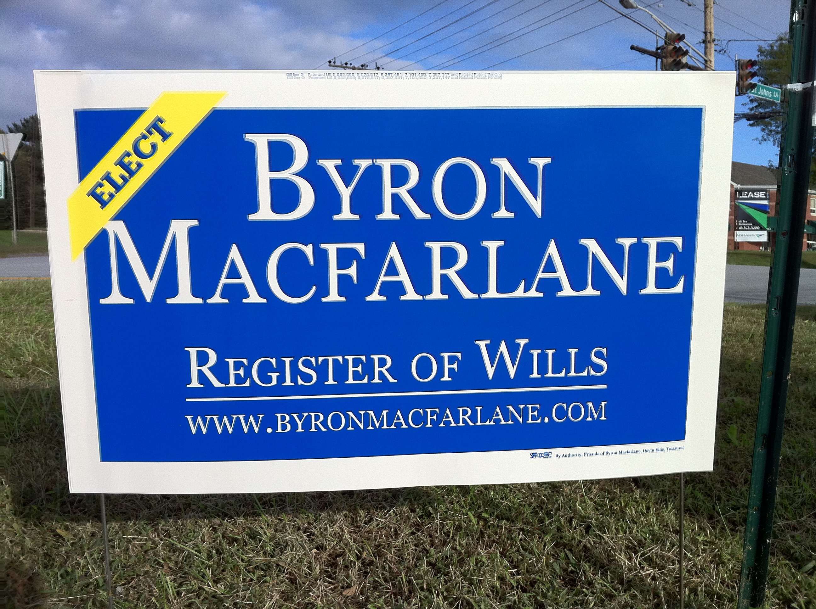
Byron Macfarlane for Register of Wills (2010)
Understatedly elegant, soberly professional, but with a nice yellow design element to rescue it from stuffiness—a sign you’d feel good entrusting your estate to.
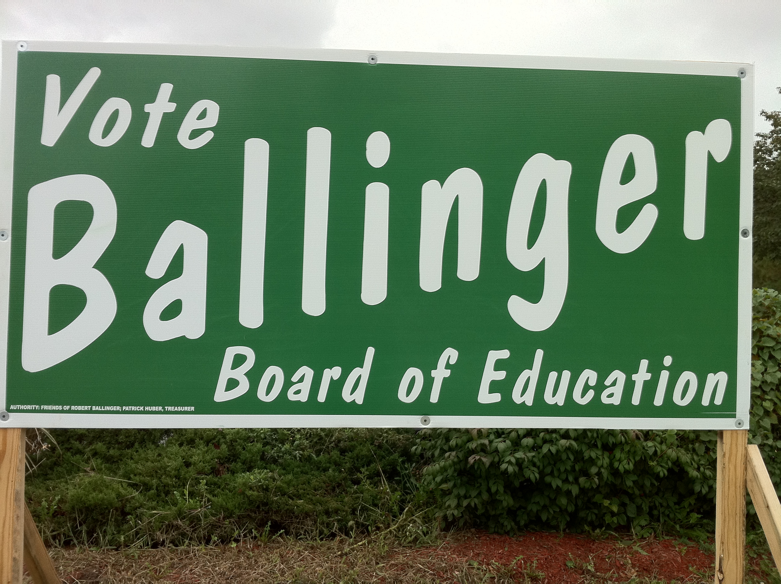
Bob Ballinger for Board of Education (2010)
This design uses an informal typeface on a green background to nicely evoke chalk on a classroom blackboard and thus the theme of education, without being overly literal or using common clichés (e.g., apples).
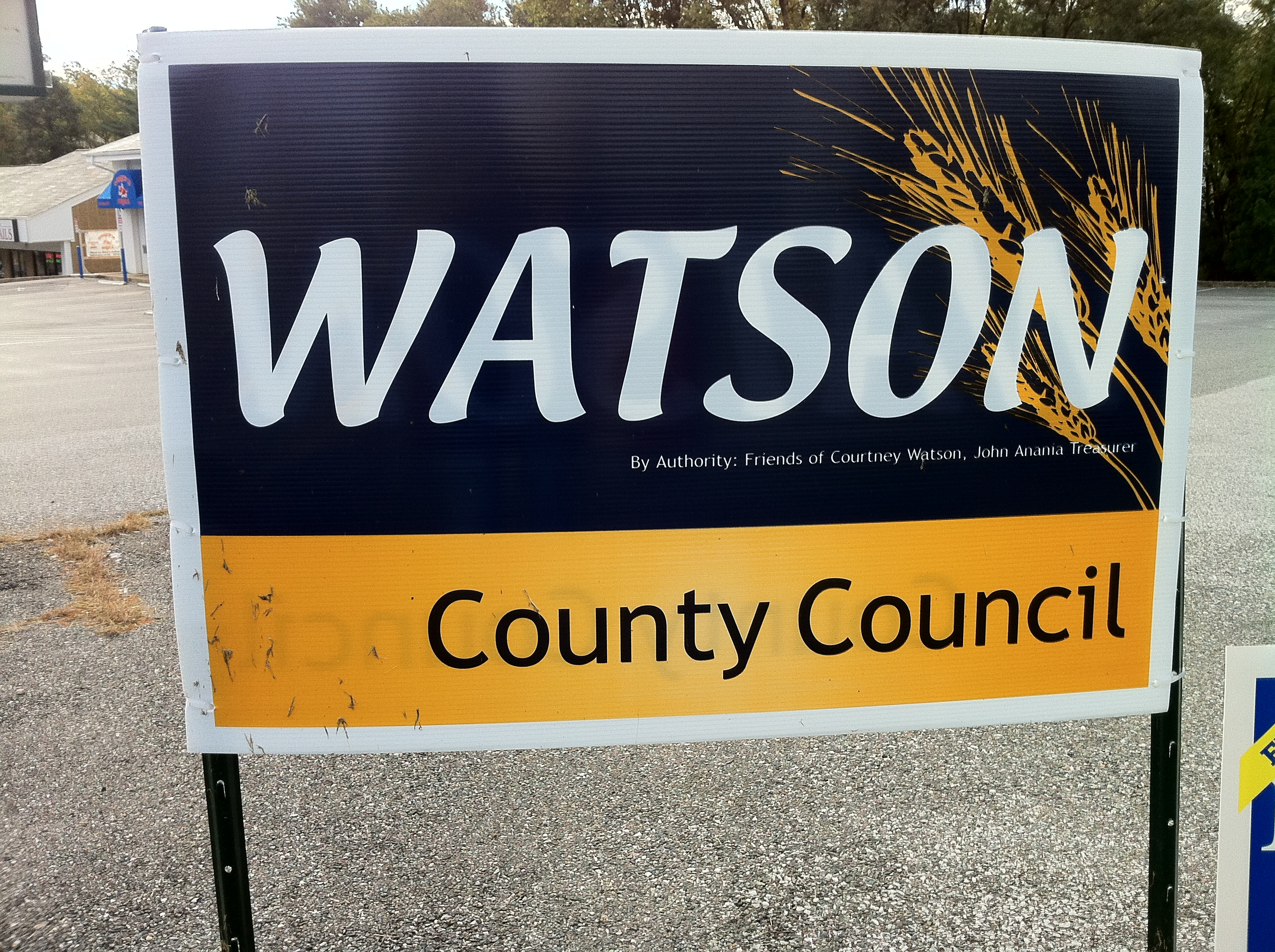
Courtney Watson for County Council (2010)
Large text that conveys only the basic information needed, nice contrasting typefaces (with the top one lending an air of liveliness to the sign), a unique choice of complementary colors (including a subtle gradient on the bottom half), and good balance in the design between the top half, the bottom half, and the white border. But what really takes this design from good to great is the stand of wheat to the right: it adds visual interest, ties back to the official Howard County seal, and evokes the rural past of the country in a way calculated to appeal both to conservative older residents and more liberal newcomers concerned about environmental issues. This one got my vote for the best Howard County campaign sign of 2010.
Who will emerge the victors in the race for best Howard County campaign signs of 2014? If I have time (and remember to take pictures) I’ll be back again next year to tell you.
hotboy2545 (taylor2545@gmail.com) - 2013-07-08 05:20
Looks like the campaign was pretty nice. Did you vote for anyone that won? [edited to remove spam link]