Sorry, I changed my plans and will not be doing the legislative races just yet, since I was able to find signs for all four of the Democratic candidates for Judge of the Orphans’ Court:1 incumbents Anne Dodd and Leslie Smith Turner and challengers Shari Chase and Nicole Bormel Miller. (There are only two Republican candidates for the three Orphans’ Court positions, Ellen Harrison and Emma Travis-Howard, both of whom will proceed to the general election. I’ve not seen signs yet for either of them.)
So on to the judging, according to the criteria I’ve previously discussed. Here are the signs, in alphabetical order by candidate, along with my comments in my role as amateur design critic.
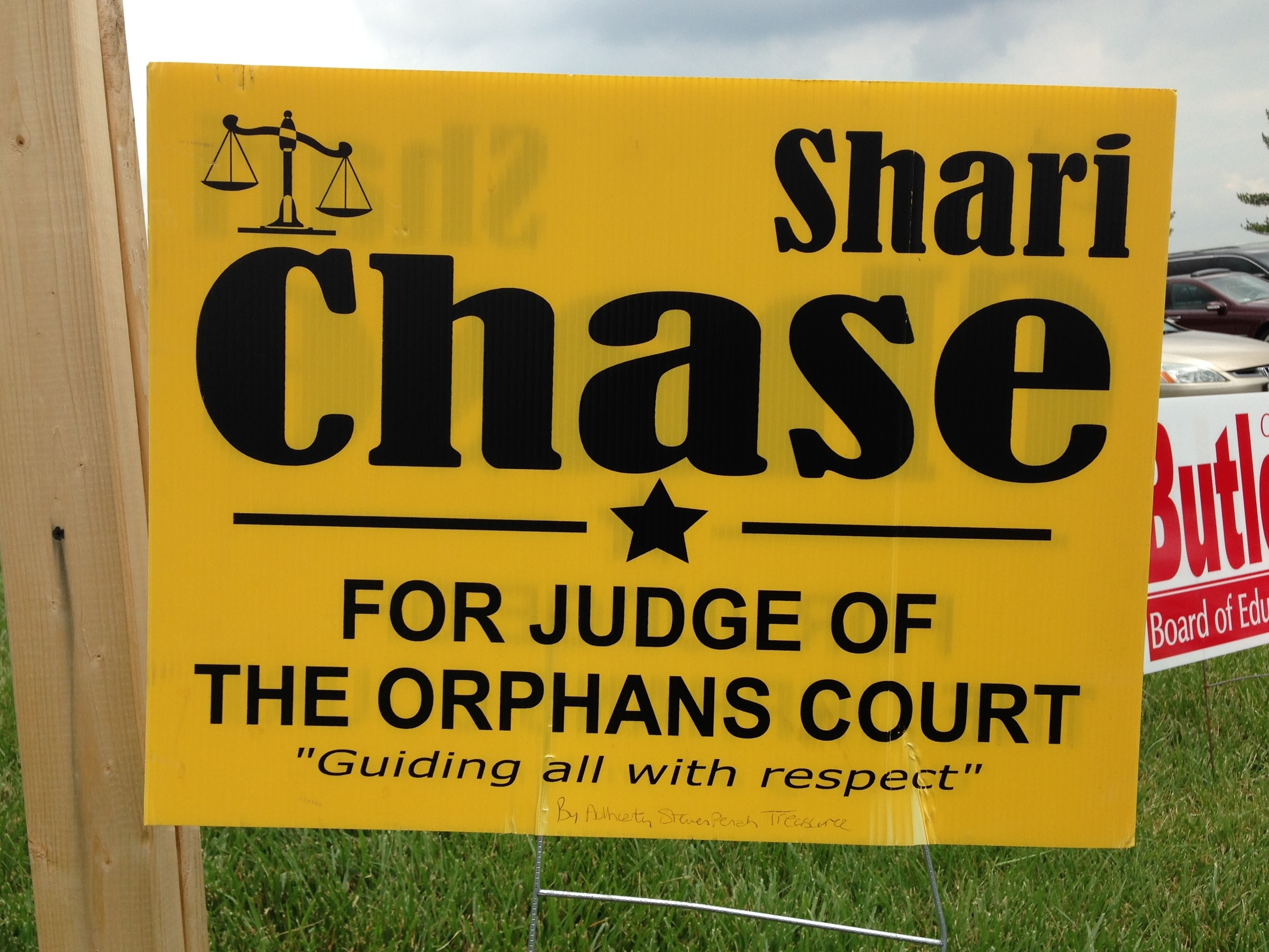
This sign uses the by-now-familiar black on yellow scheme based on the Maryland flag. It’s an OK sign: It’s fairly legible, the typeface used for the name livens the sign up a bit, the central divider with a star works well, putting “Shari” to the right rather than the center makes the overall composition more interesting, and the “scales of justice” image in the upper left serves to balance out the “Shari.” I take points away for not putting the apostrophe on “Orphans’.”
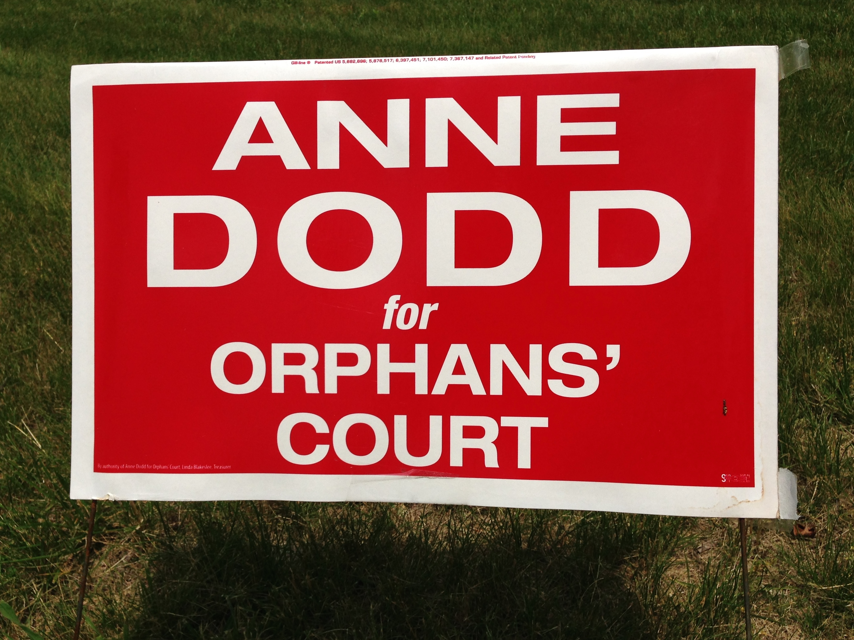
This is a good example of a effective minimal sign design: Only as much text as needed, a single and simple sans serif typeface (the “for” appears to be simply in an oblique version of the main typeface), no extraneous design elements, and only a single color other than white. I have only one criticism: When viewed from a distance the “D” and “O” in “DODD” look somewhat similar, so that the name looks like “OOOO” or “DDDD.” A different typeface might have helped this, or alternatively using both upper and lower case (“Dodd” vs. “DODD”).
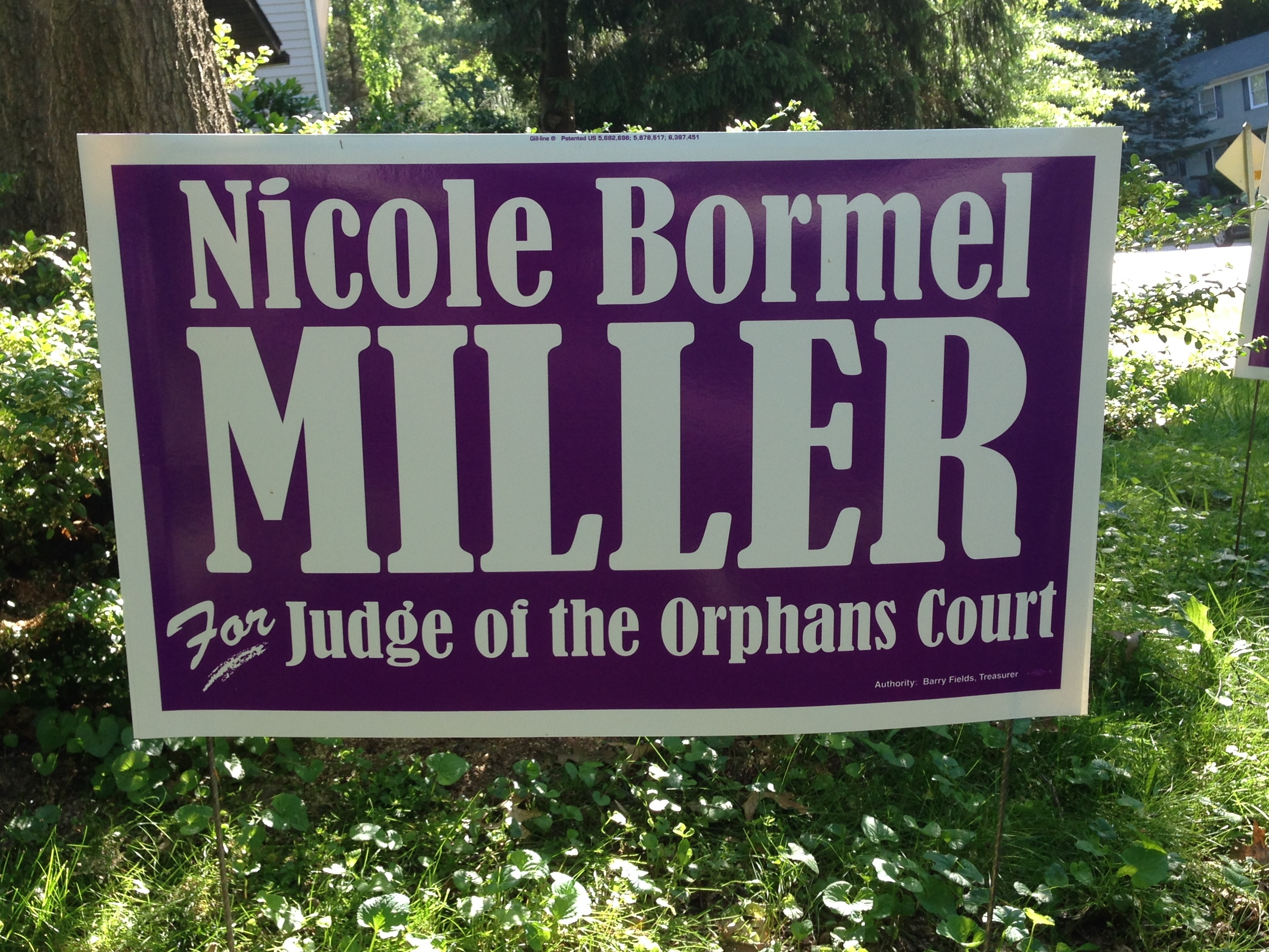
This sign has a nice purple background color (a break from the usual yellow or red), a good balance between the white foreground and purple background, and an interesting serif typeface. As with the Chase sign, I take points away for not spelling “Orphans’” properly.
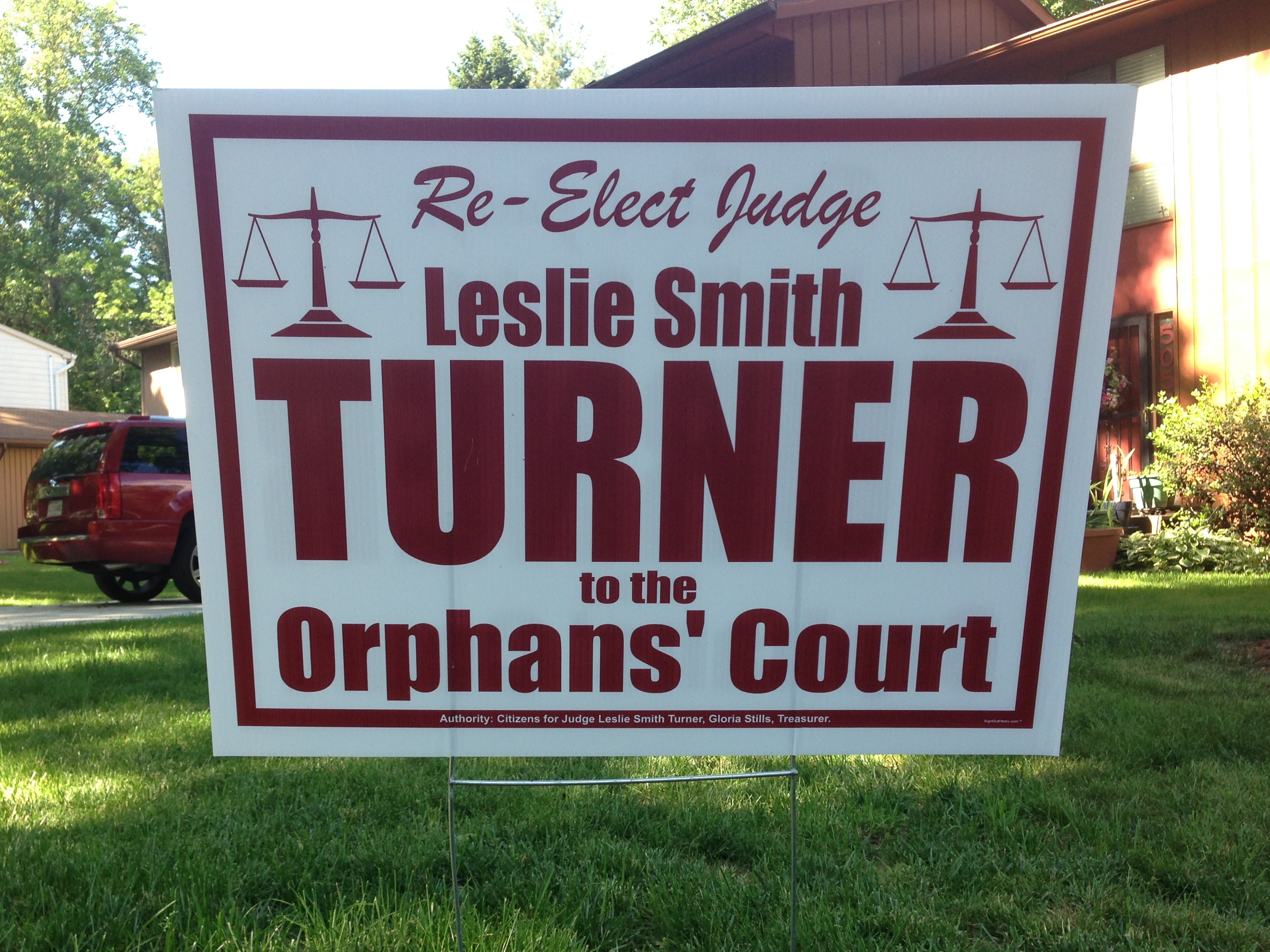
This sign does a nice job of highlighting the candidate’s last name and the position being sought; it also highlights the fact that she’s an incumbent, which many voters might not know given that this is a relatively obscure courthouse race. I’m less enthusiastic about the burgundy color used for the text, and I’m not a big fan of the script used for “Re-Elect Judge.”
Of these four I like the Dodd and Miller signs the best. The other two are not bad signs, I just don’t think their designs stand out as being particularly attractive. (Note that in the context of a campaign sign “attractive” is not necessarily the same as “effective”; I’m judging signs primarily on aesthetic grounds.)
This concludes my look at signs for the courthouse races, at least for the primary. In my next post I’ll switch to the races for the Maryland state legislature, starting with the signs for candidates for the Maryland House of Delegates, District 9A.
In case you’re curious, the Maryland State Archives has more on the history and function of the Orphans’ Court. ↩︎