UPDATE 2024/01/04: This post originally appeared on my Civility and Truth Substack newsletter. I’ve moves it to my main site in an effort to collect all of my writing in one place.
I’ve finished up my data analyses on median household income for now (although I have yet to write up the census tract analysis for civilityandtruth.com), and will next be looking at home values. However, before I started that I was curious about an issue I touched on in my last post on civilityandtruth.com:
I will note that median household income for the Northern Virginia suburbs is increasing even as median household income for Virginia as a whole is stagnant or decreasing. This is presumably due to the rest of Virginia suffering economic problems to which Northern Virginia is immune.
I was about to write something about how Virginia’s problem is poor rural areas vs. rich urban areas, following the conventional wisdom that a lot of political commentator are talking about. I then decided not to be so dogmatic about it and commit myself to any particular interpretation before I looked at any data. Since I already had data on median household income by county for the entire US, I did an off-the-cuff data exploration, including doing graphs of median household income for all counties and cities in Virginia.
To some degree this went against my initial impression, and showed me that “urban = rich, rural = poor” is an oversimplification. However it also showed me the dangers of being too quick to take data at face value: there’s a twist at the end that threw my entire analysis into question.
Since Virginia is not my main focus I decided not to do a full write-up on this, but I thought it might be interesting and informative to take you through how RStudio and the Tidyverse package make these sorts of informal analyses fairly easy to do, and also how you need to watch out for potential problems along the way.
A quick and dirty analysis
I started with my RStudio.cloud hocodata project open in my browser, with the R Markdown source file open that I used to create my full analysis of Howard County median household income vs. other counties and cities.
R Markdown is a document format in which you can interweave prose material with “chunks” of computer code, in this case code in the R language. The file already contained the code I needed to read in the census data files and recreate the county-level median household income table I wanted to use, so I just stepped through the file and had RStudio execute the chunks of code I needed to run.
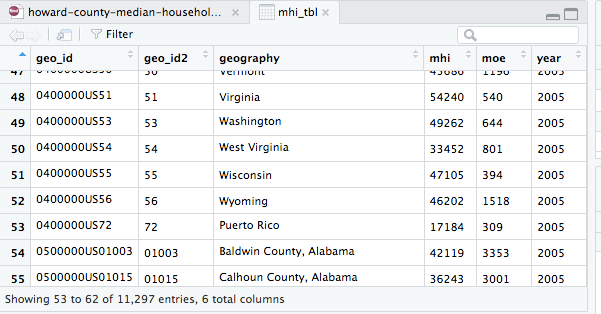
Once I had done that I had a copy of the data table mhi_tbl that I had used as the basis for my original analysis. This table contains median household income data on all counties for the years 2005 through 2017, as well as equivalent data on the state and national level. I used RStudio to display the table and refresh my memory on the column names (geo_id, geo_id2, etc.) and the format of the data values.
The state-level rows have a geo_id value starting with “04”, and the county-level rows have a geo_id value starting with “05”. Since I was interested in county-level data only my first step was to filter the data table and see if I could get just the county-level data returned. In Tidyverse syntax this is done using the command mhi_tbl %>% filter(substr(geo_id, 1, 2)) == "05"): take the table mhi_tbl and use it as input to the filter operation.
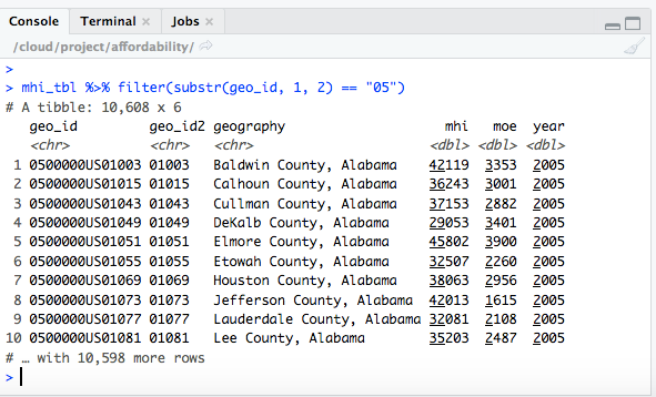
This looks like it worked. The next thing I needed to do was to just look at counties in Virginia, so I went back to look at the table mhi_tbl and searched for the word “Virginia.”
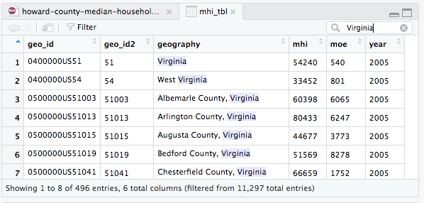
This told me that I could find counties specifically in Virginia by looking for values of geo_id2 that began with “51”. I already had a command that filtered for counties, so I took advantage of the Tidyverse ability to use the output of one command as the input to the next, and added an additional filter step filter(substr(geo_id2, 1, 2) == "51") at the end:
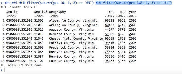
This looked like it was just Virginia counties, but why were there 379 rows in the result? I had forgotten that the table mhi_tbl contained data for multiple years. I was mainly interested in comparing Virginia counties against each other, so I decided to cut the data down to look at just 2017. This was easily done by adding another filter step: filter(year == 2017). (I should note at this point that in RStudio I didn’t have to retype the entire line. I just used the up-arrow cursor key to go to the last command executed, and then added the new bit of code to the end.)
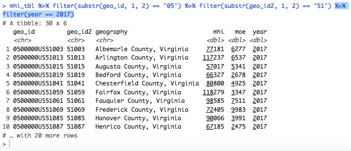
This returned only 30 rows, which sounded like a more reasonable number.
Since I was using multiple filter steps in a row, I could have combined them into a single filter step with three criteria: mhi_tbl %>% filter(substr(geo_id, 1, 2) == "05", substr(geo_id2, 1, 2) == "51", year == 2017). However, since this was a quick-and-dirty analysis and I was being lazy I didn’t bother. Instead I just wanted to get to graphing something.
(Also note that I was using the table mhi_tbl containing income values in current dollars, i.e., not inflation-adjusted, as opposed to the table mhi_adj_tbl, which expresses income all values in 2017 dollars. Since I was specifically looking at median household income for 2017 the values in the two tables were the same and there was no reason to use one vs. the other.)
Graphing the data
I wanted to compare Virginia counties against each other, so I decided to do a bar chart where each bar represented a county and the height of each bar corresponded to the median household income for that county. Using the ggplot2 package (part of the Tidyverse) this is done using the syntax ggplot(aes(x = geography, y = mhi)) + geom_col().
The ggplot part specifies that the x-axis for the graph will have the names of the counties (geography) and the y-axis will show the median household income values (mhi). (The “aes” is from “aesthetic”, i.e., how we want the graph to look.) The geom_col part then tells the ggplot2 package that we want a bar chart specifically, as opposed to some other type of chart. Finally, note that when we get to the ggplot2 functions we use + to separate the various operations, not %>%.

Unfortunately this is pretty much unreadable, as all the county names have been displayed on top of each other.
Fortunately I had seen this problem before, and after doing some Internet searching I had discovered how to tell ggplot2 to display the x-axis text at a 45-degree angle. I had adopted this solution in the analysis from which I was stealing code, so I just cut-and-pasted it in: add theme(axis.text.x=element_text(angle=45, hjust=1)) to the end of the plotting statements. Unfortunately the particular value of 45 degrees didn’t work too well, as the leftmost county name got cut off a bit. I tried using a 90-degree angle, which produced vertical text, before settling on a 60-degree angle.
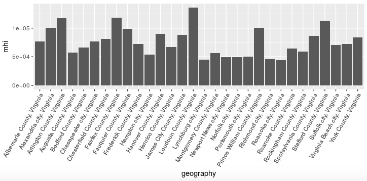
This is more readable, but I still wasn’t satisfied. What I really wanted was a graph of counties and cities arranged left to right from highest to lowest median household income.
I did another Internet search to look for ways to do this. It was a bit more complicated, as R and ggplot2 are not intuitive when it comes to handling so-called categorical variables, i.e., variables like county names that are not numeric values. I tried a couple of suggested approaches that didn’t work before finding one that did: insert mutate(geography = fct_reorder(geography, -mhi)) into the “data pipeline” before passing the data to ggplot.
This takes the geography variable containing the county names, which was previously just a simple character string, and converts it into a new variable of the same name that is a factor variable (“factor” being R-speak for a categorical variable). Factor variables have an inherent ordering imposed on them, and in this case we use the fct_reorder function to order the geography values based on the values of the mhi variable. (The - before mhi means we are ordering the geography values in decreasing order of median household income.)
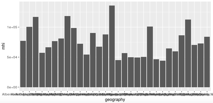
This was almost what I wanted, but I didn’t like the scientific notation (“1e+05” for 100,000) on the y-axis. Fortunately I had already investigated this issue and found a solution that I used in my previous analysis. I just cut-and-pasted it from my existing code and tweaked it slightly, using scale_y_continuous(labels = scales::dollar, breaks = seq(0, 140000, 20000)) to display the y-axis values as properly-formatted dollar amounts, and display y-axis labels from 0 to $140,000 in intervals of $20,000.
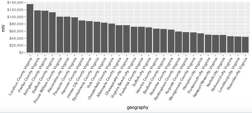
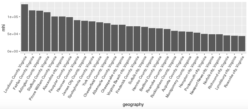
This is much better in terms of readability. And then I tried to interpret it…
Interpreting the data
The US median household income in 2017 was about $60,000, while the median household income for Virginia is above $70,000. When I eyeballed the graph above it looked as if there were three Virginia counties with median household incomes below $60,000: Rockingham, Augusta, and Montgomery, all in the Shenandoah Valley/I-77 corridor.
However, the bottom seven “counties” in median household income in the graph above are actually cities, which in Virginia are often independent jurisdictions (in the same way that Baltimore city is an independent jurisdiction in Maryland). This complicated the “urban = rich, rural = poor” story: was it possible that rural areas in Virginia are actually doing relatively better than cities—or at least cities that are not in Northern Virginia?
Hold that thought. In the meantime I also wanted to look at Maryland counties for comparison. Having built this long R command line to produce a graph for Virginia, I could re-use it to produce the same graph for Maryland, simply by filtering on a geo_id2 value of “24” rather than ‘“51.”
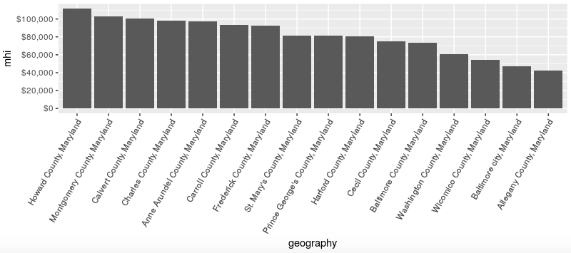
The resulting graph looked familiar, with Howard County at the top and Baltimore city (almost) at the bottom. The counties at or below the US median household income are Wicomico on the Eastern Shore and Washington and Allegany in western Maryland, all relatively rural. So far so good according to the conventional wisdom.
But then I looked closer at the lower-income counties and thought, “where is Garrett County, shouldn’t it be near the bottom as well?” I looked even closer and couldn’t find Garrett county at all in the graph. Then I counted just to be sure and found there were only 16 jurisdictions listed. I knew from prior analyses that Maryland had 24 counties (including Baltimore city). What happened to the other eight?
Misinterpreting the data
After some thought I figured out the problem. (I’ll pause here to let you think about it as well.) The problem is that . . .
The median household income data I was using from the American Community Survey 1-year estimates. I used these because I wanted to be able to do year-to-year comparisons for changes in median household income by county. But as the US Census Bureau explains in “When to Use 1-year, 3-year, or 5-year Estimates,” the 1-year estimates include only areas with population of 65,000 or greater.
The population of Garrett County is only about 30,000 people, so there are no 1-year estimates for it. Ditto for the other Maryland counties not on the list above; the most populous of the group is Worcester County at just above 50,000 people. The situation for Virginia is even worse: there are 95 counties and independent cities in Virginia, so the 30 jurisdictions in the graph above are less then one-third of the total.
The bottom line is that my off-the-cuff analysis was fatally flawed, and any conclusions I might have drawn from it were suspect to say the least.
Fixing the problem
How could I have corrected my mistakes? The obvious fix is to use the ACS 5-year estimates, which do include all areas no matter how small. As it happens I never bothered to download the ACS 5-year data for all US counties, so I wasn’t able to quickly implement this fix. Instead I just abandoned this particular analysis, at least for now.
But even if I had ready access to the 5-year data I couldn’t just repeat the above analysis verbatim. In particular, showing 30 Virginia counties and cities in a bar graph produced a busy enough graph, but showing 95 cities and counties in the same kind of graph would make it almost unreadable.
What would be the best alternatives? One approach would be to graph only the top ten counties and cities by income, or only the bottom ten. Another approach would be to use a list format rather than a graphical format, and again list only the top and bottom ten.
Lessons for today
So what might we learn from my experience?
First, I hope you come away from this with the feeling that these types of basic analyses and visualizations are not that difficult to do. I may have written this elsewhere already, but in my opinion anyone who’s comfortable with working with Excel spreadsheets and their associated formulas and macros should be able to do useful and interesting things with RStudio and the Tidyverse package.
(I’ll also add that I think these sorts of general skills with manipulating and visualizing data are exactly what we should be teaching children in school, to make them more “numerate,” prepare them for future jobs, and enable them to be more educated citizens.)
Second, at the same time the classic computer programming axiom applies here: “garbage in, garbage out.” If the data is bad to start with, or if we’re using the wrong data, then skill in analyzing it won’t help. The mistake I made above would have been immediately obvious to someone with more knowledge of Virginia than I have, but other data errors can be more subtle and hard to catch.
For example, when I did the graph and list ranking counties by median household income, those were based on the ACS 1-year estimates, and thus omitted counties falling below the population threshold of 65,000 people. For all I know there may be more affluent counties that might have ranked in the top ten but are only represented in the 5-year estimates.
Third, following on from the above point, in order for people to determine how accurately data visualizations reflect reality, and how much credence they should give data-based arguments, they really need to have access to the underlying data and code used to generate the visualizations and arguments. It’s not that everyone needs to be able to replicate the graphs and analyses, but there should be at least some people who can provide independent opinions on the matter.
Traditionally data visualizations and data-based arguments have been generated by governments, the media, and academia. In many if not most cases these have been presented as final products, with no indication as to what went into making them. Instead we were asked to rely on the authority and prestige of their creators.
Generating sophisticated data analyses can now be done by independent individuals, and for various reasons people no longer trust “the experts” as much as they use to. That’s why I “show my work” by making all the code and data for my analyses available to anyone who wants to inspect them for errors and attempt to replicate what I’ve done.
Thankfully there are more and more organizations that are doing the same. One great local example is the “data desk” at the Baltimore Sun. They have an active presence on Twitter (@baltsundata) and make a lot of their code and data available on GitHub, a service used by many open source developers. (For example, see the code and data repository for a recent story about Baltimore population losses.)
That’s all for this week.