(This is part 1 of a two-part post; for the conclusion see part 2.)
In a previous post I discussed the concept of median income and how it avoids certain distortions inherent in mean (average) income. However median income by itself is not adequate to characterize the economic status of households in Howard County (or anywhere else for that matter). In particular, the median income just provides the “midpoint” for income, i.e., the income value for which 50% of the households make more and 50% make less; it does not address the question of how income is actually distributed among the various households.
For example, let’s go back to our simple 10-household example from the last post:
| Household | Household Income | Share of Household Income | Cumulative Share of Household Income |
|---|---|---|---|
| 1 | $16,000 | 1.35% | 1.35% |
| 2 | $37,000 | 3.11% | 4.46% |
| 3 | $56,000 | 4.71% | 9.17% |
| 4 | $75,000 | 6.31% | 15.48% |
| 5 | $92,000 | 7.74% | 23.21% |
| 6 | $111,000 | 9.34% | 32.55% |
| 7 | $132,000 | 11.10% | 43.65% |
| 8 | $163,000 | 13.71% | 57.36% |
| 9 | $190,000 | 15.98% | 73.34% |
| 10 | $317,000 | 26.66% | 100.00% |
I’ve added two new columns of data, but otherwise the situation is as I described it previously: the ten households have an average income of $118,900 but a median income of $101,500, very similar to the actual numbers for Howard County.1 Now let’s look at a second 10-household example:
| Household | Household Income | Share of Household Income | Cumulative Share of Household Income |
|---|---|---|---|
| 1 | $7,000 | 0.59% | 0.59% |
| 2 | $9,000 | 0.76% | 1.35% |
| 3 | $13,000 | 1.09% | 2.44% |
| 4 | $18,000 | 1.51% | 3.95% |
| 5 | $43,000 | 3.62% | 7.57% |
| 6 | $160,000 | 13.46% | 21.03% |
| 7 | $165,000 | 13.88% | 34.90% |
| 8 | $174,000 | 14.63% | 49.54% |
| 9 | $190,000 | 15.98% | 65.52% |
| 10 | $410,000 | 34.48% | 100.00% |
As it happens, these ten households have exactly the same average income ($118,900, $1,189,000 divided by 10) and exactly the same median income ($101,500, halfway between $43,000 and $160,000) as in the first example. However the distribution of income looks very different; in its division of households between rich and poor it looks much more like Baltimore city or Washington, DC, than it does Howard County. Clearly this difference in income inequality is not captured by the median or mean income, or even by related measures like the difference between the mean and the median. How can we quantify this difference?
One commonly-used measure of income inequality is the so-called Gini coefficient or Gini index. The computation of the Gini coefficient is more complicated than that for mean or median income, but it’s still relatively straightforward and comprehensible. The key is to look at the numbers in the last two columns of the tables above, and especially the last column, cumulative share of household income.
The third column simply gives the share of household income going to that particular household. For example, in the first table household #1 has income of $16,000 against a total of $1,189,000 for all households, or 1.35% of all income; similarly household #10 has a 26.66% share of all income ($317,000 divided by $1,189,900), and so on for the other households. The fourth column then uses these figures to compute the share of income going to the poorest n% households. For example, household #1 has a 1.35% share of total income and household #2 has a 3.11% share, so the poorest 20% of households (i.e., households #1 and #2 out of 10 total households) have 4.46% of all income (1.35% plus 3.11%). Similarly we can add the income share figures for households #1 through #9 to determine that the poorest 90% of households have 73.34% of all income, with the remaining 10% of households (i.e., household #10) having 26.66% as noted above.
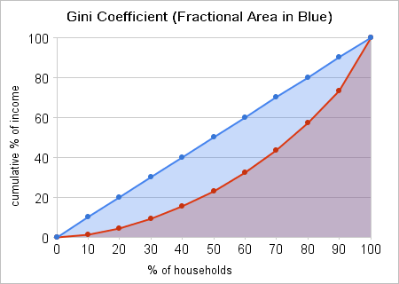
The cumulative share of income can be graphed as shown in the figure below. The red points show the values from the fourth column of the table above, with the red lines then connecting the dots to approximate a curve; if there were more households there would be more points and a correspondingly smoother curve.
Now let’s look at the graph for our second example from above:
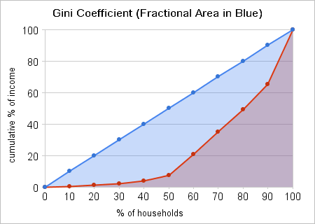
Again the red points represent the values for cumulative share of income from the fourth column of the second table, with the red lines connecting the dots. What about the blue dots in both graphs? Those represent the ideal case where all the household incomes are equal, or nearly so. In that case the poorest 10% of households will have (almost) 10% of total household income, the poorest 20% will have (almost) 20% of income, and so on. The corresponding curve will then be a straight (or nearly straight) line, here shown in blue.
Note that as household income becomes more unequal, the curve of cumulative income share (the red curve) moves further and further away from the blue line representing perfect (or nearly perfect) income equality. This gives us a straightforward way to define the Gini coefficient: It’s the size of the blue-shaded area between the blue line and the red curve, expressed as a fraction (or percentage) of the total area under the blue line. For nearly equal income distributions the red curve will be very close to the blue line, and the Gini coefficient will be close to zero, while for very unequal income distributions the red curve will be far away from the blue line, and the Gini coefficient will approach one (or 100%).
In the first example the Gini coefficient is 0.38, nearly the same as the Gini coefficient of 0.379 for Howard County (see the Census ACS table 19083).2 In the second example the Gini coefficient is 0.53. This is comparable to the Gini coefficient for the District of Columbia, which is 0.542. More interestingly for our purposes, it’s nearly the same as 0.534, the Gini coefficient for Fairfield County, Connecticut, a suburban county in the New York City metropolitan area that’s home to many hedge-fund managers and other wealthy financial services professionals.
Unlike DC, Fairfield County is a pretty affluent area overall; it has a median household income of $80,241 (somewhat lower than Howard County’s) and a mean household income of $130,397 (somewhat higher than Howard County’s).3
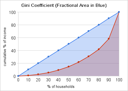
The following 10-household example roughly mirrors the Fairfield County household income breakdown:
| Household | Household Income | Share of Household Income | Cumulative Share of Household Income |
|---|---|---|---|
| 1 | $11,000 | 0.84% | 0.84% |
| 2 | $23,000 | 1.76% | 2.61% |
| 3 | $37,000 | 2.84% | 5.44% |
| 4 | $53,000 | 4.06% | 9.51% |
| 5 | $70,000 | 5.37% | 14.88% |
| 6 | $90,000 | 6.90% | 21.78% |
| 7 | $115,000 | 8.82% | 30.60% |
| 8 | $145,000 | 11.12% | 41.72% |
| 9 | $215,000 | 16.49% | 58.21% |
| 10 | $545,000 | 41.79% | 100.00% |
The corresponding Gini coefficient diagram is as follows:
What makes Howard County special with respect to income inequality, and Fairfield County particularly interesting as a comparison? The answers to those questions will be the subject of part 2 of this two-part post.
johntindale - 2008-11-21 02:26
This is a very interesting, informative, and well documented site about income disparity in HoCo. Thank you for all the hard work, research, and analysis,
Flug - 2008-12-01 15:13
I really love your stats and your interpretation of the datas. Great work, as usual. I bet I would have had higher marks in statistic, if have found your blog earlier:)
The US Census Bureau’s American Community Survey estimates the median household income in Howard County at $101,672 for 2007 (ACS table B19013). (This figure has a margin of error of +/-$3,594, which we’ll ignore for purposes of this discussion.) The ACS tables apparently don’t directly provide a figure for mean household income, but it can be computed by taking the aggregate household income estimate of $11,734,222,700 (ACS table B19025) and dividing it by the number of households, 98,866 (ACS table 19001); the resulting estimate for mean income is $118,688. ↩︎
For those who’d like to check this result, the computation is relatively straightforward. First, we convert all percentages to fractions, so that the horizontal axis goes from 0 to 1, and the vertical axis likewise; the cumulative shares of income are then 0.0135 (for 0.1 of the population), 0.0446 (for 0.2), 0.0917 (for 0.3), and so on. The easiest way to compute the Gini coefficient is to compute the area under the red curve, and then to subtract it from the area under the blue line; the resulting difference is the size of the blue-shaded area, and we can then divide it by the area under the blue line to obtain the Gini coefficient. The area under the blue line is simple to compute: It’s a triangle that is half of a 1 by 1 square, so its area is 0.5. The area under the red line is composed of a series of nine trapezoids and one triangle (at the left). The area of the triangle is half the base times the height: 0.5 times 0.1 (base) times 0.0135 (height), or 0.000675. The area of each trapezoid is the base times the average of the two vertical sides; for the first trapezoid (counting from the left) this is 0.1 (the base) times the sum of 0.0135 and 0.0446 divided by 2 or 0.0297 (the average of the two vertical sides), or 0.00297. Continuing with the other areas (left as an exercise for the reader), the sum of all the areas is about 0.31; this is the area under the red curve. We subtract this from 0.5 to get 0.19 as the area of the blue-shaded area, and then divide by 0.5 (the area under the blue line) to get 0.38 as the Gini coefficient. ↩︎
As with Howard County, the mean household income for Fairfield County can be computed by taking the aggregate household income of $42,228,652,700 and dividing it by 323,848, the number of households. ↩︎