Now that the local Howard County political campaigns are starting to heat up, I thought it would be fun to take a look back at the last local elections in 2010. Don’t worry, this won’t be a boring statistical analysis or a deep philosophical rumination. Instead I thought it would be fun to comment on the candidates’ 2010 campaign signs—or at least the ones that I saw and managed to take pictures of. (I had meant to do this post in 2010 but never got around to it. For more on this topic see part 2 and part 3.)
I’m not a professional graphic designer, so don’t expect any truly profound thoughts. However I do think I have at least a modicum of good taste and some basic understanding of what makes a good campaign sign design. With that in mind, here are some general comments before we get to the signs themselves:
- Less is more when it comes to campaign signs. Whether campaign signs actually make a difference or not is disputed. However as this article notes, if it does nothing else a sign has to reinforce the candidate’s name in the minds of the voters, and readability is paramount in that. The only mandatory elements are the candidate’s last name and the office they’re seeking.
- Getting colors right is important. Some color combinations are a cliché at this point, like red, white, and blue (especially popular with Republicans) or green (increasingly popular with Democrats). Other color combinations are really hard to make work. (We’ll see some examples later.)
- Design is a lot more subtle than people realize, though I think it’s possible for people to take it overboard. (See for example this discussion of the typefaces used by the Obama and Romney campaigns.) I personally think it’s worth finding the best graphic designer you can, even if they’re somewhat more expensive. If you don’t feel confident in your own taste find a disinterested third party (like someone you know who’s “arty”) and ask them for advice.
And now without further ado, a gallery of 2010 campaign signs and my comments on them; again, remember that I didn’t manage to get pictures of everyone’s sign, so this is only a selection:
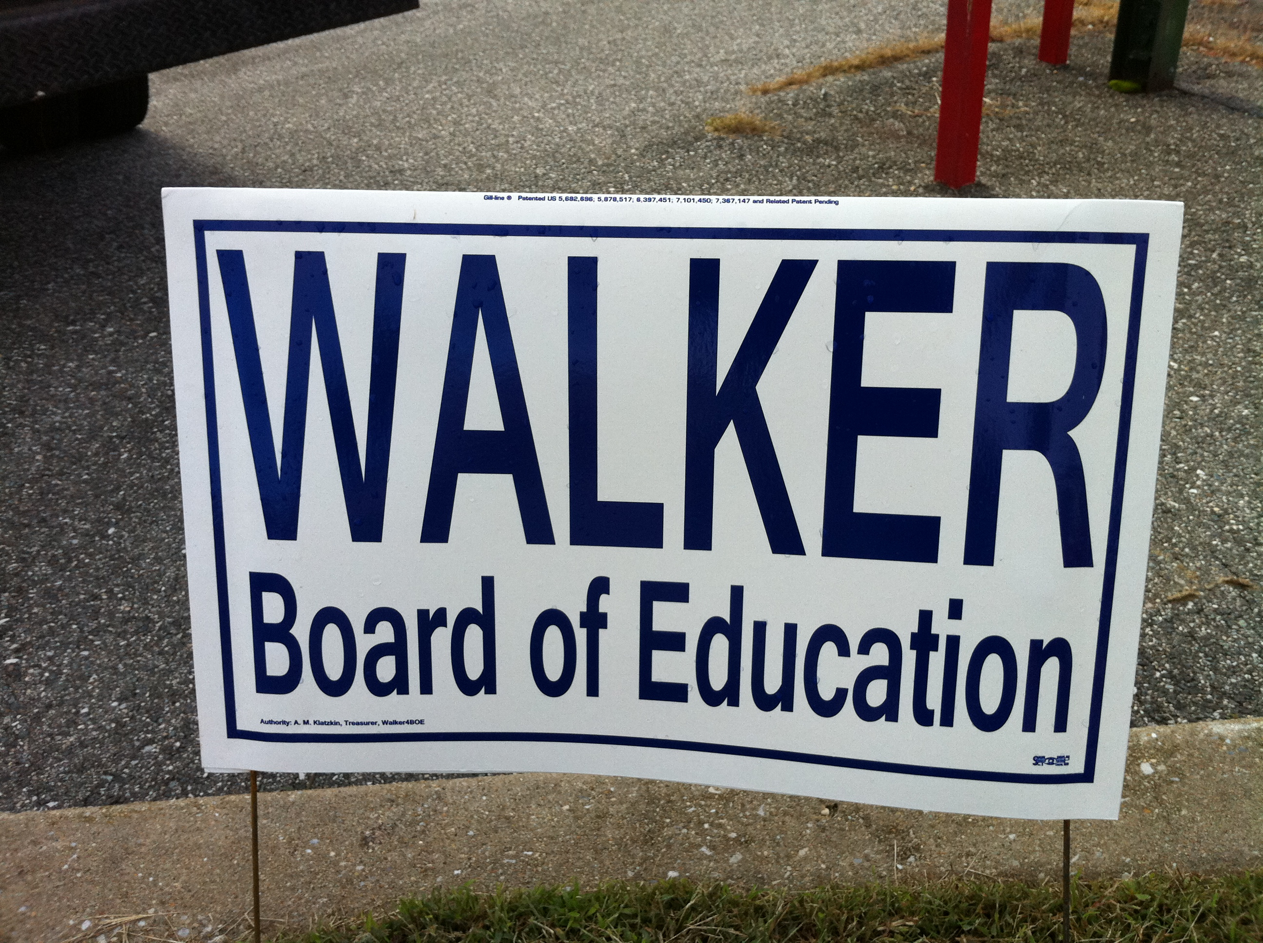
Larry Walker for Board of Education (2010)
How much more minimal could this be? The answer is none. None more minimal. But, as noted above, it gets the job done.
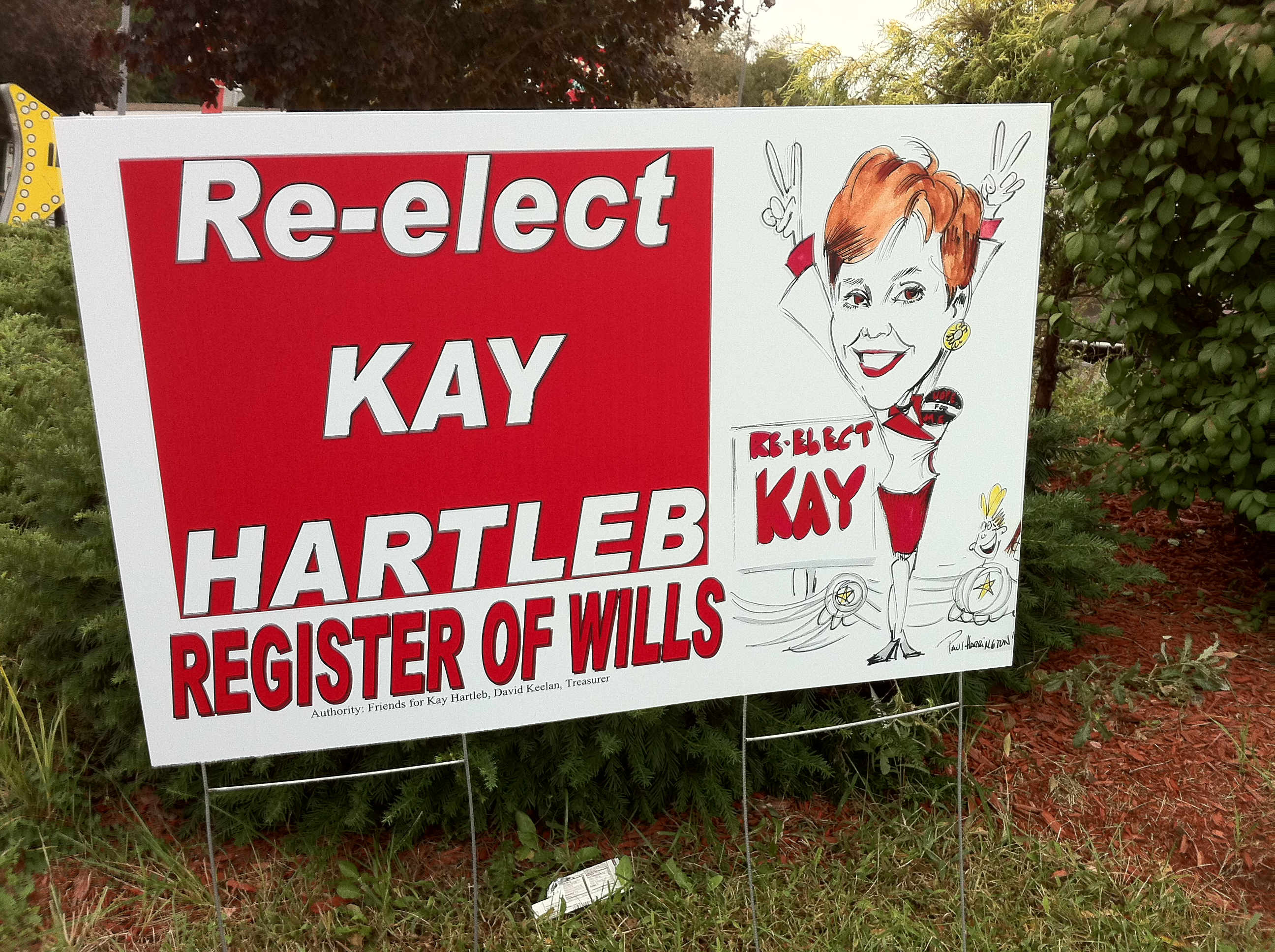
Kay Hartleb for Register of Wills (2010) (with picture)
At the other end of the spectrum, a sign with personality to burn.
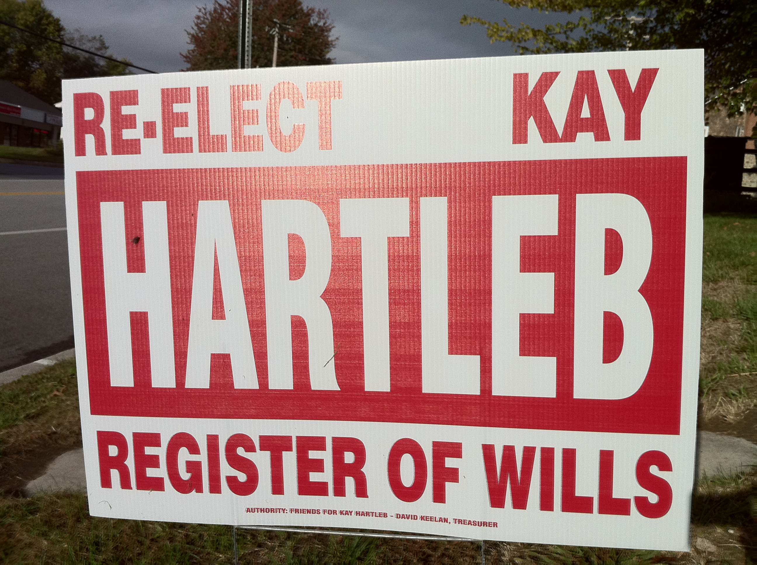
Kay Hartleb for Register of Wills (2010)
Here the personality gets turned down, but the red-and-white color scheme remains.
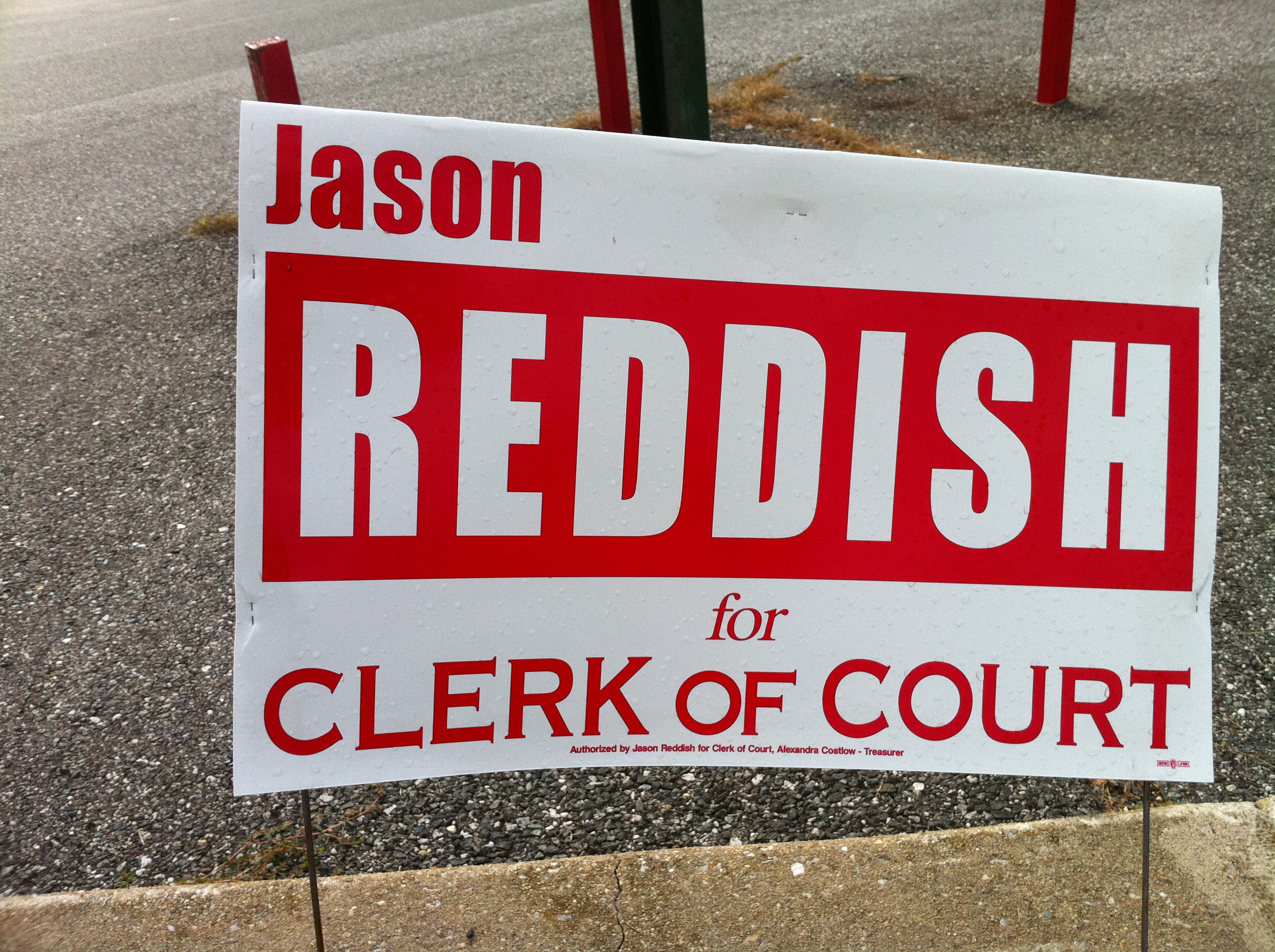
Jason Reddish for Clerk of Court (2010)
A color scheme that (deliberately?) puns on the candidate’s name. It’s also the political equivalent of showing up at a party wearing the same dress as someone else—although to be fair there were a number of copycat design schemes in 2010, including (as we’ll see) the ubiquitous white text on dark blue background.

Margy Rappaport for Clerk of Court (2010)
Lavender’s a color you don’t see that often in campaign signs.
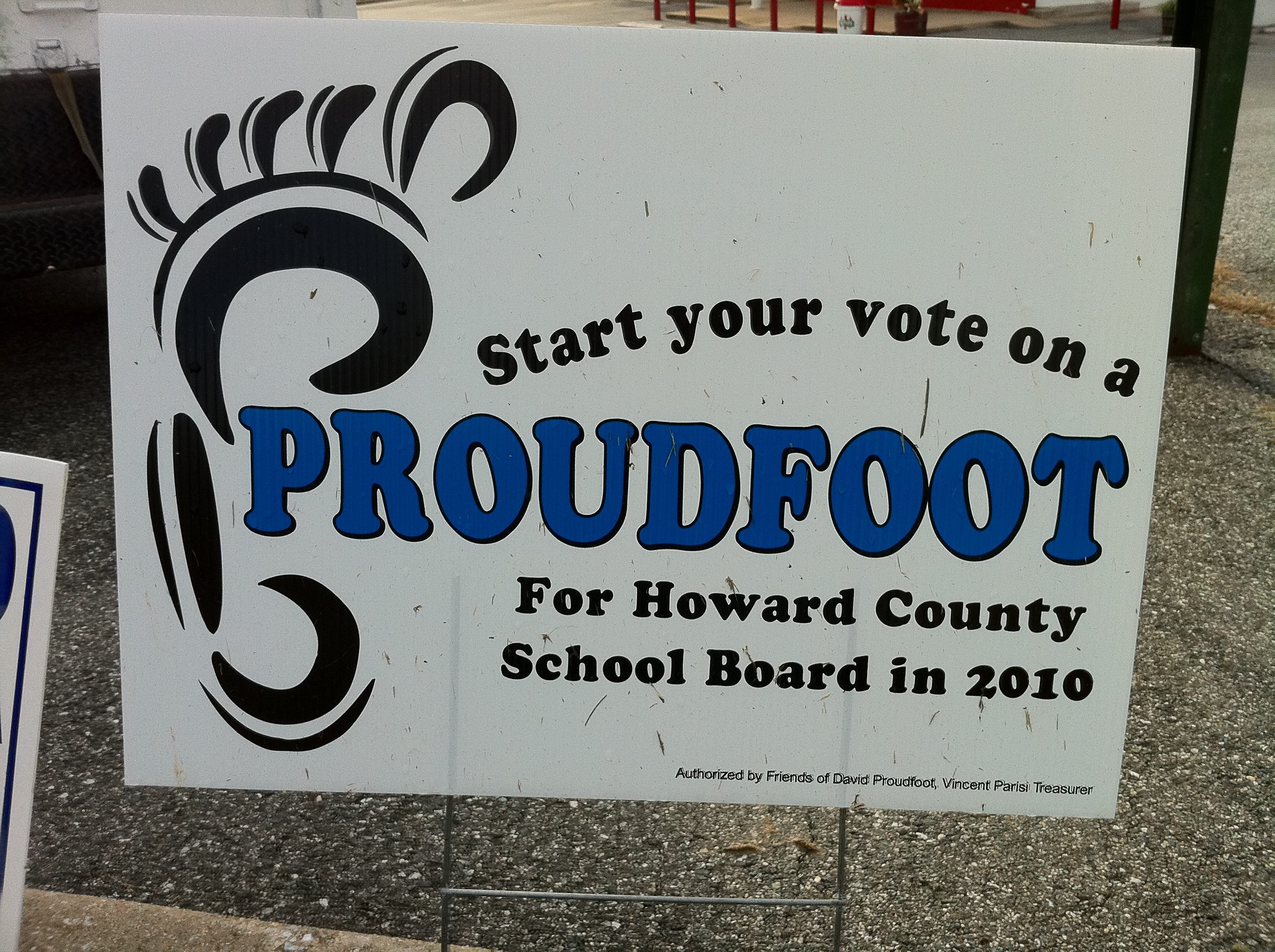
David Proudfoot for Board of Education (2010)
Using a foot as a design element was presumably an idea that was impossible to resist. Note also that this sign refers to the “School Board”; I think all the other candidates’ signs referred to the “Board of Education.”

Brian Meshkin for Board of Education (2010)
Brian Meshkin was one of several candidates listing a campaign website as an alternative to having people do a Google search for more information. I didn’t notice until looking very closely that it also includes instructions for texting him.
More 2010 campaign signs to come in part 2!