Today I look at the proposed structures and other features proposed for Symphony Woods as part of the Inner Arbor plan presented at the pre-submission meeting last Tuesday. For more background see part 1 and part 2 of this series. For a good summary of the proposed features see Andrew Metcalf’s story “Breaking Down the Plan to Develop Symphony Woods” at the Columbia Patch. My goal in this and subsequent posts is to critique each feature, measuring it against the following questions:
Does it work? In other words, does the feature address the problem for which it apparently was designed? Will people use it in the intended way? Are there other interesting and beneficial uses that people might find for it?
Is it beautiful? Or, if not truly beautiful, is it at least attractive? (How can we tell what’s beautiful rather than attractive? By our reactions: We ooh, we aah, we spontaneously break into applause, we stop in our tracks when we encounter it.)
Will it last? Over time how might the feature no longer work for people, or fail to retain its beauty or attractiveness?
What’s its cost? Does the feature look like it might be especially expensive due to its materials, complexity of construction, or other factors?
I can’t provide complete answers for all these questions, of course. I’m just an amateur critic, and don’t have any special insight into issues like construction costs and schedules. However I’ll try to at least make a start.

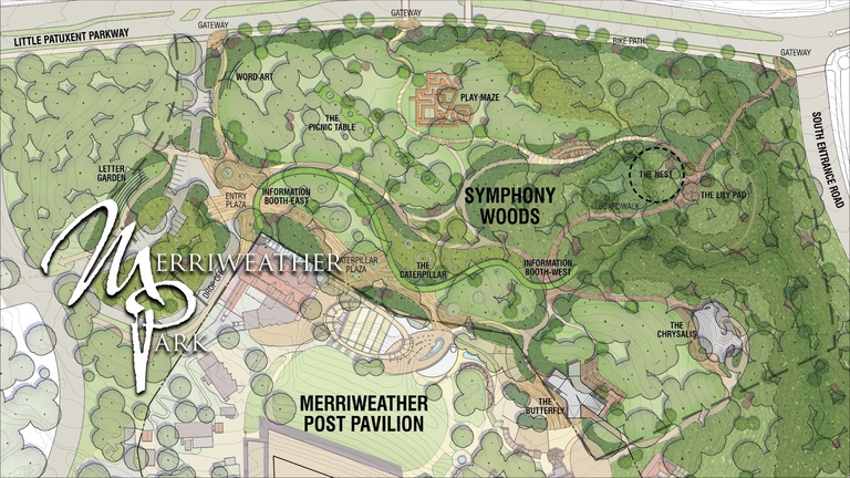
Overview of the proposed Merriweather Park, showing features proposed for Symphony Woods as part of the Inner Arbor plan. (Click for high-resolution version.) Image © 2013 Inner Arbor Trust; used with permission.
The graphic above shows all the proposed features and their relationship to the current Symphony Woods and Merriweather Post Pavilion. Note that a few of these features, most notably the Word Art and the Letter Garden, were presented at the pre-submission meeting but were not mentioned in Andrew Metcalfe’s breakdown of plan features. Other features are proposed but have yet to be designed; these include the Nest, which I’m guessing is intended to be the “iconic interactive sculpture” mentioned in the original CA Inner Arbor plan presentation, as well as some unnamed features proposed for the Merriweather Post Pavilion property. Finally, note that the road to the left side of the graphic is not Broken Land Parkway, but is a planned road that would be built in future between Symphony Woods proper and yet-to-be-built downtown Columbia developments on the east site of Broken Land Parkway.

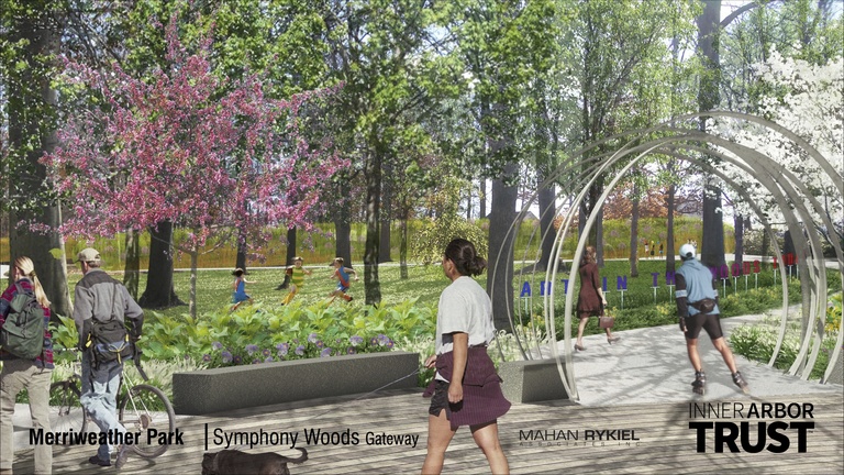
Word Art at the northwest entrance of Merriweather Park in the Inner Arbor plan. (Click for high-resolution version.) Image © 2013 Inner Arbor Trust; used with permission.
The Word Art and Letter Garden features are intended to function as “arrival art,” something to welcome you to the park. The Word Art feature in particular is intended to highlight events taking place in the park for people arriving via the northwest entrance. (See for example the above graphic, with the letters announcing “ART IN THE WOODS TODAY.”) The letters would be made of dichroic film sandwiched between inch-thick glass; the film would cause the letters to appear in different colors when viewed from different angles. Letters not used for the Word Art feature would be kept in the Letter Garden near the (small) parking lot for the park.
These features fulfill their basic function of welcoming visitors to the park and providing an attractive bit of color at the entrance and parking lot. During the Q&A period of the pre-submission meeting one person suggested improving this feature by allowing for words in other languages such as Spanish; this could also include languages with non-Latin scripts (e.g., Korean or Arabic). I think this is an excellent suggestion (as did the presenters apparently); besides being a nice nod to the diverse populations of Howard County, it would go beyond the relative monotony of capital Latin letters to provide a more varied and attractive experience. It would also echo other multi-language signs and design features elsewhere in the county, such as the advertisement for Johns Hopkins Medicine at the play lot in the Mall in Columbia, and the “Welcome” banners on the walls of the Miller Branch library.
The Word Art and Letter Garden features should be reasonably durable, although I suspect the glass of the letters might get scratched and cloudy over time. One person at the pre-submission meeting raised a concern about people stealing the letters or moving them around (for example, to spell out obscenities); however the letters would be locked in place and should be resistant to at least casual theft. Any letters that do get damaged or stolen could be replaced individually.
The cost of these features is a direct function of the number of letters deployed. Creating words in non-Latin scripts could significantly raise the cost, since given the large number of glyphs in some such scripts (e.g., Chinese, which has thousands) the only practical approach would be to commission new characters on a custom basis as they were needed.
Another feature near the northern park boundary is the Maze (or Play Maze); it is shown on the overview but I don’t have a separate image for it. This would consist of multiple mazes overlaid on top of each other: At the bottom level a maze (or multiple mazes) would be inlaid into the rubber surface forming the floor of the feature. (This sounds reminiscent of the labyrinth paths found in some religious contexts, for example at St. Johns Episcopal Church in Ellicott City.) Next would come a maze formed by semi-transparent scrims. These scrims could support art of various types, either created by park users or curated as part of a formal exhibition. Screen doors of various styles (invoking suburban homes, presumably) would be set into the maze walls. Above the scrims and doors would be a reflective roof.
This feature seems intended to provide a “play space” in the general sense: not a conventional playground or “tot lot” but something that’s more oriented to teens and adults. As Julia McCready put it, relating the reactions of her teenaged daughter,
As a young teen, she often feels it would be uncool to play on a traditional playground. And yet the energy and desire to play don’t automatically shut off at a predetermined age. The designers of the park have conceived a play space which is so beautifully open-ended that it will encourage play, participation, and interaction from a wide range of ages.
Her daughter went on to say, “It would be a great place to shoot a music video.”1 I think that captures pretty well what the Maze could be at its best: A stage on which people could express themselves and create things for the enjoyment of themselves, their friends, and the general public. It wouldn’t necessarily be a beautiful place in and of itself, but beauty could be created there.
My major concern with the Maze is maintainability, in particular how durable the scrims forming its walls would be. Depending on the material of which they’d be made, one can imagine them over time being torn, dirtied, and generally ripped to shreds. The screen doors would also constitute multiple moving parts that would likely break (or be broken) over time. Hopefully the cost of the overall feature would be low enough that periodic repairs would be relatively cheap to make.
This post is getting a bit long, so I’ll call it a night. In the next post I’ll move on to other proposed features.
UPDATE: Corrected the spelling of Andrew Metcalf’s name.
Michael Grant - 2013-12-09 13:12
I posted this comment with the Washington Post article and then found your blog and thought it germane to re-post it here. I grew up in Columbia in the 70s and 80s. This park has always been a special place. I’m both happy and sad that they are developing it. I have been to many developed parks around the world now, including Kew Gardens, parks in Australia, all over the UK and in Europe. I hope that the designers of this park also go and see some of these gardens in real life because I get the feeling that they’re designing this from a text book. Though they say there will be a cafe in this X shaped building, there needs actually to be a few small cafes around the garden. I see why they want to build a caterpillar but it looks pretty ugly to me. I wonder if a wooden barrier with lots of foliage wouldn’t look better. It could still water itself too. The raised platform is a terrible idea. Not only will it obscure the forest floor, but beneath it will be a hive for rats and other unwanted rodents in a public area. And how many people want to go sit on artificial grass? Just plant real grass! The bus system should have a stop within the park. Not for car traffic. Something I’ve seen in Australia which I always thought an excellent idea are the gas BBQs. In Australia, they’re virtually all free, but there are some models which you pop a coin in. What a great idea, how convenient. This park needs to be better integrated into the walkway system in Columbia making it easier and more desirable to walk to it and through it. Not just a place you go on special occasions. One big difference between this and gardens like Kew is that Kew is a botanical park almost like a museum and with many green houses. However, there are many parks (like the “jardins de ville” in France and across Europe that are not specifically botanical in nature and really work to draw people in, but they work primarily because they are in the middle of the town and not off in some less used corner between the freeway and a shopping area.
hecker - 2013-12-09 15:45
Thanks for stopping by to comment! I don’t have time to discuss your points right now, but may do a separate blog post addressing your and others’ comments. (Remember, I have no association whatsoever with the Inner Arbor Trust, so this is all just my opinions.)
Just for fun, here’s an example of a music video shot in a sort-of-maze with semi-transparent walls: the video for the song “1mm” from the J-pop group Perfume. ↩︎