Thanks to those who sent in pictures of campaign signs for Eric Ebersole; I’m still looking for signs for other candidates mentioned in my previous post. I’ll soon start posting my opinions on signs I do have. In the meantime I wanted to recap some of my comments from last time on campaign signs and what I personally look for in judging them.
I should say up front that it’s not clear at all that campaign signs are actually effective in persuading to vote for one candidate rather than another. As a 2012 Slate article notes, some research has shown that non-specific campaign signs urging people to vote (though not for a particular candidate) can be effective, but that says nothing about candidate-specific signs. On the other hand, a Vanderbilt University study seems to indicate that signs can be effective in promoting candidates in races in which they are a large number of candidates and voters have little information about them. There are some political consultants who feel strongly that yard signs are a waste of money, and others who are happy to advise you on which types of signs are more effective.
In any case, I think campaign signs lend a festive air to election years, and from a purely aesthetic standpoint offer interesting examples of both good and bad graphic design. As a amateur design critic here’s what I personally look for in a campaign sign:
Legibility. Whatever other attributes a sign has, at a minimum it has to be readable. There’s nothing more frustrating than driving down a road at 30 or 40 miles per hour, seeing a small campaign sign, and not being able to figure out which candidate it’s for.
Information. Assuming that the primary purpose of a sign is to promote name recognition, then obviously it needs to include the candidate’s name (full name or just last name) and the office they’re seeking, Anything else—party affiliation, slogans, icons and images, candidate picture, etc.—is arguably superfluous.
Color. Some people have specific recommendations on sign colors. Others tend toward traditional colors, like the American flag colors red, white, and/or blue, or the Maryland flag colors black, red, white (silver), and yellow (gold). Many signs use other colors to good effect, and they get bonus points from me for doing that. My main comments here are that some color combinations (like red and blue) impair readability, and that using the Maryland flag colors in an effective way can be hard if you use more than two colors at a time.
Typography. Beyond being readable, I like to see sign typefaces that are clean, dynamic, elegant, and work well together (if multiple typefaces are being used) and in the context of the sign.
Other design elements. Some signs have additional graphic elements, for example stars, small flags, etc. I judge these on how well they work in the overall context of the sign: do they enhance the design, or detract from it?
To illustrate the above criteria, here are some examples of signs I liked from the 2010 campaigns (click on the images to see them full-size). Note that I didn’t get pictures of all 2010 signs, so don’t consider this a true “best of 2010” list.
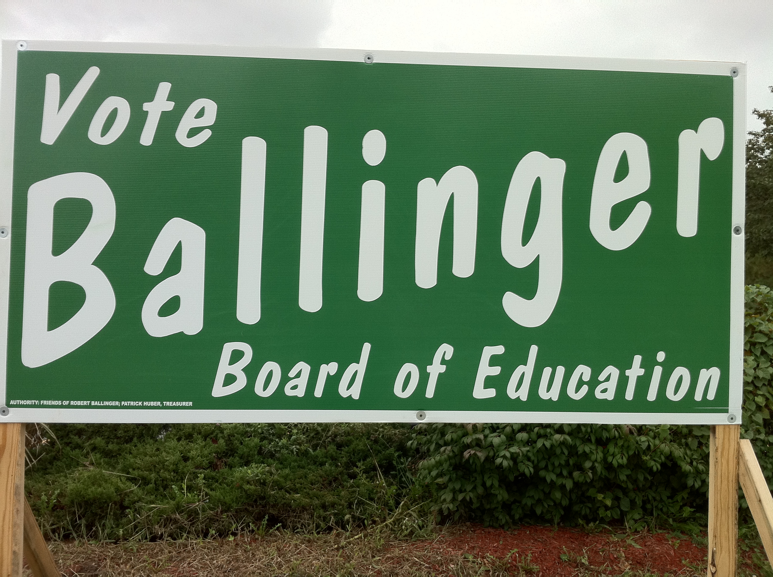
Bob Ballinger 2010 sign
I thought this sign for Bob Ballinger was an excellent sign for a non-partisan Board of Education campaign. It gets the basics right in terms of legibility and conveying the essential information. The green background color and the typeface resemble chalk writing on a blackboard and thus highlight the theme of education in a nice subtle way that avoids the design clichés common in Board of Education signs (for example, apples).
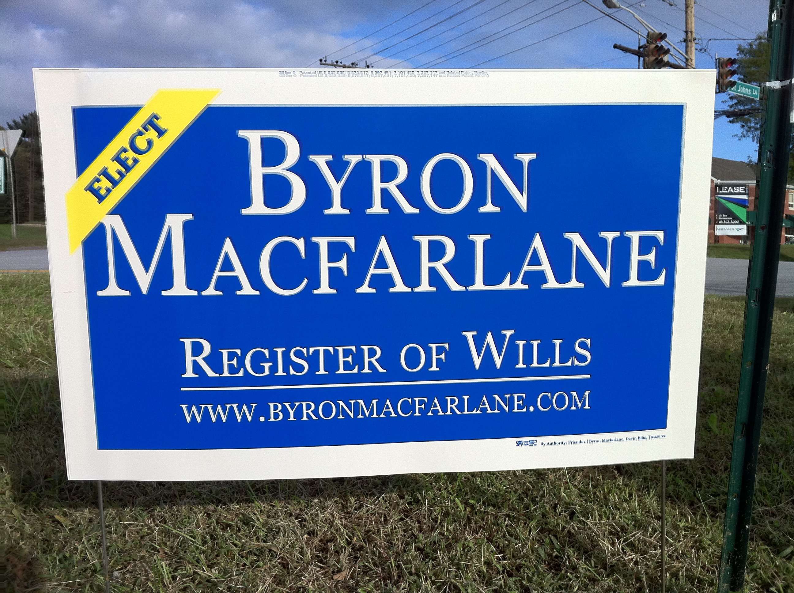
Byron Macfarlane 2010 sign
Again, like all my favorite signs this sign for Byron Macfarlane (for Register of Wills) is quite readable and highlights the essential information. The blue background color is pleasing to the eye and not overbearing (as some darker blues can be), while the yellow element in the upper left-hand corner adds visual interest in a nice contrast of colors. The typeface is quite elegant and has an air of formality about it that is appropriate for a courthouse election, especially for a position involving estates and trusts—it’s reminiscent of a typeface that a bank or financial advisor might use.
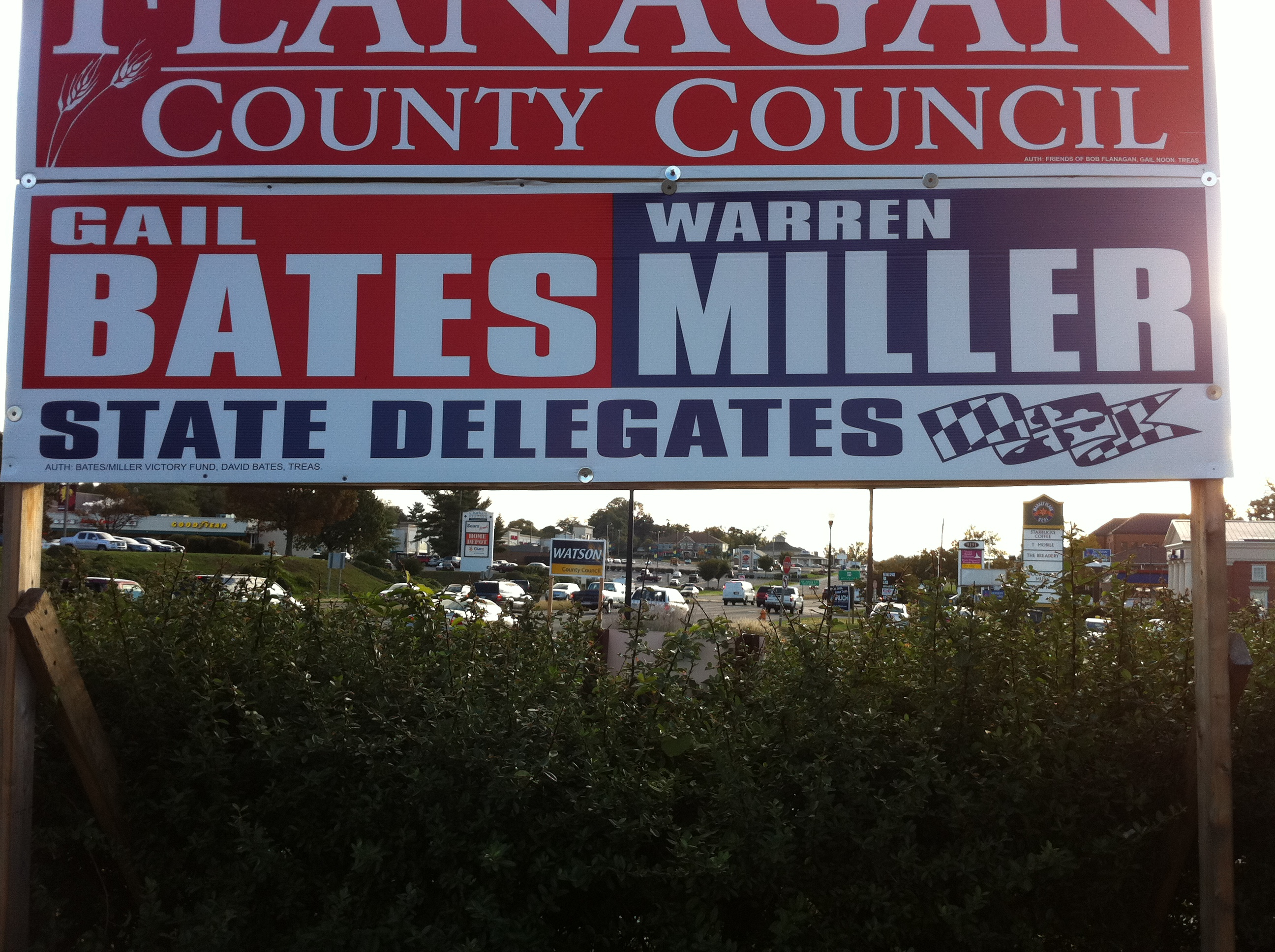
Bates/Miller 2010 sign (large)
I thought this sign for Gail Bates and Warren Miller (for the Maryland House of Delegates) did several things well: It did a good job of highlighting the “team” aspect of their campaign. It made excellent use of the traditional red, white, and blue colors, which with its implications of patriotism is a favorite color combination for many Republican candidates. The typeface is bold but still readable. Finally, the design element invoking the Maryland flag nicely filled in the overall design.
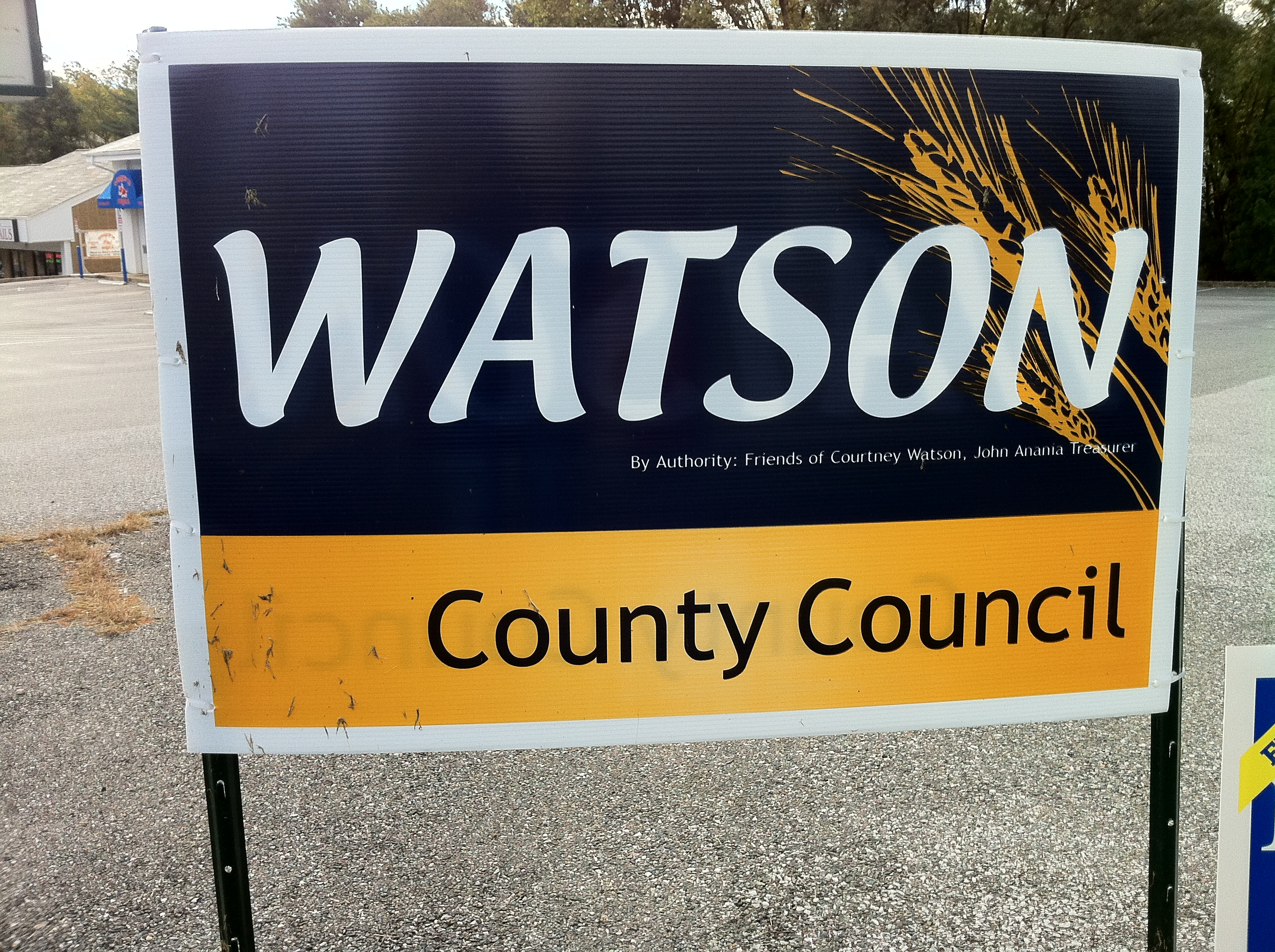
Courtney Watson 2010 sign
This was my overall favorite of the signs I saw in 2010: It was pared down to only the essential candidate information (last name and position sought, with “Howard County” implied rather than explicitly stated on the latter). The colors were nice and complemented each other well. The typeface was somewhat unconventional (i.e., not a over-used serif typeface like Times Roman or sans serif typeface like Helvetica) but was quite legible and conveyed a feeling of dynamism. Finally, the design element of a stalk of wheat enhanced the design and evoked the rural roots of Howard County.
That concludes the preliminaries. In my next post I’ll start looking at the 2014 signs; unlike last time I’ll do this race by race and (where possible and appropriate) pick an overall winner in each.