OK, the preliminaries are over, and here’s my first campaign sign 2014 face-off. I’m starting with the courthouse races, and in particular the race for Howard County Sheriff, which pits incumbent James Fitzgerald against challenger John Newnan in the Democratic primary. (John McMahon is unopposed in the GOP primary, and I wasn’t able to find a sign for him.)
Both Fitzgerald and Newnan have multiple types of signs; I think I got pictures of all of Newnan’s but may have missed one of Fitzgerald’s. Here are the signs, in alphabetical order by candidate and from small to large for each candidate, along with my comments.
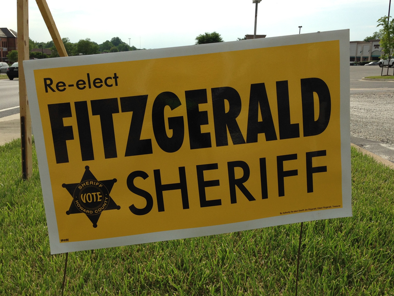
This is the basic Fitzgerald sign in its most minimal form. Fitzgerald is using the same black on yellow color scheme (two of the four colors from the Maryland flag) as last election; in fact this sign and others appear to be unchanged from 2010. This is a good sign in my opinion, simple, legible, and uncluttered in its design. The typeface is nothing fancy but works well, and I like the white border.
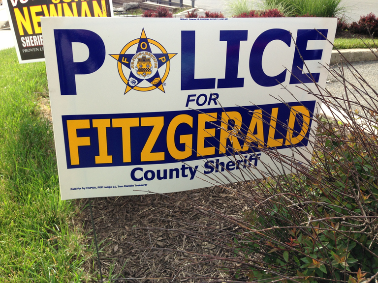
This sign is a departure from the normal Fitzgerald sign template in its use of a blue and white color scheme and a different typeface. It’s a nice attempt to do something different but I don’t think it really works, mainly because the star intended to be the “O” in “POLICE” doesn’t actually look that much like an “O.” As a result I tend to read the sign as saying “PLICE FOR FITZGERALD.”
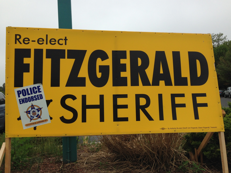
This sign is essentially the small sign above blown up to a large size and with a “Police Endorsed” sticker covering the six-pointed sheriff’s star. Possibly because it lacks the white border, this sign seems more “oppressive” than the corresponding small sign, and the blue on white sticker lightens the look of the sign and adds some visual interest.
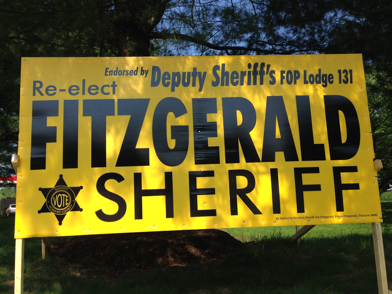
This sign is also based on the small sign writ large, this time with the “Endorsed by …” tagline at the top right. As with the previous sign, I think the sign is improved by adding an additional element beyond those on the small sign.
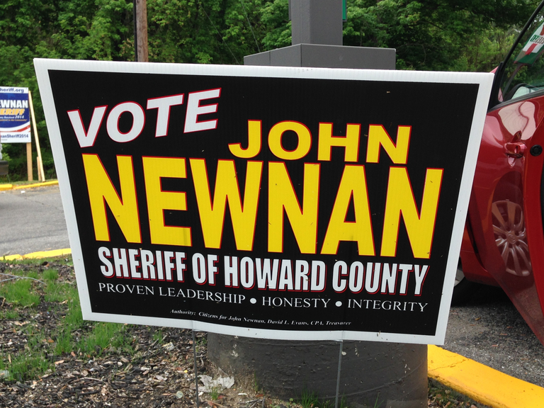
Turining to John Newnan, there’s a lot to like about this small sign. The name is nicely legible, and the oblique typeface used for the word “VOTE” adds some dynamism to the sign. A nice subtle touch is the use of a thin red outline around both “VOTE” and the candidate’s name; there’s also a red drop shadow (not an outline) used for the phrase “SHERIFF OF HOWARD COUNTY.” The red makes the words pop out from the black background and further livens up the sign. Together with the black background and the yellow and white type the inclusion of a touch of red also makes this sign a textbook example of how to use all four colors of the Maryland flag in a very effective way.
My one criticism of this sign is that the phrase “SHERIFF OF HOWARD COUNTY” is pretty small, and the tagline below it is smaller still; I doubt either of these is that readable from a car moving fast. I think I understand why the full position was used: Since the word “SHERIFF” is as long as “NEWNAN,” if it were made smaller on the sign then there would be blank space on either side of the word that would make the composition of the sign look a bit unbalanced, unless some design elements were placed at either side of it. However I still think the tagline could have been omitted.
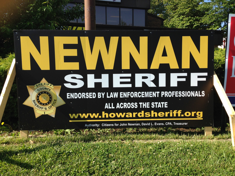
This large sign uses the same basic color scheme of yellow and white type on black background as in the small sign, but lacks the red highlighting (possibly for reasons of cost?). Unfortunately leaving the red out means that the yellow and white type looks somewhat flat and lifeless against the black background. The endorsement line is also rather long and hence less readable, and the use of a seven-pointed rather than six-pointed star is somewhat jarring. (Maybe Newnan avoided using the six-pointed star for some sort of obscure legal reason? But he did use it in the sign below, albeit not conspicuously.)
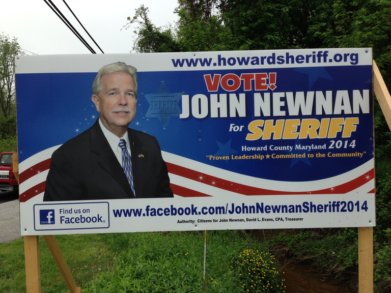
I’ll be up front here: I am not a big fan of signs that show a picture of the candidate; I think that’s better reserved for a web site or direct mail piece. There’s a lot going on in this sign: the candidate photo, the (barely visible) sheriff’s star next to the candidate, not one but two pointers to online information, the red and white stripes, and yet another slogan. I think it’s all too much of a muchness.
My vote: I really like the design choices on the small Newnan sign. It would probably be my pick if it had been more minimal, e.g., including just “SHERIFF” rather than “SHERIFF OF HOWARD COUNTY,” and omitting the tagline at the bottom. However given those shortcomings, at least in this election I’ll instead vote for the tried-and-true choice, namely the basic Fitzgerald sign in its small version.
Tune in next time, when I’ll look at the signs in the Howard County State’s Attorney race.
Kemp Freund (kemp.freund@verizon.net) - 2014-06-26 22:08
Frank - on Newnan’s signs you commented on the use of the 7 point star. The HCSO actually wears a 7 point star but an inverted version of the one on Newnan’s sign (which is generic clip art). Fitzgerald used a clip art 6 point star on his signs, probably because his printer had that artwork and most people don’t really pay attention to the star in the first place. But if you look at the Sheriff’s marked cars, their patch and the actual badge you will see a gold 7 point star with the Maryland seal in the center. BTW - did you ever see anything from the mystery Republican candidate? I am wondering if he intends to run on name recognition alone and hope that the public thinks that they are voting for the retiring Police Chief.
hecker - 2014-06-26 22:32
Thanks for stopping by to comment, and for the detailed explanation! I never did see any signs for the GOP side of this race. Maybe closer to the general election?
Cherie Beck (cheriebeck@gmail.com) - 2014-07-10 12:40
Just looking around Frank…noticed the comment above. Says it’s by me. What a surprise, since I didn’t write it, Someone must have used my email address as a generic author.
hecker - 2014-07-27 18:32
Cherie: I think I cleaned up the comment in question.
