My next “sign-off” is for the race for Howard County State’s Attorney, in which incumbent Dario Broccolino faces fellow Democrat Rich Gibson in the 2014 primary. (There are no Republicans running for this position.) Unlike the race for Howard County Sheriff, each candidate has limited himself to one type of sign. (Broccolino has both large and small signs, but except for one small detail they’re simply different-sized versions of the same sign.1) So on to the judging, according to the criteria I’ve previously discussed. Here are the signs, in alphabetical order by candidate, along with my comments in my role as amateur design critic.
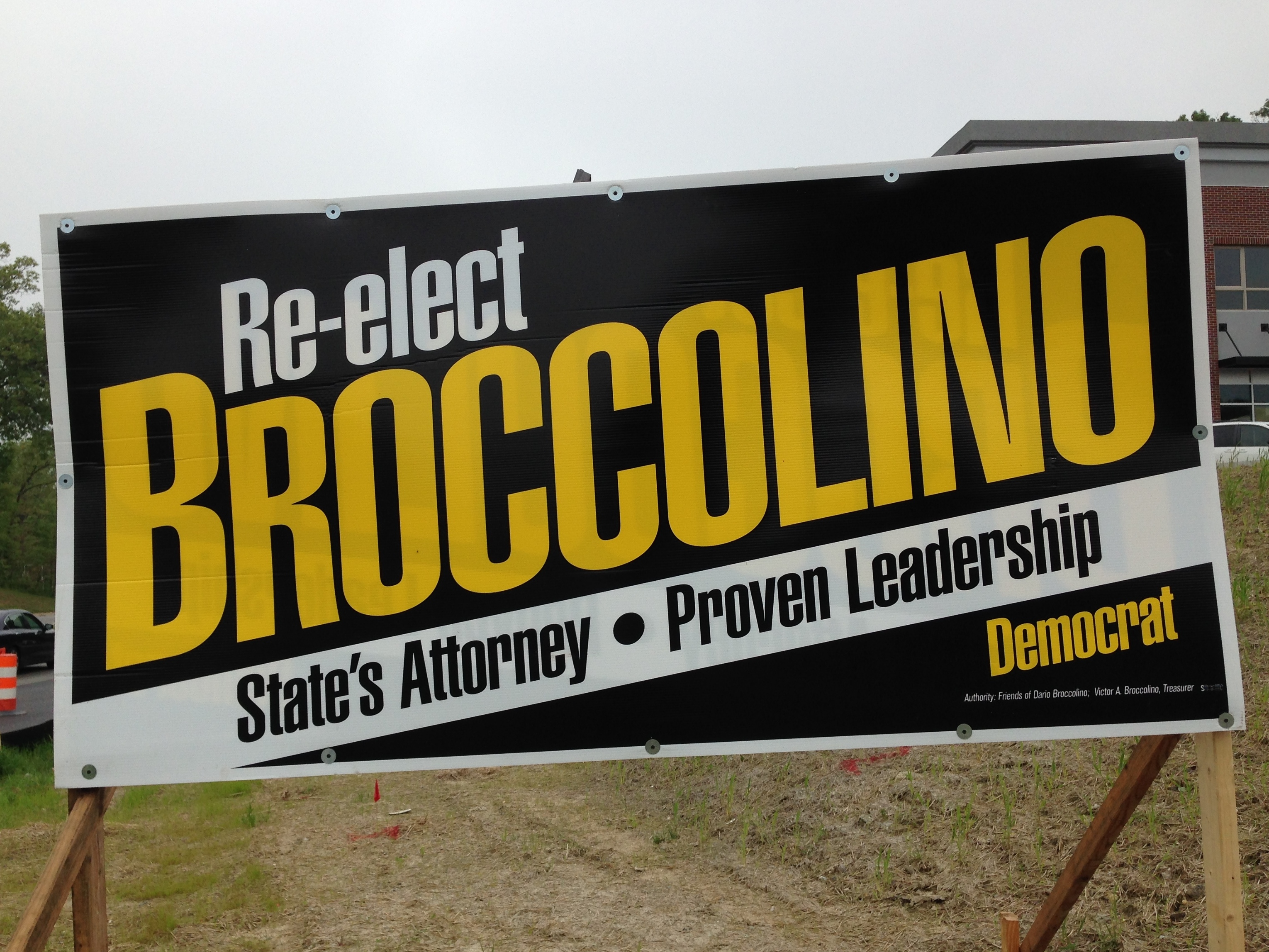
This is the large Broccolino sign; as noted above the small sign is identical to this. I have to admit that when I first saw this I immediately thought, “What a great sign!” My eye was first drawn to the dramatic upward slant of the text in the design. Then I noticed the cleverness of the color scheme: First white on black, then yellow on black, then a dramatic switch to black on white, and then back to yellow on black again, so that no two lines of text are in the same color.
Besides being a good use of three of the four Maryland flag colors, the switching back and forth increases visual interest, and together with the upward slant of the design avoids the problem of visual “flatness” I previously identified in the large John Newnan sign for the Howard County Sheriff race. The white border, although relatively thin, serves to tie together the overall design and keep the black background from being overwhelming; again, compare this to the large John Newnan sign, which also had a black background but no border.
The sans serif typeface looks really good too; it’s an excellent choice for this design. Note also that the typeface is slightly oblique with the vertical strokes of the letters exactly parallel to the sides of the sign, which prevents the letters from looking crooked and adds further energy to the upward slant of the design; it’s little touches like these that turn a good sign into a great sign.
The sign is not perfect: The “State’s Attorney - Proven Leadership” tagline is somewhat small and not that readable at a distance, even in the large sign. Also, the “Democrat” in the lower right, which is also not that readable from a distance, seems to be there mainly to balance the composition.2 But overall I can’t fault the design choices.
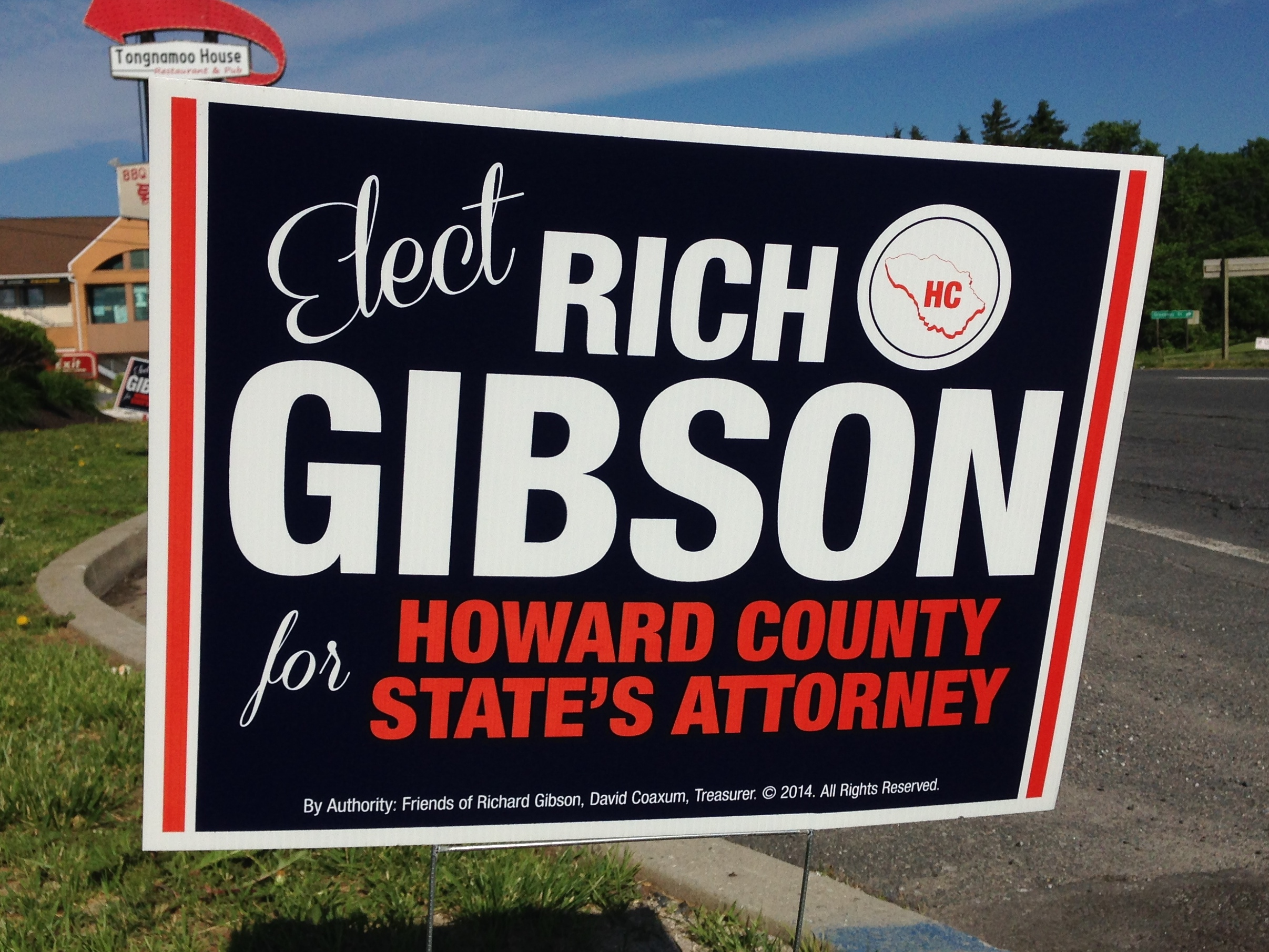
Rich Gibson’s sign is also a solid professional piece of work. (There are no slackers or amateurs in this race as far as signs are concerned.) The sans serif typeface for “RICH GIBSON” and “HOWARD COUNTY STATE’S ATTORNEY” looks good and is bold while remaining readable. The script typeface used for “Elect” and “for” is a nice contrast with the main font; it’s not as readable, but that’s not important since those words are mainly there to add visual interest. A darker orange is a good choice for the contrasting color; it’s a nice break from yellow (which would be the typical choice) and orange text on blue is significantly more readable than red on blue. The two vertical orange bars on both sides nicely highlight the main body of the sign.
Overall the sign is just a tad cluttered, but every visual element plays a role in the design, even the stylized Howard County map in the upper right corner, which balances the “Elect” in the upper left and the “for” in the lower left. Unlike the Broccolino sign, the Gibson sign features consecutive lines of text in the same color (“RICH” and “GIBSON” in white, and then “HOWARD COUNTY” and “STATE’S ATTORNEY” in orange). However I don’t see that as a problem, since if “HOWARD COUNTY” were omitted the “STATE’S ATTORNEY” line would be out of balance with the two lines of text above it.
My vote: I’ll give the Rich Gibson sign credit for a good performance, one that might have put it on top in another race. However unfortunately for it it’s up against the Dario Broccolino sign, one that I’d easily put in the top three for best Howard County campaign signs of 2014 thus far. I wouldn’t call this a landslide victory, but overall this is a clear win for the Broccolino sign.
This concludes my look at signs for the courthouse races. (I did see one sign for a candidate for Judge of the Orphans’ Court; if I see more signs for that race I’ll do a post then.) In my next post I’ll switch to the races for the Maryland state legislature, starting with the signs for candidates for the Maryland House of Delegates, District 9A.
UPDATE: Added a bit about the small Broccolino sign, and refined my comments on the large sign.
I didn’t notice this at first, but in the small Broccolino sign the dot between “STATE’S ATTORNEY” and “PROVEN LEADERSHIP” is yellow rather than black, as it is in the large sign. ↩︎
Note that I may not be giving Broccolino and the sign designer enough credit here. If I recall correctly, Republican candidates for Howard County courthouse races don’t typically put their party affiliation on their signs. Rich Gibson is a Democrat, but his sign doesn’t identify him as such. Thus in a way by being upfront about the candidate’s party affiliation the Broccolino sign works to put doubt in peoples’ minds as to whether his opponent is actually a Democrat or not. ↩︎