We now come to the first of my posts on signs in the races for the Maryland House of Delegates, starting with District 9A (my own district, as it happens). On the Democratic side there are only two candidates for the two positions (Walter Carson and Ward Morrow), so both will proceed to the general election unchallenged. However on the Republican side the field is very crowded, with five candidates: Eric Bouchat, Trent Kittleman, Kyle Lorton, incumbent Warren Miller, and Frank Mirabile. One interesting consequence of this crowded field is that (with one exception) the GOP candidates are using their signs to try to stand out in various ways.
Here are the signs, in alphabetical order by candidate, along with my comments, according to the criteria I’ve previously discussed.
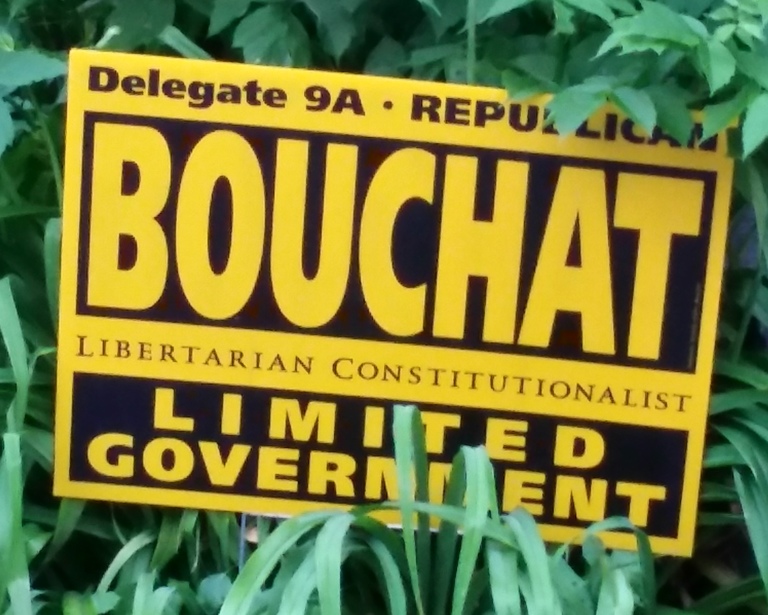
In my opinion this sign goes overboard in its attempt to let the voters know exactly what kind of candidate Eric Bouchat is (and thus who he’s trying to appeal to). In fact, there’s so much other text that the actual position he’s running for gets relegated to a small space in the upper left. Design-wise the letters in “BOUCHAT” seem too blocky and close together, while the letters in “LIMITED” look to be spaced too widely compared to those in “GOVERNMENT,” presumably in an attempt to balance the two words in terms of length. Finally, the letters in “LIBERTARIAN CONSTITUTIONALIST” are so small I doubt they’d be readable except very close up.
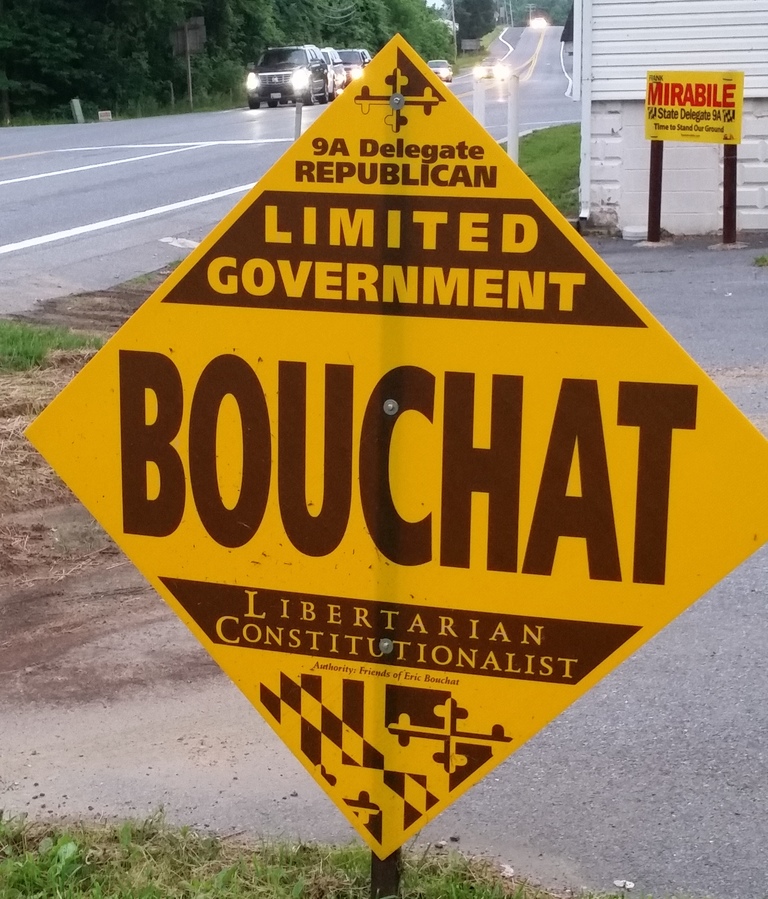
This is the only diamond-shaped sign I’ve seen in the campaign, and there are reasons for why that’s the case: First, the shape doesn’t provide a lot of room for text. The very top and bottom of the sign can be used only for non-text elements (like the Maryland flag-inspired design here); even in areas closer to the center the text has to be relatively small in order to fit. Second, the support for the sign has to run through the middle of the sign, which means that the other side of the sign can’t be used.
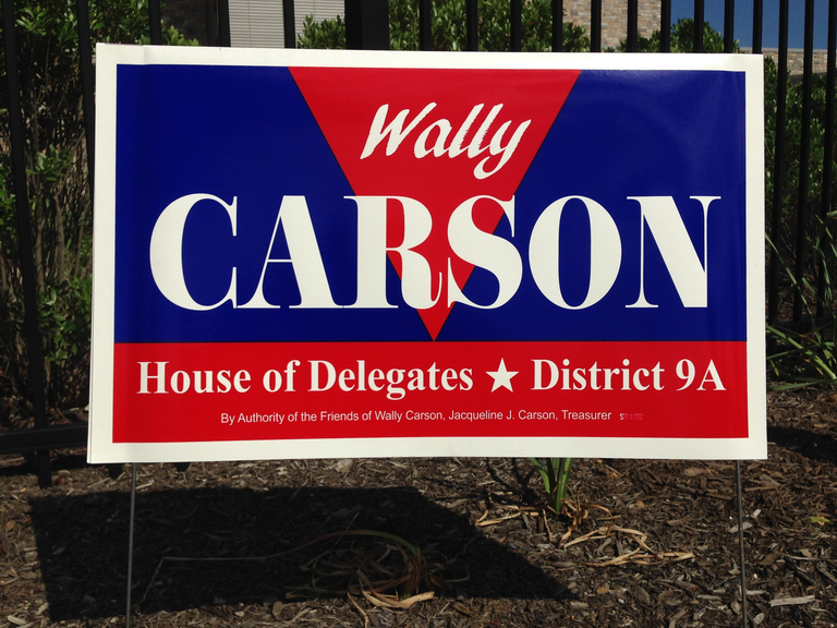
This is an unusual red-white-and-blue design. I’ll give it credit for trying to do something out of the ordinary, but I don’t think the red triangle works well; in particular I think it reduces legibility a bit for the “R” and “S” in “CARSON.” I’m curious as to what the sign would look like with just a blue background in the upper half.
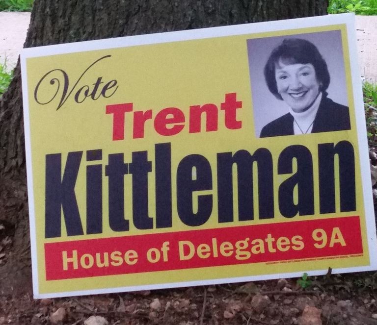
Like other GOP candidates Trent Kittleman does a little extra to try to stand out, in this case including a picture of herself. I’m only guessing here, but perhaps this was done both to highlight her role as the only female candidate in the race (from either party) and to help reduce potential confusion between herself and Allan Kittleman.
The sign’s color scheme, based on the four colors of the Maryland flag, is the same as Trent Kittleman’s sign in 2010 when she ran for Howard County Executive; in fact, except for the picture the design itself is almost identical. As I wrote at the time, it’s very tough to make this color scheme look good in a sign, especially if the sign uses red text on a yellow background or vice versa—the two colors are too similar, especially when (as in this sign) the red color ends up looking more orangish.
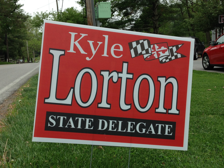
This is a good sign: The “Lorton” is very visible from a distance, due to the use of mixed upper and lower case (which tends to be more readable than all upper case), the large serif typeface, and the black outline around the letters, which tends to make them stand out from the background. The white on black “STATE DELEGATE” looks good as well, and the design element in the upper righthand corner adds interest and does a good job of balancing the “Kyle.” My only real criticism of the sign is that the red background looks somewhat dull and flat.
Note that unlike all the other Republican candidates’ signs, the Kyle Lorton sign doesn’t attempt to highlight his GOP/conservative/Tea Party bona fides; I think of it more as a “general election sign” (which assumes, of course, that Lorton will make it through the primary).
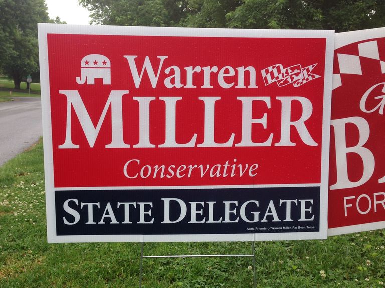
In this election Warren Miller continues his tradition of having good-looking examples of red-white-and-blue sign designs. In this version the blue is very dark, almost black, and makes an excellent contrast with the bright red of the top part. (At least I think the bottom color is blue; it’s really hard to tell for sure, even in close-up.) The typefaces are quite elegant and legible, with a nice rhythm in the text top to bottom: First “Warren” in mixed case, then “MILLER” in upper case in the same typeface, then “Conservative” in mixed case echoing “Warren,” albeit with a different and italic typeface, and then finally “STATE DELEGATE” in upper case in the main typeface, echoing “Miller.”
The only things I don’t like about this sign are the design elements in the upper corners, which I think add clutter and are not essential. The GOP elephant at the upper left I think is redundant given the highlighting of Miller as a conservative, and the flag at the upper right seems to be there just to balance the elephant in the design. I think the sign would look better and be more legible overall if those two elements were removed.
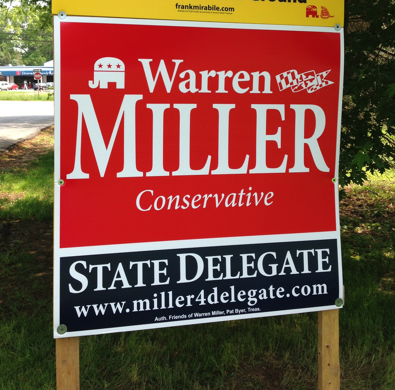
The most obvious difference in the larger Warren Miller sign is the addition of the “www.miller4delegate.com” web address. However this addition forced more subtle differences: In order to accommodate the address, the height of the bottom part of the sign was increased. The top part of the sign was also increased in height, presumably to keep the two parts in balance. Unfortunately this increase in height had a downside: Since the word “Conservative” is now further above the white border separating the red background from the blue background, and has more of the red background color surrounding it, optically it appears to be a bit smaller than it does in the small sign, even though the size of the text relative to “MILLER” is exactly the same.
I therefore think this sign would look better if the word “Conservative” were made slightly larger (say by 25% or so) and moved slightly lower down, so that it were equidistant between “MILLER” and the white horizontal divider. And as with the smaller sign, I think the design elements in the upper corners are not necessary.
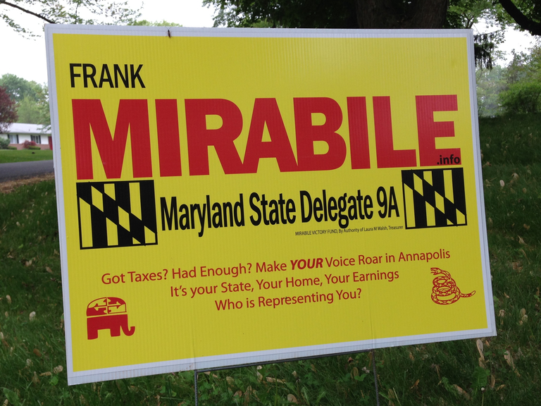
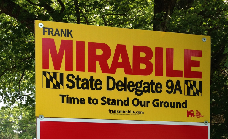
This is an unfortunate example of a sign that is trying to be a campaign manifesto—unfortunate because the type is so small and the text so lengthy that even someone walking by rather than driving is unlikely to be able to easily read it all. Their task isn’t made any easier by the use of orange/red type on a yellow background, as with Trent Kittleman’s sign. Finally, I don’t like the Maryland flag-derived design elements to the left and right of “Maryland State Delegate 9A”; I think they overwhelm the text and make it harder to read.
This larger version of the previous Frank Mirabile sign improves on the previous sign in two ways. First, the “State Delegate 9A” is larger in size and uses a bolder typeface than “Maryland State Delegate 9A” on the previous sign, and matches the size of the flag-derived design elements. I still think those elements could be ditched, but at least the text can hold its own against them. Second, the campaign manifesto has been replaced by the pithier and more effective “Time to Stand Our Ground.” The message is further reinforced by the GOP elephant and “Don’t Tread On Me” snake in the lower right, although as on the Warren Miller signs I think those are superfluous and could have been removed.
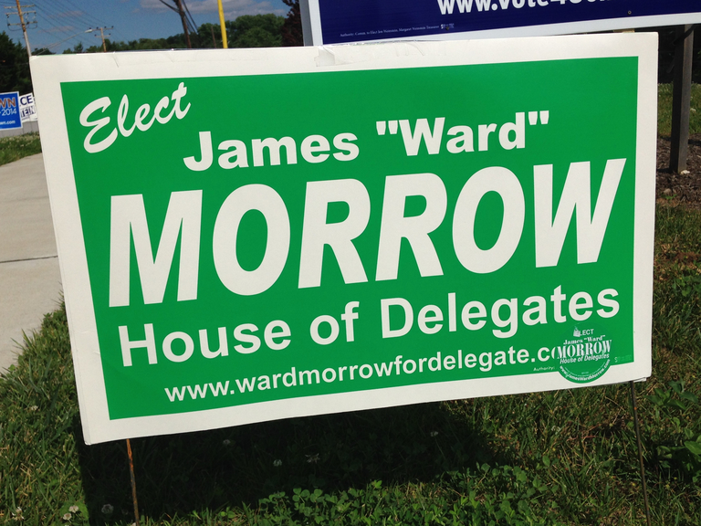
This is a good solid sign, in the green and white color scheme used by many Democratic candidates. There’s not a whole lot else for me to say about it—there’s nothing wrong with the sign, and at the same time nothing that truly makes it stand out from the crowd.
 s
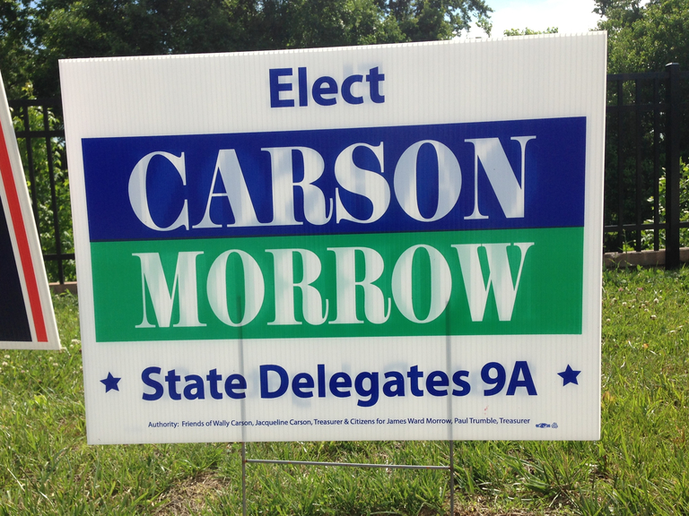
This combined sign for the two Democratic candidates nicely echoes the individual candidates’ signs: The typeface used for the names and the blue background to “Carson” hark back to Wally Carson’s sign, and the typeface used for “Elect” and “State Delegates 9A” and the green background to “Morrow” remind one of Ward Morrow’s sign.
Overall it’s a lively and visually interesting sign. My only gripe is that the word “Elect” seems out of balance with the rest of the sign; maybe it would have been better to leave it off?
I know this is a two-member district, but I find it hard to pick just two winners. My top three picks are the Kyle Lorton sign, the small Warren Miller sign, and the Carson/Morrow sign. I go back and forth on my ranking of the three; however I will say that if the (in my opinion) superfluous design elements were removed from the small Warren Miller sign then it would be my top pick—I just really like the colors and typefaces used in Warren Miller’s signs.
In my next post I’ll evaluate signs for House of Delegates candidates in District 9B.
Walter Carson (wcarson@columbiaunion.net) - 2014-06-15 15:25
Well done! Thank you for sharing your opinion and insights. Best wishes. WEC Sent from my iPhone
hecker - 2014-06-15 16:47
Thanks for stopping by to comment. I did early voting yesterday at the Miller Branch library, and fortunately was able to get pictures of all the signs I was previously missing, including yours and Ward Morrow’s.
