Next in line for a campaign sign critique is the race for the Maryland House of Delegates in District 9B. On the Democratic side the candidates are Tom Coale and Rich Corkran, one of whom will face off against either Bob Flanagan or Carol Loveless.
Here are the signs, in alphabetical order by candidate, along with my comments, according to the criteria I’ve previously discussed. Full disclosure: I publicly endorsed Tom Coale in this race almost a year ago (my, how time flies!), but will try not to let that affect my aesthetic judgment.

This sign’s design is uncluttered, I like the typeface, and it’s pretty readable from a distance. The star design fits in well and adds some interest, but the red portion of the design doesn’t show up well against the blue background. This is especially true of the thin red line dividing “TOM COALE” from “FOR DELEGATE,” which is almost invisible even up close. (In fact, I hadn’t noticed the line myself until I was writing this post.)
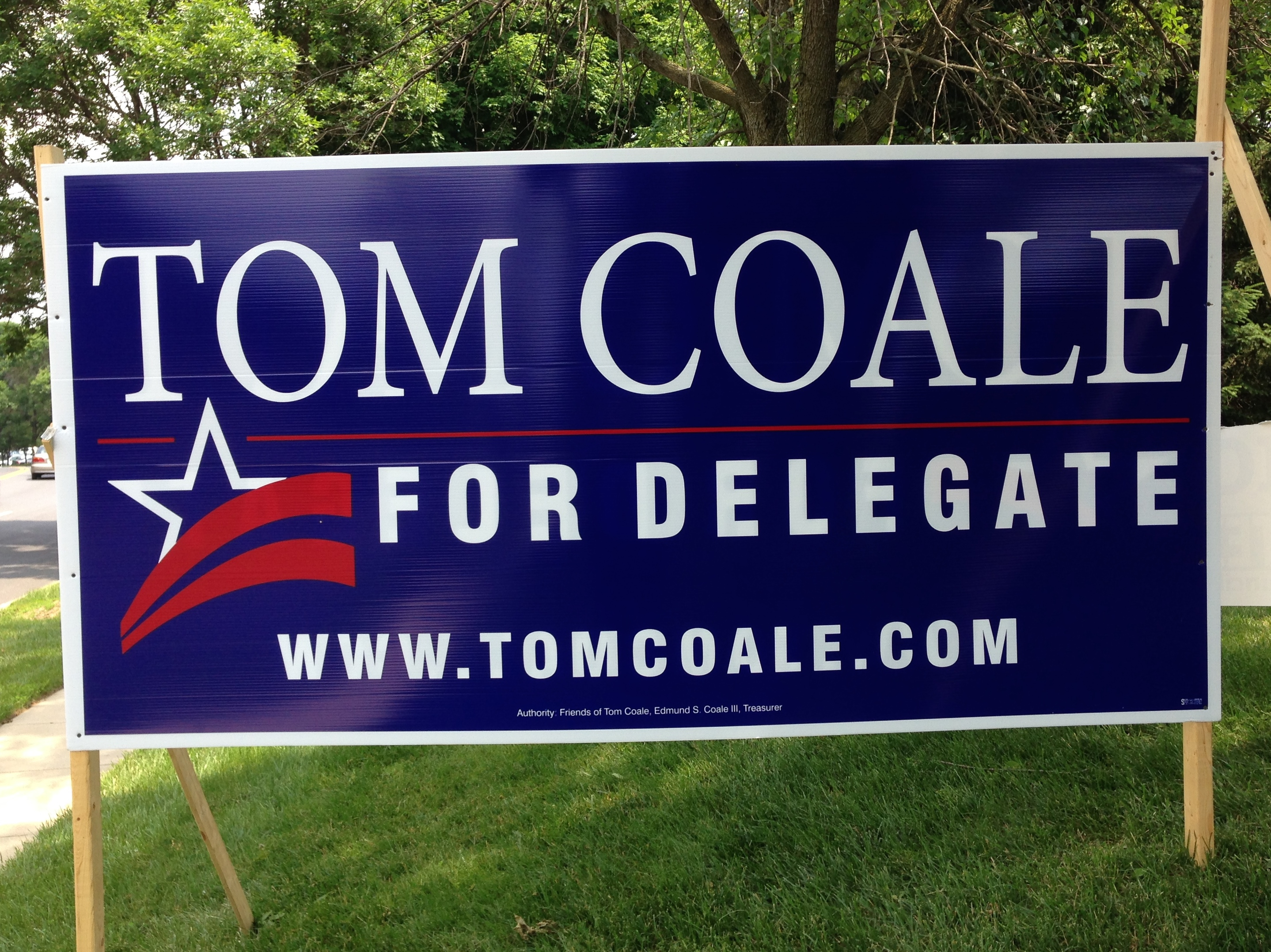
The large version of the sign, like the large Warren Miller sign, adds the web site address, and the arrangement of “TOM” and ”COALE” is modified to better fit the larger size. (The red elements of the design seem to show up better as well, but that may just be due to the particular lighting conditions in which I took the photograph.)
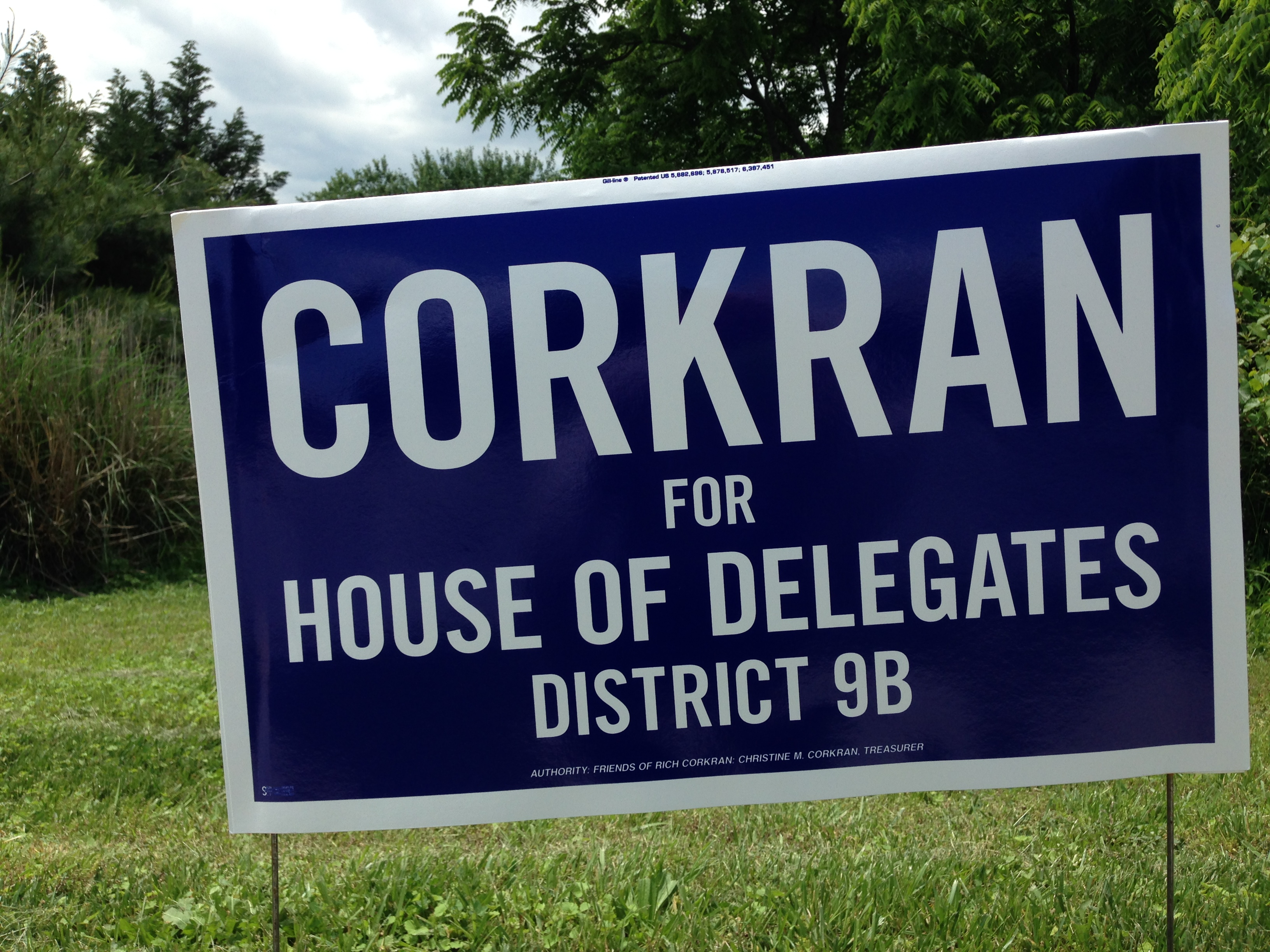
This simple minimal sign is like the Ward Morrow sign in my last post: There’s nothing wrong with it, and it’s attractive as far as it goes, but it also doesn’t stand out as particularly interesting.
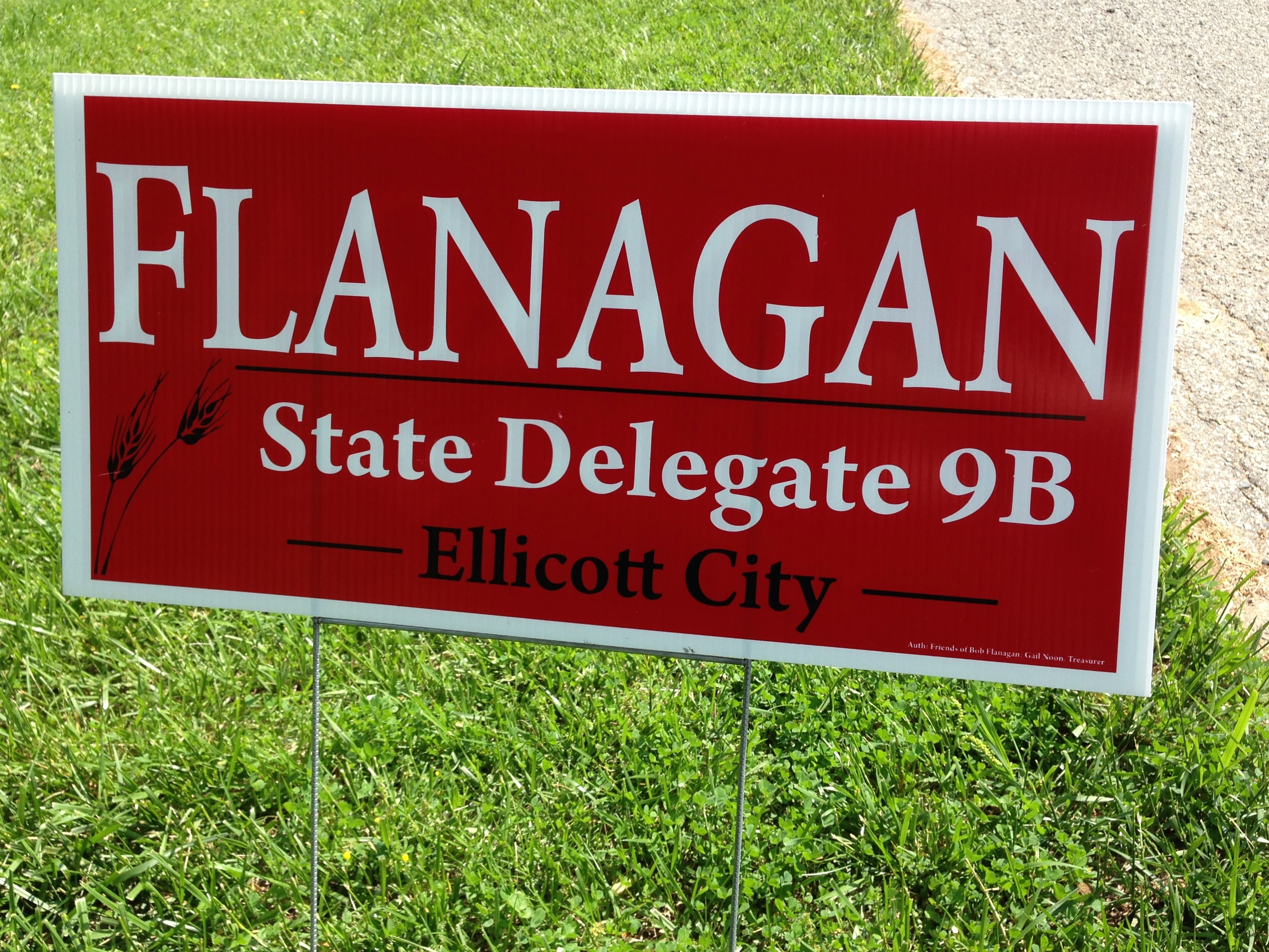
I don’t have a picture that shows Bob Flanagan’s sign from his 2010 county council campaign in its entirety, but I believe this sign is basically the same design, even including the stalks of wheat on the left side. Unfortunately the stalks of wheat are almost invisible as printed in black ink on a red background; ditto for the “Ellicott City” at the bottom. Other than that the typeface is clean and legible; it’s very similar to the typeface on Tom Coale’s signs.
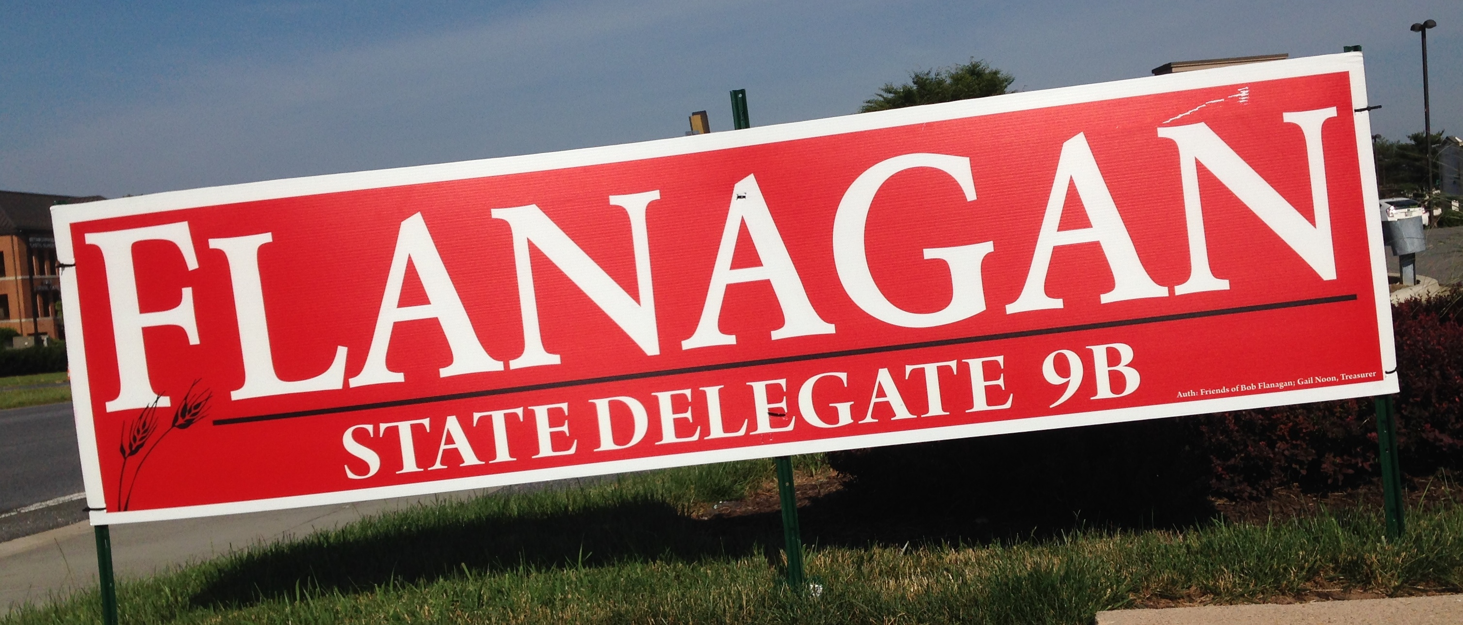
This large version of the Flanagan sign dispenses with the “Ellicott City” at the bottom, which I think is a definite improvement. It still has the black on red wheat stalks and horizontal line, but the larger size makes these elements more visible and lets them contribute more to the overall effect of the design.
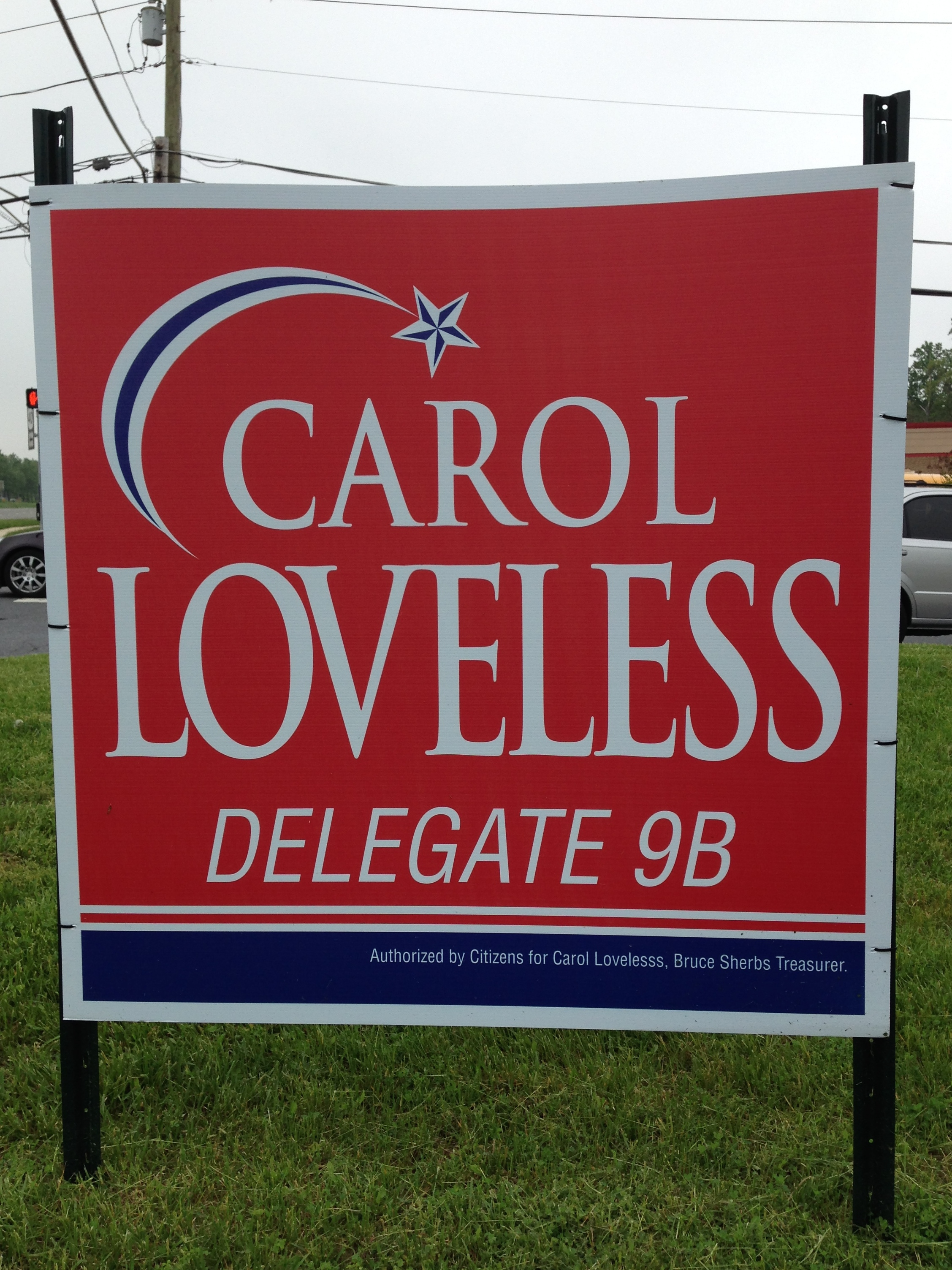
My major problem with this sign is the busyness of the added design elements, in particular the star. The shape and positioning of those elements also reminded me somewhat of the star and crescent symbol associated with Islam—an odd association for a Republican candidate. As for the rest of the design, the serif typeface works well and the sign is pretty readable overall.
There are no clunkers in this collection of signs, and no breakout winners either. I think the best of the lot are Tom Coale’s small sign and Bob Flanagan’s large sign; they’re both attractive and show an effort to add some visual interest, and their flaws—such as they are—are not that consequential. However those who prefer a “plain vanilla” sign (one that’s attractive, free of obvious flaws, but somewhat bland) may like Rich Corkran’s sign better.
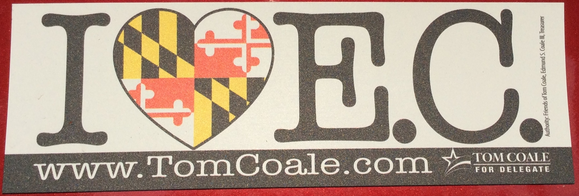
Finally, although it’s not a sign (and hence is not eligible in this particular “election”) I couldn’t resist highlighting this Tom Coale car magnet. Clearly it’s not a straightforward campaign item, but it promotes the candidate’s theme of being an advocate for Ellicott City: If you put this on your car, you’re advertising not only that you love Ellicott City, but that Tom Coale does too. And its attractiveness (due to an excellent Maryland flag-based design) means that more people will be inclined to put it on their cars and keep it there. I lost one of these in a car wash and was so upset I begged Tom Coale’s field director Kirsten Coombs to give me a replacement.
That’s all for now. In my next post I’ll evaluate signs (a lot of signs) for House of Delegates candidates in District 12.
UPDATE: After I originally posted this I came across the large version of Bob Flanagan’s sign, and in the interest of fairness and completeness I decided to update the post to include it, especially since I consider it one of the best signs in the group.