Today we look at the signs in the House of Delegates race in District 12. On the Democratic side there are 10 candidates for the three positions (deep breath. . .): Brian Bailey, Jay Fred Cohen, Rebecca Dongarra, Eric Ebersole, Michael Gisriel, Terri Hill, Clarence Lam, Renée McGuirk-Spence, Adam Sachs, and Nick Stewart. On the Republican side there are only three candidates: Gordon Bull, Joe Hooe, and Rick Martel, all of whom will go on to the general election.
Here are the signs, in alphabetical order by candidate, along with my comments, according to the criteria I’ve previously discussed. I couldn’t find signs for Jay Fred Cohen, Adam Sachs, or Rick Martel.
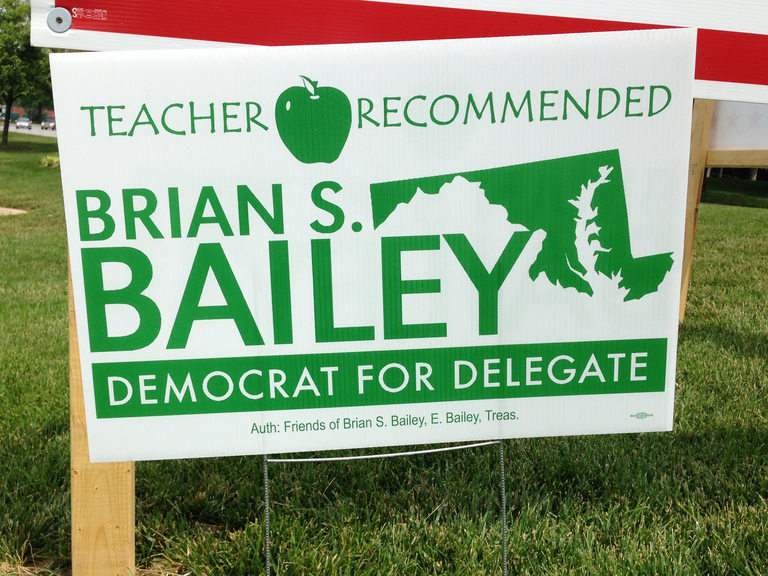
The state of Maryland seems strangely balanced on the “Y” in “BAILEY” in this sign. I think it might have been better to reduce the size of the image slightly, or just ditch the map of Maryland entirely and use something else. (The crooked shape of Maryland doesn’t lend itself easily to good sign designs.)
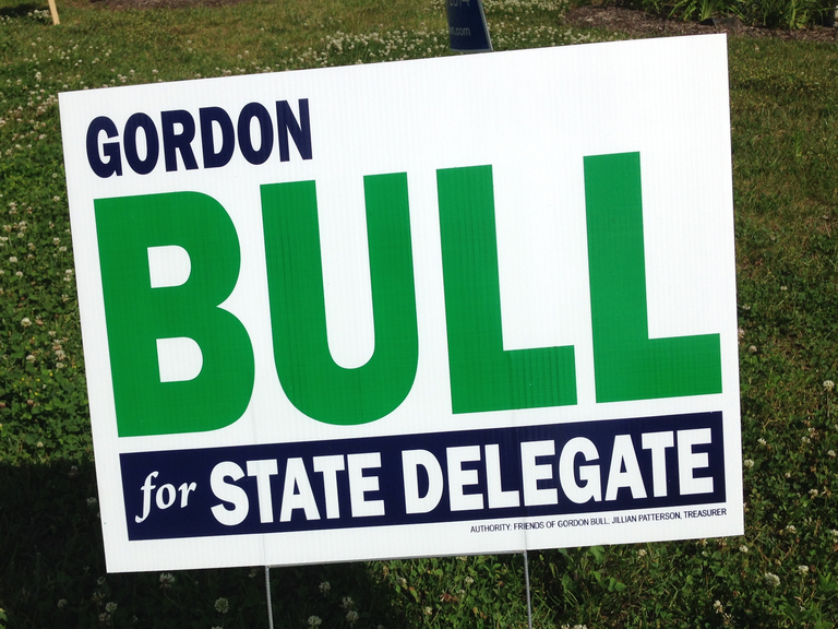
This sign is readable and serviceable, but not more than that. Gordon Bull has the benefit of having a short last name, which means it can be featured prominently, but next to the giant “BULL” the small “GORDON” looks out of place and unbalances the composition.
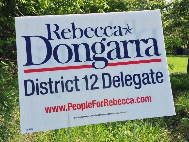
This sign is very reminiscent of the sign Eric Wargotz used for his 2010 US Senate campaign, even down to the descender of the “g” interrupting the horizontal stripe separating the top and bottom halves of the sign. That’s not a bad thing, as I thought Wargotz’s sign would have been quite nice with some changes. Dongarra’s sign has those changes, most notably simplifying the horizontal stripe and moving the position and web site address to the bottom of the sign, and is all the better for them. (I’m not sure the star to the right of “Rebecca” was really necessary, but it does provide a bit of balance since “Rebecca” is shifted to the left a bit.)
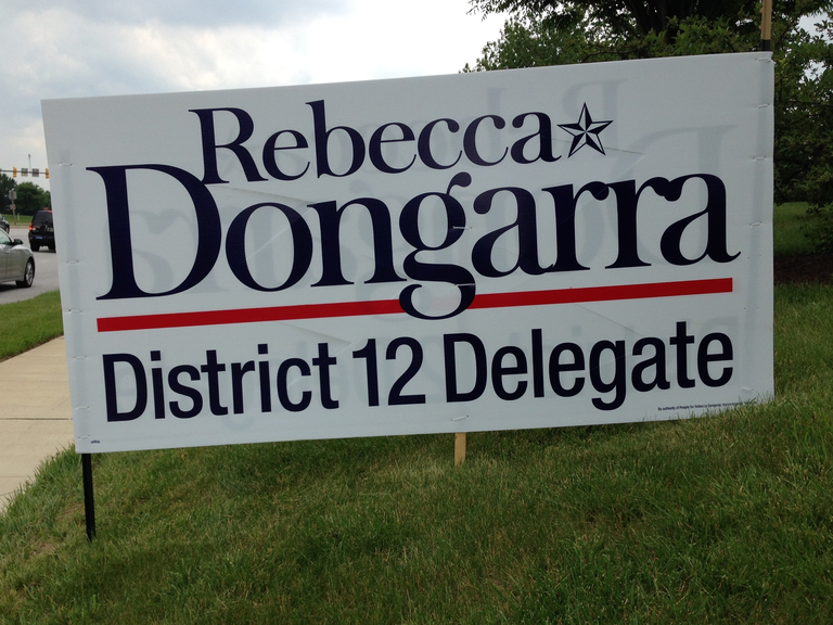
Interestingly enough, this large Rebecca Dongarra sign follows the opposite strategy from Warren Miller’s and Tom Coale’s large signs, by not using the extra space to add the web address. Instead the web address is on the small sign. I think leaving off the web site address increases the impact of what was already a very good sign.
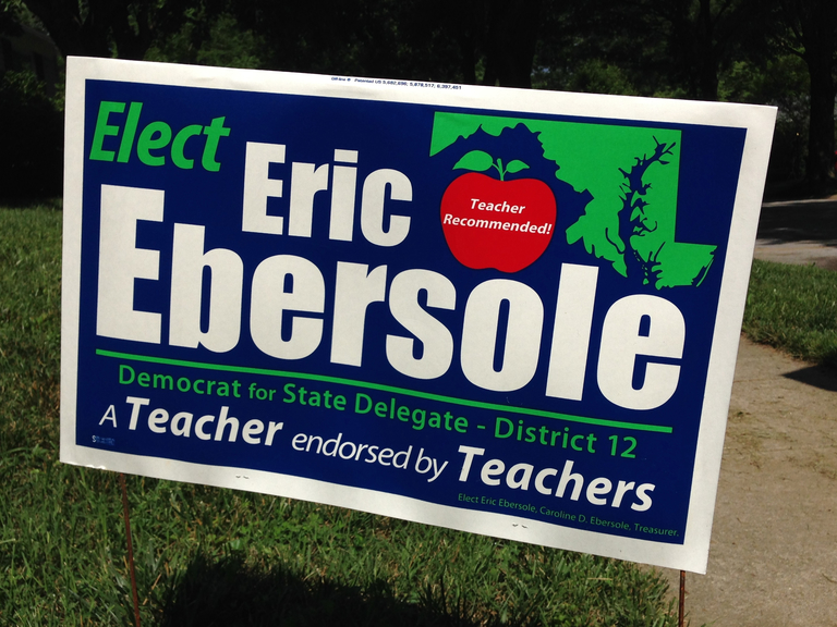
The name is very readable on this sign (a function of the typeface and using mixed upper and lower case), and the red, green, and blue colors work well together. However putting the “Democrat for Delegate - District 12” text in green impairs its readability, and together with the multiple occurrences of “Teacher” makes this sign almost look like one in the Board of Education race. Also, as with the Brian Bailey sign I’m not too big on including a map of Maryland; it makes the sign very crowded.
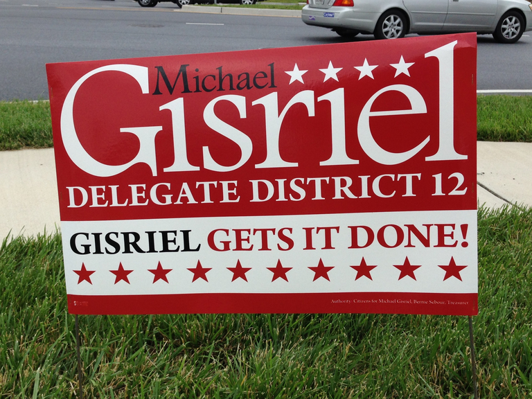
While this sign gets good marks for readability of Michael Gisriel’s last name, it’s just too busy. In particular it has 14 stars, which is about 12 or 13 stars too many. It also has the same problem as Bob Flanagan’s sign, namely poor readability of black text printed on a red background.
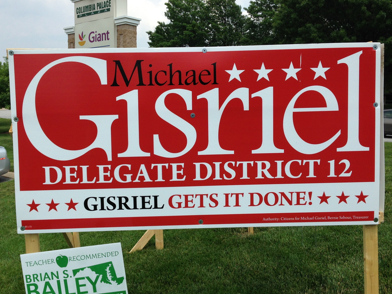
At only 10 stars rather than 14 this large version of Michael Gisriel’s sign is an improvement on the small sign.
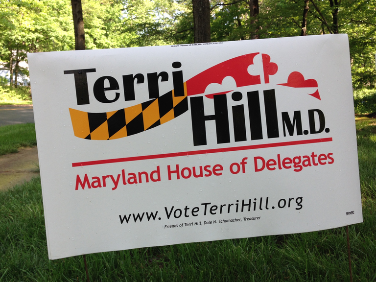
The typeface for this sign is somewhat quirky and I think might impede readability a bit. However the more serious problem with this sign is the design element based on the Maryland flag: The left half is OK but in the right half the white background of the banner blends with the white background of the sign, so it no longer looks like a banner.
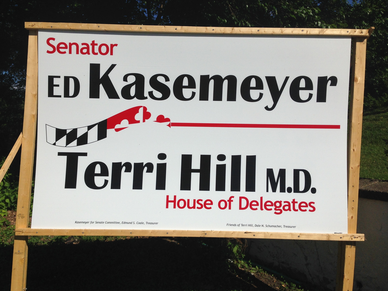
On this larger version of Terri Hill’s sign (advertising Ed Kasemeyer, who is unopposed in the primary) the text is more readable but the flag-based design element has the exact same problem as on the small sign. If anything the problem is worse because the banner is supposed to transition into the red horizontal strip, and the transition just looks messy.
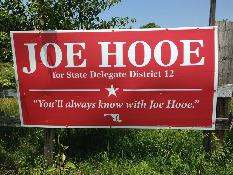
A good straightforward sign, with good readability for the candidate’s name. I could do without the map of Maryland, which looks out of place, and I’m not sure what the slogan accomplishes other than telling us how to pronounce Joe Hooe’s last name.
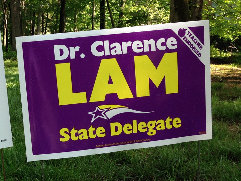
The best thing about this sign is the last name: Clarence Lam is blessed with the shortest name of any candidate in this race, or for that matter any other Howard County race, and this sign pounds it into your skull with big bold yellow letters. I don’t really love the purple background color, but in general this is an effective sign.
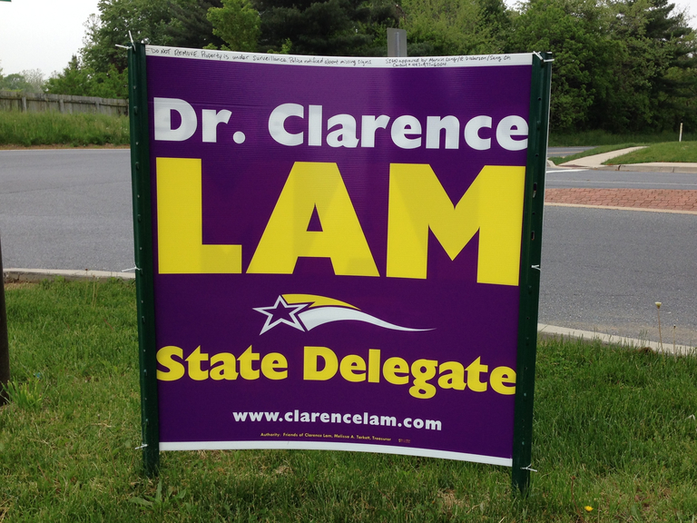
This large Clarence Lam sign is the exact same design as his small sign, but it suffers in comparison by being so severely cropped on both sides.
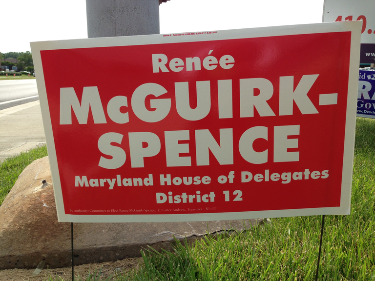
From the candidate with the shortest last name we move to the candidate with the longest one. However Renée McGuirk-Spence is blessed with a hyphenated name with two almost equal-length parts, which means it can be neatly split across two lines. The result is a sign with a straightforward design, nothing fancy but it works well enough.
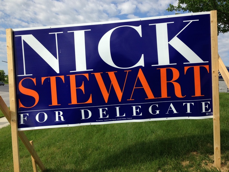
This sign has an unusual and interesting color combination. It’s a little strange though how “NICK” appears to be much more prominent than “STEWART.” The typeface is interesting too, but I think it’s a bit thin, which again impairs readability of the candidate’s last name.
Now for the results: Even though this race has a lot more candidates and thus a lot more signs than the District 9A and 9B races, it’s much easier for me to pick a winner. I think Rebecca Dongarra’s signs are the class of the field in terms of design; although several of the other signs have their good points, nothing else really comes close as far as I’m concerned.
In my next post I’ll evaluate signs for House of Delegates candidates in District 13.
UPDATE: I finally found a sign for Eric Ebersole, and updated the post to add it.
Patricia DiCarlo (patdicarlo13@gmail.com) - 2014-06-21 14:09
Siddiqui’s sign is the only one that gives a party affiliation. Is this legal?
hecker - 2014-06-21 17:50
Thanks for stopping by to comment! To answer your question: There are a number of other candidates other than Nayab Siddiqui who include party affiliation on their signs, including Eric Bouchat in the Maryland House of Delegates race in District 9A, and Brian Bailey in the House of Delegates race in District 12. It’s perfectly legal. (I should also add that putting only the candidate’s last name on a sign is also perfectly legal, as long as the last name matches the last name on the candidate’s filing papers.)
