Since election day is not far off it’s time to pick up the pace and look at the signs for the Maryland House of Delegates race in District 13. On the Democratic side there are five candidates for the three positions: the “Team 13” slate of Vanessa Atterbeary, Shane Pendergrass, and Frank Turner (along with Guy Guzzone for State Senate), and then Fred Eiland and Nayab Siddiqui as the “challengers.” On the Republican side there are only three candidates, Danny Eaton, Jimmy Williams, and Chris Yates, all of whom will go on to the general election.
Here are the signs, in alphabetical order by candidate , along with my comments, according to the criteria I’ve previously discussed. (I’m doing Team 13 first because “Atterbeary” starts with an “A.” Also, I couldn’t find signs for Eaton and Yates.)
The Team 13 sign seems to be a repeat of its sign from 2010 (from what I can recall). Is it effective? Yes: The sign reinforces that this is a slate, and tells you who’s part of it. Is it attractive? Only if you like bare-vanilla minimalism. I will say though that I think in some ways doing red text on a white background is superior to doing white text on a red background.
Another basic sign that gets the job done but doesn’t hold much interest from a design perspective.
I like the orange background color on this, as well as the white outlining around the black letters in “SIDDIQUI,” which makes the name stand out nicely. This sign also has three more subtle characteristics: First, and most trivial, the orange background and black text with white outline remind one of the Baltimore Orioles (for example, this version of their uniform); if this isn’t simply a coincidence then it’s certainly appropriate for a candidate running in the Baltimore suburbs, especially in a district that also takes in part of Baltimore County.
Second, omitting the first name means that this sign could have been used equally well by either Nayab Siddiqui or Janet Siddiqui, prior to the “great switcheroo” that saw Janet withdraw from the District 13 race at the last minute and be replaced by Nayab. (Of course, if either Janet or Nayab Siddiqui had been accepted into Team 13 then presumably they would have been on the standard Team 13 signs and if they wanted to they could have saved money and not done their own signs.) And in any case it allows Nayab to get the benefit of any positive feelings people have toward Janet.
Finally, if I recall correctly, on every other sign I’ve seen for House of Delegates races the word “Delegate” appears on the bottom of the sign, below the candidate’s name. On Nayab Siddiqui’s sign, and only on his sign, it appears at the top, so that a casual observer would read the sign as “Delegate Siddiqui.” (The word “For” appears at the beginning, but it’s in fairly small letters and is east to miss.) Again, this may be a coincidence, just based on the way the design evolved, but it can also be read as a way to compensate for being left off of Team 13: Encourage less-informed voters to think that you’ve already been elected and are running as an incumbent.
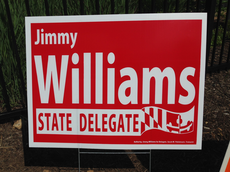
Another basic sign that gets the job done. I don’t like the way the white stripe at the bottom transitions into the Maryland flag-based banner, but that may just be me being picky.
As with District 12 it’s not difficult to pick a winner here. If nothing else Nayab Siddiqui’s sign evinces an attempt to put some thought into the sign’s design above and beyond the minimum required, and it also has fun subliminal cleverness whether intended or not.
In my next post I’ll evaluate signs for Maryland State Senate candidates in District 9.


