Today I take a break from party primaries and look at the signs for the Board of Education race. There are 13 candidates in this race: Bess Altwerger, Corey Andrews, Maureen Evans Arthurs, Tom Baek, Zaneb Beams, Olga Butler, Allen Dyer, Sandra French, Dan Furman, Leslie Kornreich, Christine O’Connor, Mike Smith, and Cindy Vaillancourt. FourEight of them will go on to the general election.
Here are the signs, in alphabetical order by candidate, along with my comments, according to the criteria I’ve previously discussed. Thanks to Corey Andrews for sending in a picture of his sign. I couldn’t find any signs for Zaneb Beams and Dan Furman. I did see one sign for Allen Dyer, but couldn’t stop to take a picture; by the time I came back later that day the sign was gone.
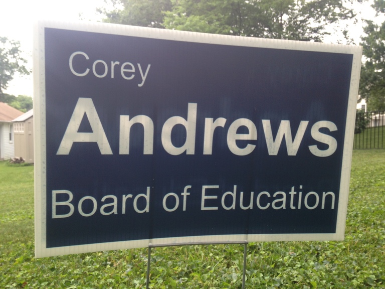
This is a good minimal sign with a nice clean typeface and a dark blue background to provide excellent contrast and legibility.
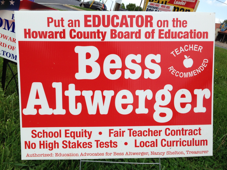
The core of this sign is good: Nice typeface, readable, stands out. However the top and bottom of this sign succumb to the syndrome of treating a campaign sign like a direct mail piece.
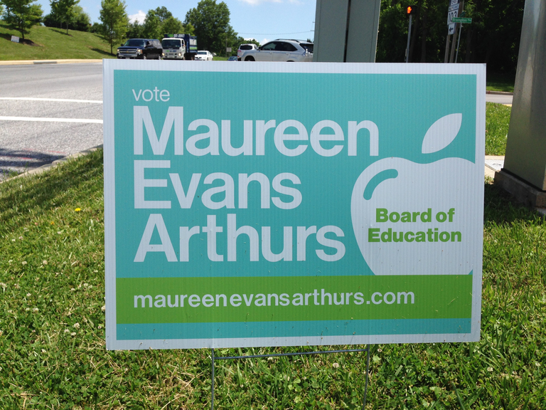
This is a well-designed sign as far as it goes: The typeface is great, the candidate’s name is prominently featured (even though it takes most of the sign to do so), and the apple design element is really well-done. Unfortunately the pastel color scheme just doesn’t work well in the great outdoors; it gets washed out in bright sunlight and the sign becomes difficult to read.
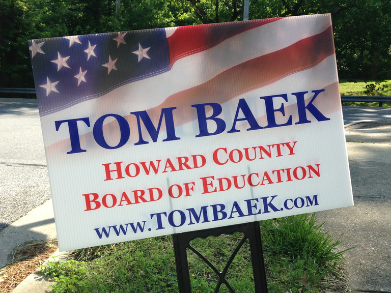
I don’t understand why this sign uses an American flag; it’s a Board of Education race, not a national election. Other than that the text elements are OK as far as they go—but note that ditching the flag motif would have allowed splitting the candidate’s name onto two lines and making the text significantly larger.
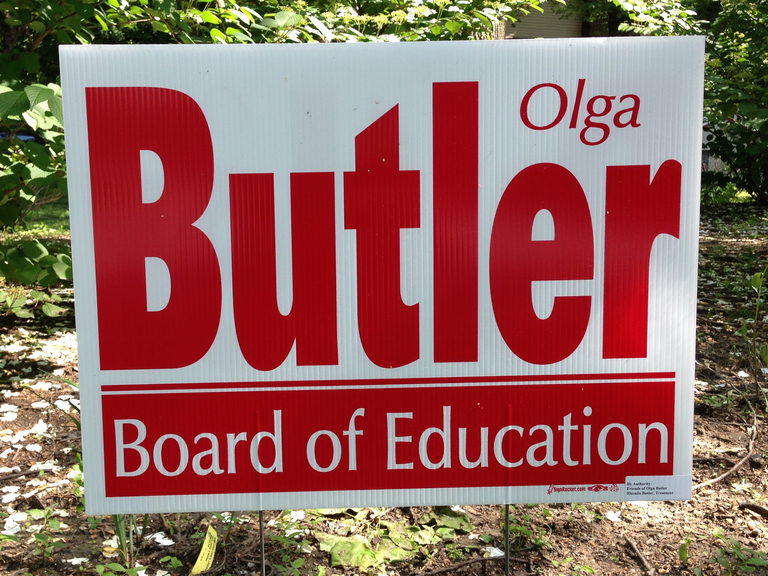
A nice sign. The main typeface used for “BUTLER” stands out well, and the other typeface complements it well. (Note that the typeface used for “Olga” is an oblique version of that used for “Board of Education.” The thin white line above “Board of Education” is a nice touch too; it breaks up what otherwise might be a too-heavy red background.
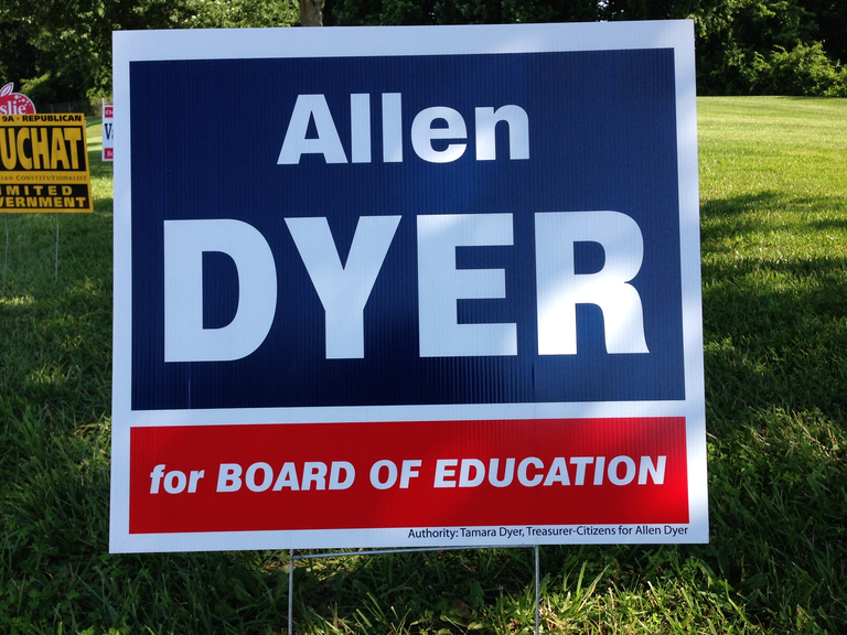
A good solid sign that’s quite readable. The red, white, and blue color scheme, though quite attractive, doesn’t exactly say “Board of Education” to me.
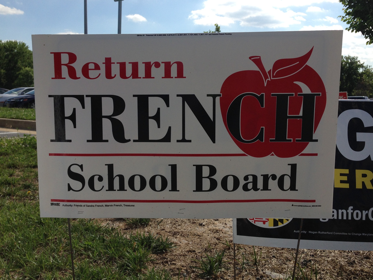
The background apple makes the “CH” in “FRENCH” almost unreadable on this sign from a distance. Also, why “Return” and not “Re-Elect”? Because it sounds more “nonpartisan”?
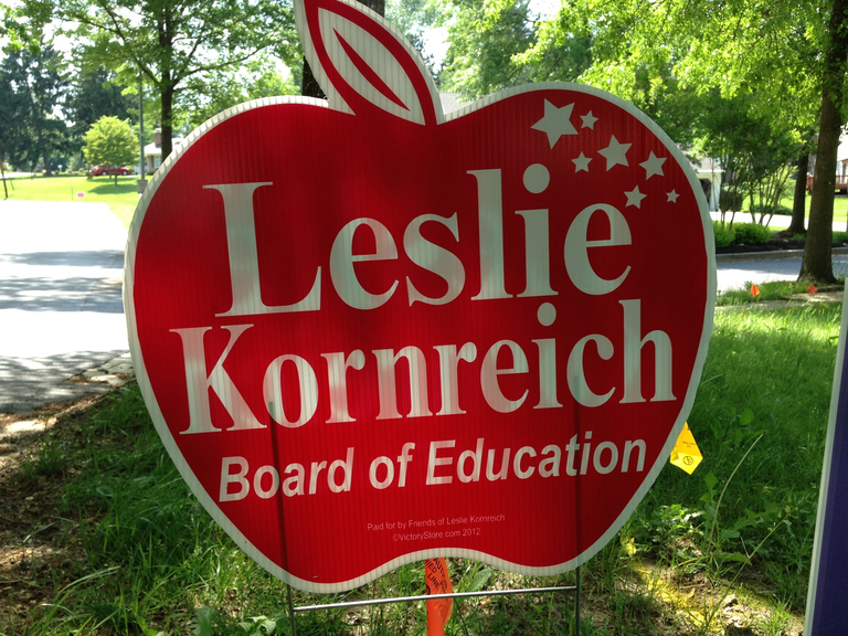
As I’ve mentioned previously, apples are a cliché in the context of Board of Education campaign signs. The strategy of this sign is that if you’re going to use a cliché, own the cliché. That together with minimal text and good complementary typefaces makes for a good sign. My only nitpick is with the stars in the upper right, which make that area of the sign look a bit busy.
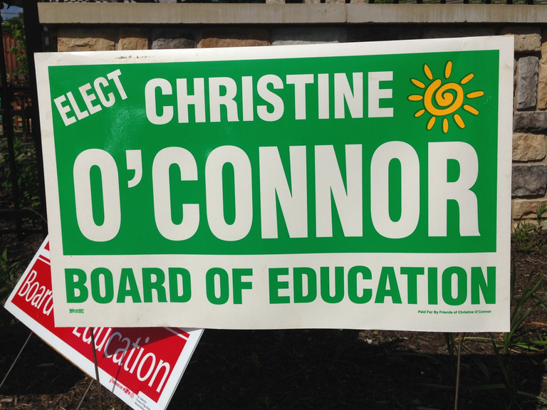
The sun adds visual interest to this sign, its yellow color complements the green background and text colors, and the childish look of the drawing evokes education without resorting to the usual clichés.
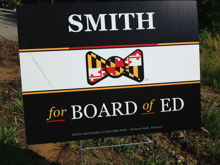
My daughter writes: “An awesome sign. The bow-tie makes it look totes adorbs! Even though they are soooo 2012, it’s still a nice touch.” I write: Why a (trademarked!) bow-tie that’s inspired by the Maryland flag? Apparently because Mike Smith wears one; see for example this Baltimore Sun story. I guess it’s a change from the usual apples, but to be honest I’ve been looking at this sign for over a month now and just now cracked the code on it. (For a while I wasn’t sure it was even supposed to be a bow-tie.) In any case, whether the bow-tie is a good idea or not, including it in the middle of the sign means that the candidate’s name is relegated to a small space at the top of the sign. That’s definitely not a good idea in my book.
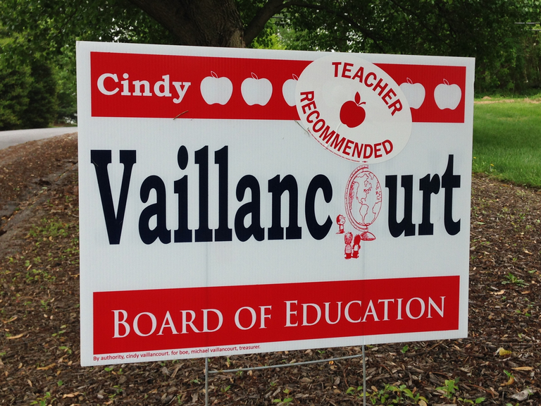
This sign goes heavy on the apples, but oddly enough where one might expect to find yet another one, i.e., replacing the “o” in Vaillancourt, instead there’s a large globe and three small children. This is another sign where I had to puzzle out what was going on: The globe isn’t that visible from a distance, so you have to get up close to see what’s going on. Again, this might be OK on a direct mail piece, but with a sign the viewer will likely be driving by at 20 mph or more and there’s not enough time to notice and interpret sign elements that aren’t boldly drawn.
This is a tough race to call an overall sign winner. The Olga Butler sign had no missteps, but it also didn’t have anything in the design that specifically evoked a Board of Education race; ditto for the Allen Dyer sign. The Leslie Kornreich sign did do that effectively, and was definitely the best of the “apple signs”; the Christine O’Connor offered an alternative way to evoke education and childhood that I thought worked well. Finally, the underlying design of the Maureen Evans Arthurs sign was really excellent, and if the colors had been a bit bolder I would have likely named it the winner.
In my next post I’ll look at the signs for candidates in the Howard County Council race in District 1.
UPDATE: Corrected the number of candidates going on to the general election; thanks go to Corey Andrews for the correction.
UPDATE 2: Finally found a sign for Allen Dyer and updated the post to add it.
Urban Bushwoman - 2014-06-23 02:31
I like the Smith sign. :)
hecker - 2014-06-23 03:50
Thanks for stopping by to comment! Once I figured out the bow-tie thing, I think it was a clever gimmick for personal branding. But I still think the name is too small…
Corey Andrews (cacoreya@yahoo.com) - 2014-06-23 16:19
Good post. One thing to note… eight candidates will make it through the primary, not four.
hecker - 2014-06-23 17:25
D’oh! I was confusing the number of open seats with the number of people going on to the general. Thanks for catching this! I’ve updated the post.
