Today is primary day, and the day I cover the last of the local campaign signs, this time for Howard County Executive candidates Allan Kittleman and Courtney Watson (both of whom happen to be unopposed in the primaries).
Here are the signs, in alphabetical order by candidate, along with my comments, according to the criteria I’ve previously discussed.

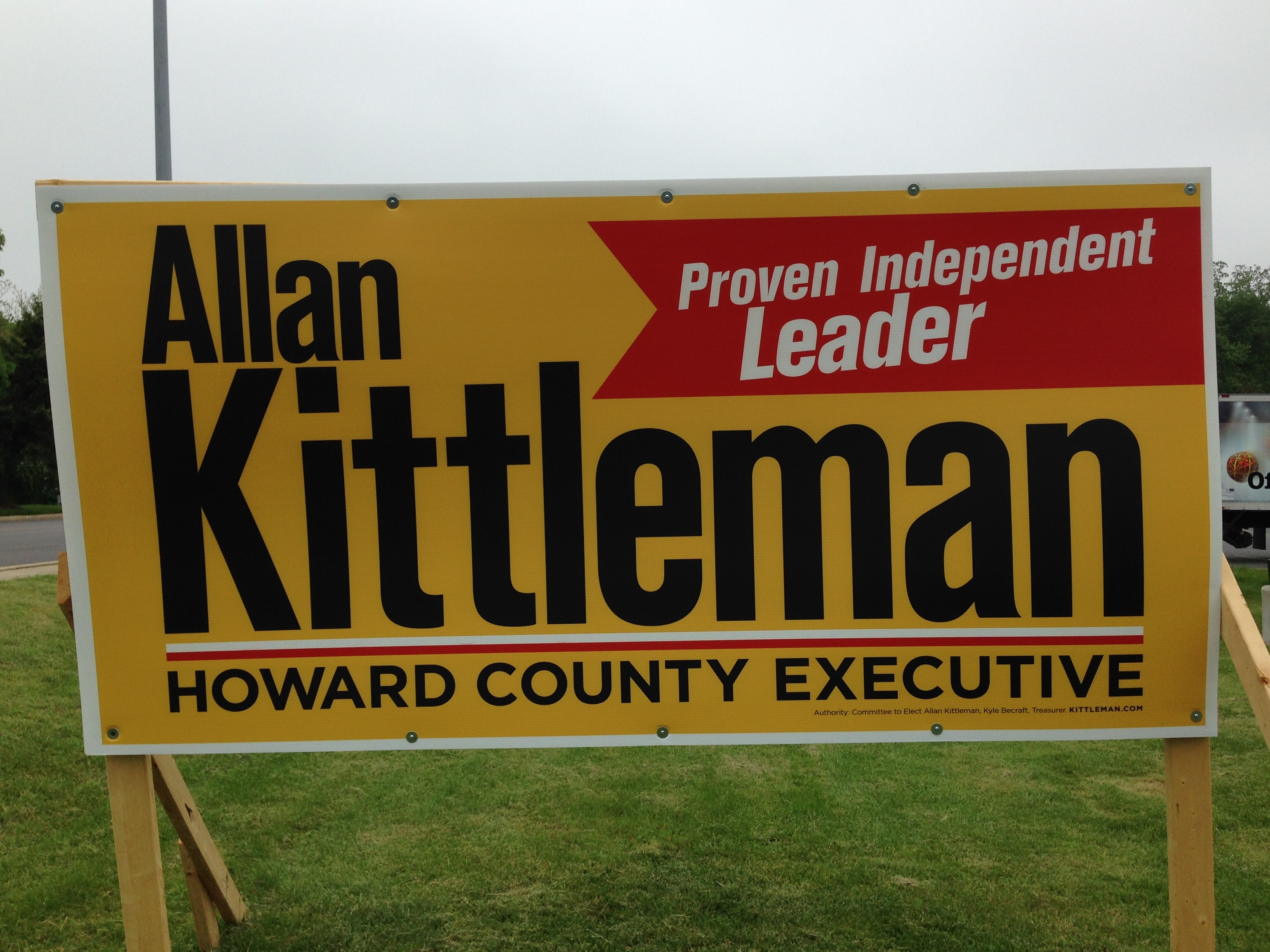
I’ve previously written about the problems inherent in using all four colors of the Maryland flag in a single sign. This sign handles those problems as well as they can be handled, mainly by avoiding the red text on yellow background found in signs from Trent Kittleman, Frank Mirabile, and others. Instead this sign carefully restricts itself to the exact color juxtapositions found the Maryland flag: black with yellow, and red with white. More specifically, it restricts itself to what I think are the best color combinations: black text on a yellow background and white text on a red background.
Some other things to note about this sign: The typeface is clean and readable; it’s bold enough to stand out but light enough to allow adequate space between the letters. Using both upper and lower case in “Kittleman” means that the text isn’t quite as wide as it would be if it were in all upper case, and thus it can fit better on the sign. (“Kittleman” has nine letters, just like “Grabowski” and “Markovitz”; compare this sign to the Grabowski and Markovitz signs I discussed in my previous post.) The red banner-like design element in the upper right corner is well-done; note that on the left side of the element the yellow background seems to form an arrowhead pointing to the “Proven Independent Leader” slogan. The slogan itself points diagonally upward to the right to make the sign more dynamic (the same technique used on the Dario Broccolino sign). Finally, note that the horizontal line separating “Kittleman” from “Howard County Executive” is not just red on yellow (a poor combination) but is both red and white in order to maintain the preferred color juxtapositions I mentioned above.
The one thing that bothered me about this sign is that the “Howard County Executive” seems a bit thin. When I was walking around the neighborhood I had some trouble making that text out when viewing the sign from a distance.
The design of the large version of the Allan Kittleman sign is the same as that of the smaller sign, except that “Howard County Executive” is now one line rather than two, is in a slightly bolder typeface, and (at least to my eyes) is more readable.
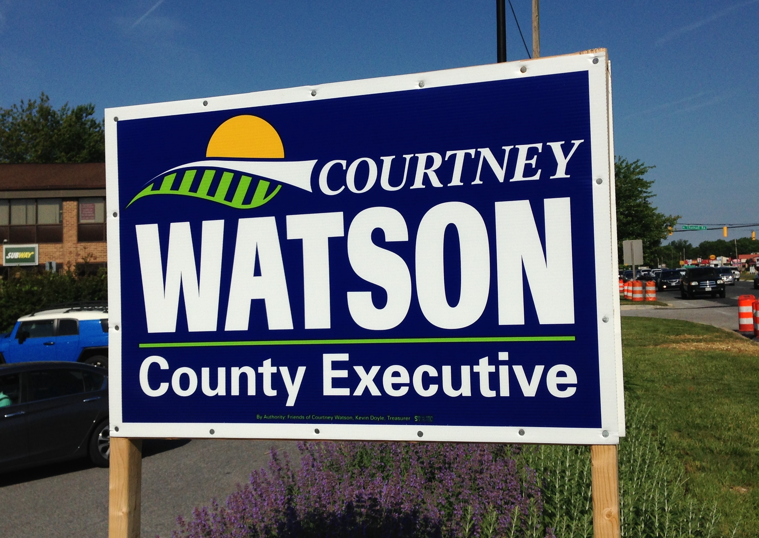
Like Courtney Watson’s 2010 sign, this sign uses white text on a blue background to good effect: The text is very readable (especially “County Executive”), and there’s a good visual progression from oblique serif type and all caps in “COURTNEY” to the bold san serif typeface of “WATSON” to the sans serif mixed case of “County Executive.”
The one potentially problematic part of this sign is the design element in the upper left corner. Typical non-text elements in signs are either totally non-representational (e.g., lines or borders) or are common symbols that are immediately recognizable (e.g., stars, apples, flag-derived banners). This element is clearly intended to represent something, but it’s not immediately clear what that something is. My personal interpretation is that it’s symbolic of Howard County’s rural heritage: (yellow) sun above (white) road above (green) field; however I’m not sure the average person would see it the same way as I do. Nevertheless the colors are very nice and brighten up what would otherwise be a plain and unadorned sign. (Note also that subtle green line that separates “WATSON” and “County Executive” and echoes the green in the upper left conner.)
Now for the tough part: Which sign to vote for? This contest is certainly not as lopsided as we saw four years ago with Trent Kittleman’s sign vs. Ken Ulman’s sign; these signs are much more closely matched. Both sign designs are professional and effective but neither is perfect, for reasons explained above. On Kittleman’s side I think this the first black/yellow/red/white sign design I actually find attractive; on Watson’s side I really like the sign but consider it just a step down from the 2010 sign. In the end I’m going to take the coward’s way out and call this a toss-up.
This concludes my look at the campaign signs for Howard County local races in 2014. In my next post I’ll wrap things up and name some overall winners in various categories, including my choice for the best Howard County campaign sign of 2014.