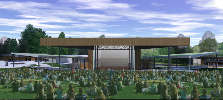
Architectural rendering of the planned raised roof of the Merriweather Post Pavilion in Columbia, Maryland. Click for a higher-resolution version. Image credit: JP2 Architects.
tl;dr: Merriweather Post Pavilion gets ready for the 21st century, and the Howard County Design Advisory Panel offers its advice.
I’ve previously written about the planned renovations of Merriweather Post Pavilion in downtown Columbia. Last week that renovation took two more steps forward, with a pre-submission community meeting (held at Merriweather itself) to present the plans to the general public and a meeting of the Howard County Design Advisory Panel to review the current design for the renovated pavilion.
To make a long story short, the Design Advisory Panel gave its overall blessing to the design, though with some advice given along the way. (This seems to be a standard practice of the Panel, at least based on the meetings I’ve attended.) I found the discussion of some aspects of the design to be fascinating. In order to understand why it’s best to take a trip back in time.
Most people familiar with Columbia know that the Merriweather Post Pavilion was designed by Frank Gehry (only a half-truth, as I’ll discuss below). Some of those people also know that Merriweather Post Pavilion was originally intended to be a venue for classical music, not the popular music mecca it later became. However what I didn’t know (until I did some research for this article) is that the present form of Merriweather Post Pavilion is an accident of history.
What became Merriweather Post Pavilion was originally supposed to be designed by an architect from California, Jim Lief.1 However his design, a 3000-seat “free form tent structure . . . made of nylon material,” was ultimately deemed to be unbuildable, a conclusion that was reached only six months before the pavilion was supposed to be inaugurated with a gala concert to be attended by Vice President Hubert Humphrey and other dignitaries. The Columbia project managers then had to scramble to put together an alternative, and project architects Frank Gehry and N. David O’Malley created a new design that was then constructed on a fast-track schedule.

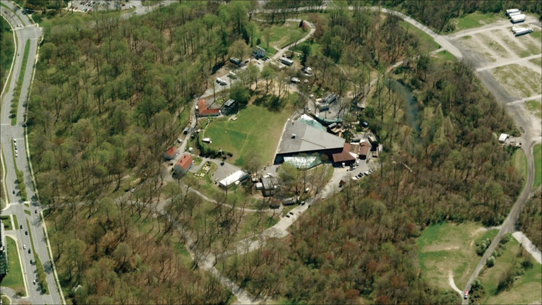
Aerial view of Merriweather Post Pavilion in Columbia, Maryland. The narrow end of the pavilion roof is the stage roof. Click for the full image.
Due to the time constraints and the relatively small budget of $500,000 (about $3.5 million today), the design of Merriweather Post Pavilion turned out to be relatively straightforward and spartan: a flat pavilion roof (trapezoidal in shape when viewed from above), with the narrow end of the trapezoid also serving as the roof of the stage house, i.e., the portion of the pavilion enclosing the the stage. This latter feature meant that there was not a lot of room above the stage. This was made worse by the fact that the stage house walls were not vertical but rather sloped inward (continuing the trapezoid theme), so that the stage house was narrower near its top than at stage level.
This design was adequate for Merriweather Post Pavilion’s original intended use by a symphony orchestra, which did not have a need for elaborate sets and associated rigging above the performers. However the use of the pavilion for symphony performances lasted only briefly (its intended tenant, the National Symphony Orchestra, having gone bankrupt), and other “high culture” performances such as ballet lasted only slightly longer.
In the 1970s Merriweather Post Pavilion became a venue primarily for popular music acts, and remains so to this day. The focus of the Merriweather renovation is thus on better serving such acts, with their elaborate sets and larger audiences. This includes making the stage house higher, improving sight lines for audiences on the lawn, and providing permanent roofs (instead of seasonal tents) for audiences in the loge areas to the left and right of the main pavilion seating.

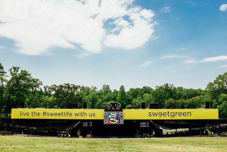
Current roof of Merriweather Post Pavilion as seen from the lawn, showing the relatively small gap between the roof and the ground. The image has been adjusted to match the scale of the rendering above as closely as possible. Click for the original version. Image credit: I.M.A.
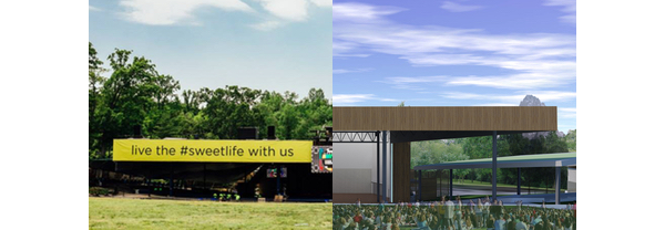
The proposed renovations (designed by JP2 Architects) improve sight lines from the lawn by raising the entire pavilion roof about 20 feet higher, as shown in the rendering above. (The lower edge of the current roof is only about 23 feet above the ground at the point where the lawn begins, as seen in the above photo.) The design raises the roof of the stage house even higher, so that it is no longer flush with the main pavilion roof but extends above it. (The permitted height of the stage house is 85 feet, but the current plan has it at just over 74 feet.) However the stage house roof is still low enough relative to the new roof so that it wil not be visible by audiences on the lawn (as shown in the rendering above and the comparison below). Finally, the design makes the stage house walls vertical, and adds two lightweight roofs to the loge areas.
The raising of the roof will also apparently present an opportunity to address some of the perceived issues surrounding sound levels at Merriweather Post Pavilion For example, having a higher roof will enable speakers to be configured so that sound is directed more down toward the audience than out toward the lawn and beyond.

The current roof and the planned raised roof of Merriweather Post Pavilion compared. Original image credits: I.M.A. (left) and JP2 Architects (right).
So far, so good. The remaining issue is that although the higher stage house cannot be seen from the lawn, it can be seen to some degree from the sides, and will present a considerably higher façade than it does at present. How should this increased height be addressed from a visual point of view?
In the design presented at the Design Advisory Panel meeting, the “architectural concept for the stage house breaks down its scale by introducing a serrated edging in the top tier of the building where cedar paneling transitions into a cementitious paneling.” The serrated edging was described as echoing the treeline of the surrounding park. The cementitious or cement-like material on the upper part of the stage house exterior walls would then have a lighter color that would blend in with the sky.
This particular feature of the proposed design occasioned the most contentious discussion of the Design Advisory Panel meeting, partly I think because the architectural rendering of the stage house displayed at the meeting made the “cementitious material” look almost blindingly white, in sharp contrast to the cedar paneling below it (which would be the same color as the existing roof). Panel member Mohammad Saleem expressed his concern about the design as presented, and eventually made a motion that the “serrated edge of the stage house be simplified to reduce the height [of the edge] and that the top . . . be some type of gray metal,” and that “instead of [being] serrated, [the edge] be more horizontal and [plain] and simple to fit in the current, natural environment.”
Most of the other members of the panel disagreed with Saleem, apparently because they liked the serrated boundary between the lower and upper halves of the stage house walls and also believed that the wall colors as constructed would be more subtle than on the renderings. In the end Saleem’s motion was voted down by a 4-2 margin.
Though the motion failed, the discussion about the stage house design did highlight an underlying question some might have about the renovation, namely to what extent should the renovated pavilion retain the spare and spartan appearance of the pavilion as originally constructed. For example, in addition to the serrated design proposed for the stage house walls, the design also includes “light hole punch outs . . . introduced throughout the building façade for additional interest”. In other words, instead of being a plain cedar plank surface, the lower parts of the stage house walls would be periodically punctuated by lights of various colors, lending a more festive appearance to the stage house façade.2
Should Merriweather Post Pavilion continue to be as plain and unadorned as it was in the past? There are certainly no plans to do anything with the main pavilion roof, the wooden sides of which would be unchanged from their present appearance. That’s fitting since that roof is iconic, even to the point of being incorporated into the Merriweather Post Pavilion logo.
What about the stage house? Should it be instead clad totally in wood panelling in a natural color, similar to the main roof and echoing other venues in wooded settings, like Filene Center at Wolf Trap? At the Design Advisory Panel meeting Jamie Pett of JP2 Architects noted the desire to break up the stage house mass and not have it appear so monolithic. Some of the Panel members noted that this was in fact an entertainment venue, so some playfullness in the architecture was appropriate. Brad Canfield of I.M.A. echoed this, noting that they had originally considered doing an all-wood façade but had concluded that it reminded them of Wolf Trap, and that they didn’t want it to look like Wolf Trap.
It’s not a slamdunk case, but ultimately I’m going to go with Pett, Canfield, and the majority of Design Advisory Panel members on this one. As much as some people might like Merriweather to be “Wolf Trap in Columbia,” it’s not and never will be. Wolf Trap is a national park, the Filene Center is a much more self-consciously elegant and expensive3 structure than Merriweather Post Pavilion, and the (subsidized) Wolf Trap programming has much more of a high culture flavor than the unbashedly populist offerings at Merriweather. One Panel member said of Merriweather, “it is an entertainment venue, and we’re in the next century,” and Brad Canfield noted the “quirky” sculptures and other art that I.M.A. had placed throughout the grounds in effort to give the venue a more lively feel.
At the time of its creation Merriweather Post Pavilion was not intended as an architectural masterwork for the ages but rather as a quick and cheap solution to a pressing problem. In the current renovation I believe the goal should be to enhance what Merriweather has evolved into, by making the venue more fun, funky, and functional—and to add a fourth “f,” to do so in a relatively frugal manner. I think the proposed design for the new Merriweather could be further refined, but its heart is in the right place.
For further exploration
The chapter “Early Buildings: People and Projects” in the book Creating a New City: Columbia, Maryland contains an in-depth and entertaining discussion of the construction of Merriweather Post Pavilion, by project manager James Wannemacher. My two-part series on the planned Merriweather Post Pavilion renovations (part 1 and part 2) explains why the renovations are necessary and what is planned to be done; a followup post covers the schedule for the renovations. All three posts contain links to Howard County documents relevant to the renovation effort. The Design Advisory Panel meeting summary contains the recommendations by the members at the meeting on September 9, 2015, as well as the text of Mohammad Saleem’s failed motion. The Department of Planning and Zoning Technical Staff Report on FDP-DC-MSW-1A provides additional context on planning regulations affecting the renovation, including the 85-foot height limit for Merriweather Post Pavilion.
Despite a fair amount of online searching I was unable to turn up any information about Lief. ↩︎
I can’t recall whether there would be actual lights in the stage house walls, or whether these would be small clear windows allowing the stage lighting to shine through to the outside. Either way the visual effect would be similar. ↩︎
According to a Washington Post story, Catherine Filene Shouse donated $2.3 million to build Wolf Trap and the Filene Center (over $13 million today), and then after the amphitheater burned down in 1982 helped raise another $18 million or so (over $40 million today) to rebuild it. ↩︎