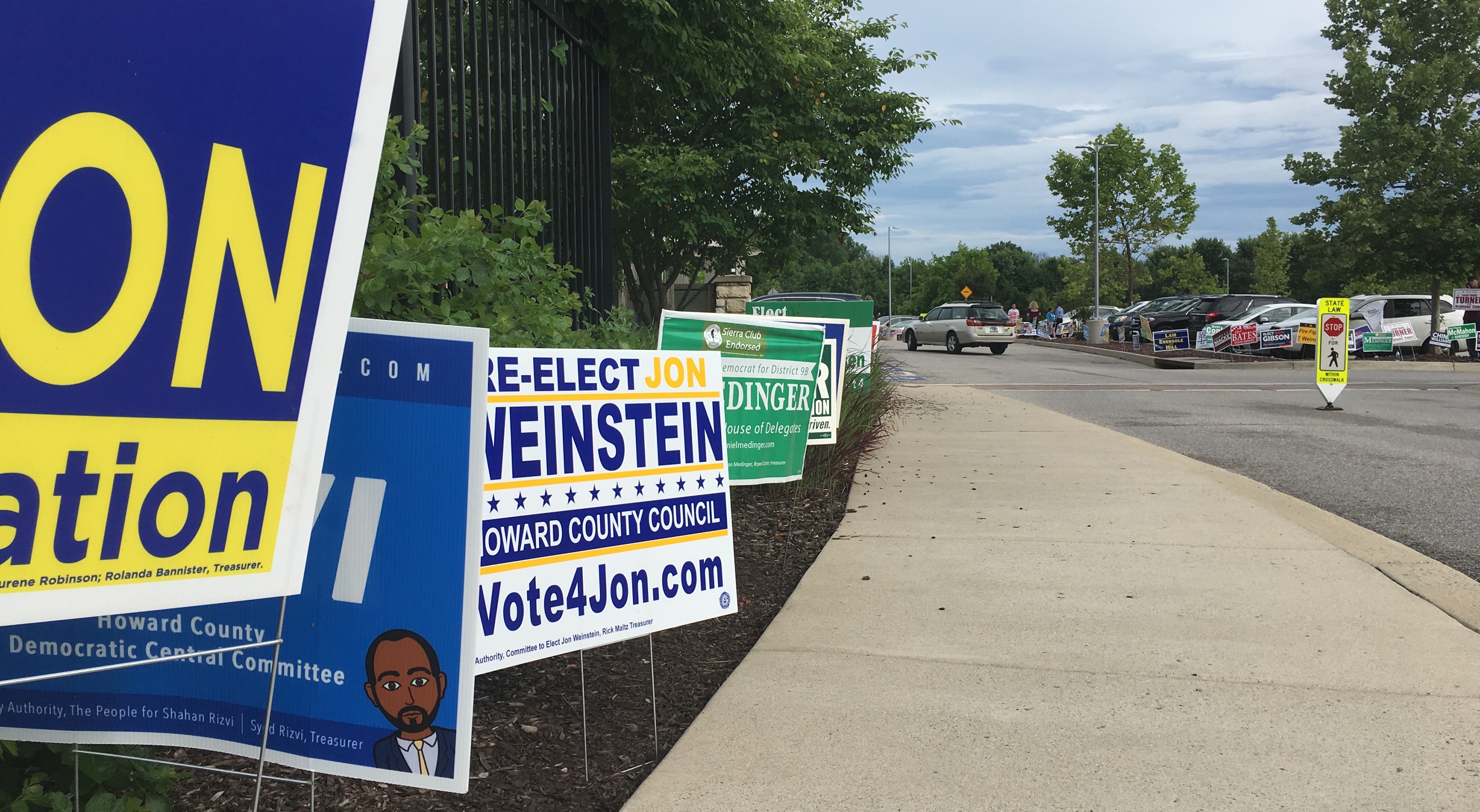
Campaign signs and canvassers at the Miller Branch of the Howard County Library System during early voting. (Click for a higher-resolution version.)
tl;dr: I take a look at 2018 campaign signs in Howard County. This first post features signs from Jon Weinstein, Dan Medinger, Mavourene Robinson, Greg Jennings, Leslie Smith Turner, Bob Glascock, Jen Mallo, Terry McAndrews, and Kim Oldham.
One of my interests is graphic design—not that I have any talent for it myself—and one of the ways I’ve manifested that interest is in critiquing political campaign signs. I did a delayed retrospective on 2010 campaign signs, and then later did a more full discussion of as many 2014 campaign signs as I could track down.
I had thought I’d take a break this year, especially since I’m doing a series of political posts that are much more time-intensive. However in going this weekend to vote at the Miller Branch library, the array of signs was so impressive that I couldn’t stop myself from taking pictures of all of them. And what’s the use of taking pictures if I don’t do anything with them?
So without first ado here’s the first post in a series that I hope I can complete by the time (primary) election day rolls around. Rather than organizing the signs by race I’m posting them in a random order, just to mix things up.
I’ve previously outlined the criteria I use in judging signs, but I’ll briefly summarize them here once more:
- Legibility, especially at a distance from a moving car.
- Including the most important information: the candidate’s name and the office sought.
- Attractive colors that don’t clash or impede legibility.
- Clean, professional typography that adds an extra “oomph” to the sign’s visual appearance.
- Effective use of other design elements to enhance the impact of the sign, not detract from it.
I will say that local candidates have upped their game this year in the sign department: I’ve seen fewer things I consider to be basic mistakes, and a higher percentage of pretty good-looking signs.
And with that, let’s look at some signs!
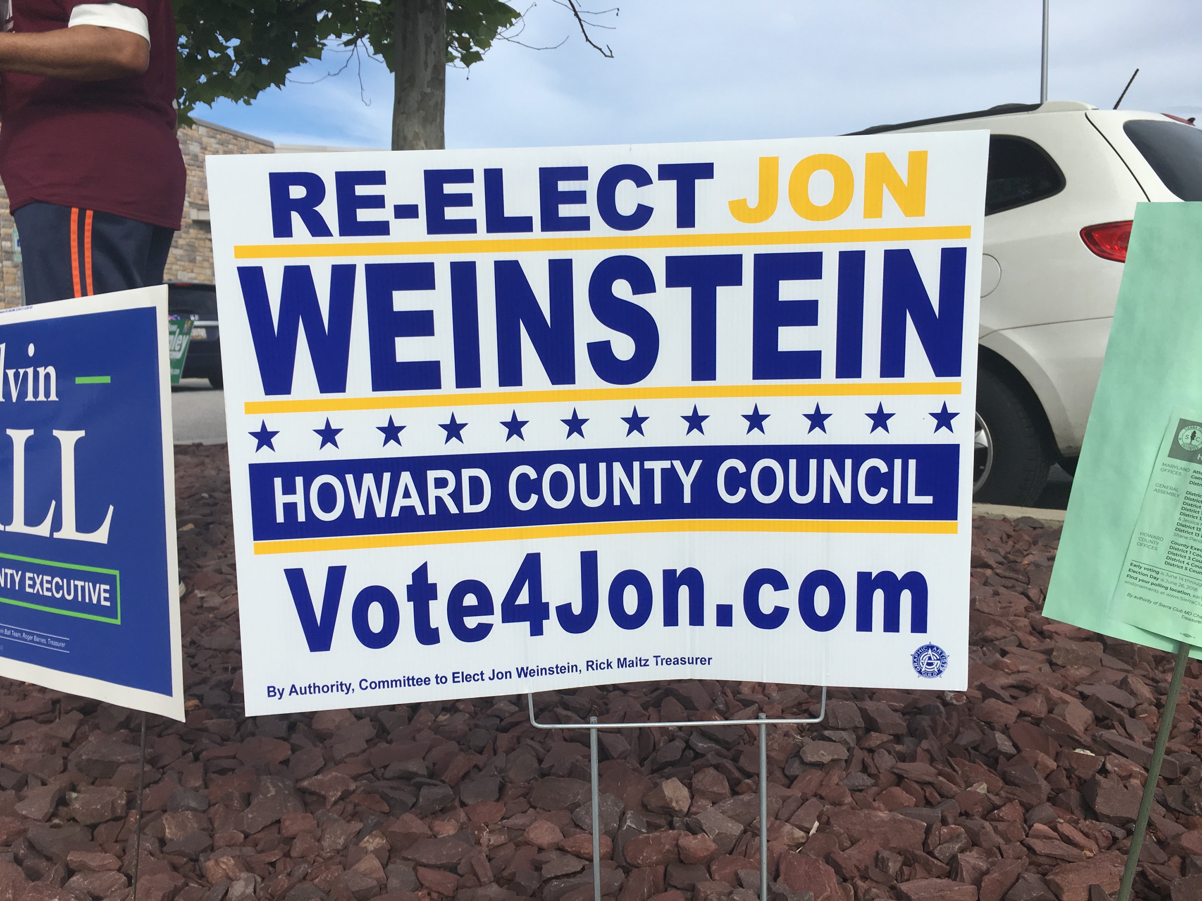
Jon Weinstein, Democratic candidate for Howard County Council, District 1. (Click for a higher-resolution version.)
Based on his 2014 campaign signs there are three things I’ve noticed about Jon Weinstein: He likes blue, white, and yellow, he likes little stars, and he likes to promote his web site.
He’s continuing those themes in 2018, as you can see above, though with a twist: where the 2014 signs used white and yellow text on a blue background, the 2018 signs use yellow and blue on a white background.
The main knock I have against the 2018 sign is that it looks fairly crowded and busy with all the design elements and the website name. The yellow horizontal lines and the line of blue stars help to separate the textual elements, but they also make the sign very dense. There’s also not much variation in the typography to lighten the density: same typeface throughout and mostly all upper case except for the website name.
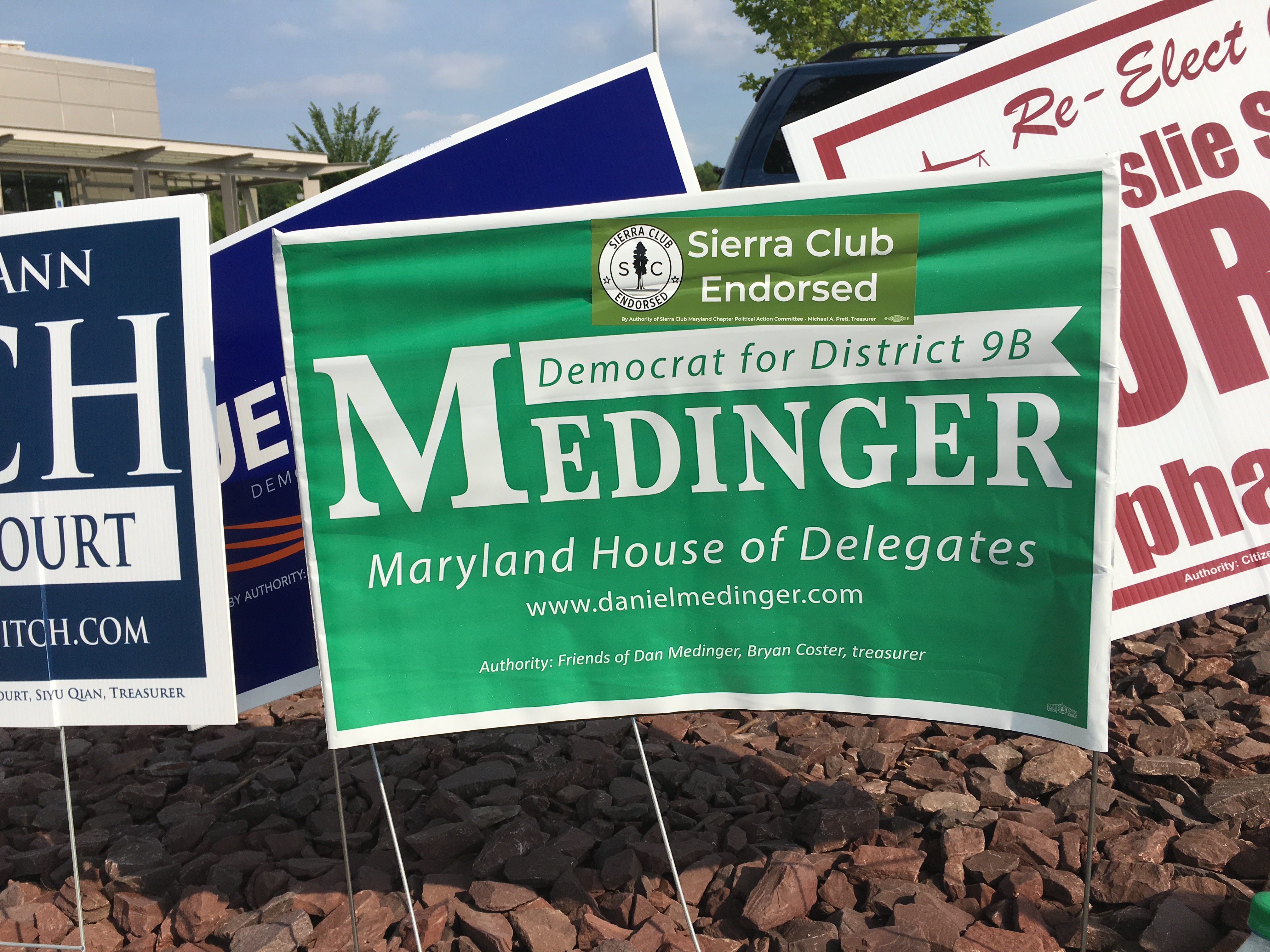
Dan Medinger, Democratic candidate for Maryland House of Delegates, District 9B. (Click for a higher-resolution version.)
Like Jon Weinstein, Dan Medinger has his favorite colors, in this case green and white, the same as those used on his 2014 sign. I wrote of that sign that it was “competent and unexceptionable,” and I think that’s true of this sign as well. There’s really not a whole lot more I can say about it.
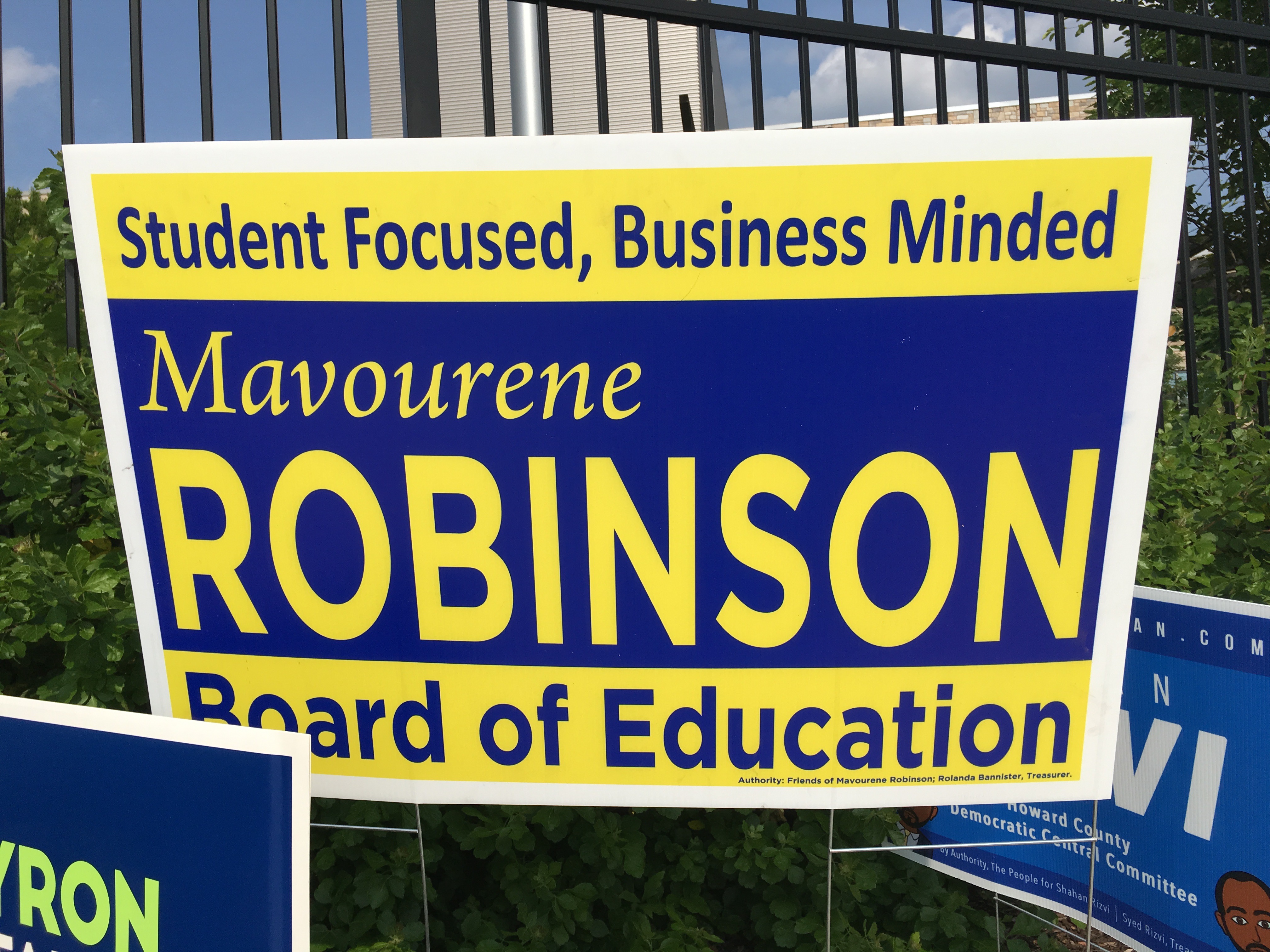
Mavourene Robinson, candidate for Howard County Board of Education. (Click for a higher-resolution version.)
One interesting aspect of campaign signs is that a sign can be perfectly effective in promoting the candidate while not being all that elegant from a design standpoint. This sign for Mavourene Robinson is a good example of that: The yellow on blue and blue on yellow stands out well and has good contrast for readability; in fact, the “Robinson” almost bores its way into your brain.
On the down side, I’m not that fond of the blue and yellow color combination, and design-wise there’s nothing particular interesting about the sign: just a basic horizontal yellow/blue/yellow division of the background, and a simple mixing up of the typefaces for variety: mixed upper and lower case sans serif in the slogan, mixed upper and lower case italic serif in “Mavourene,” all upper case san serif in “Robinson,” and then back to mixed upper and lower case sans serif for “Board of Education.”
The bottom line: while this sign won’t win any design awards, it gets the job done.
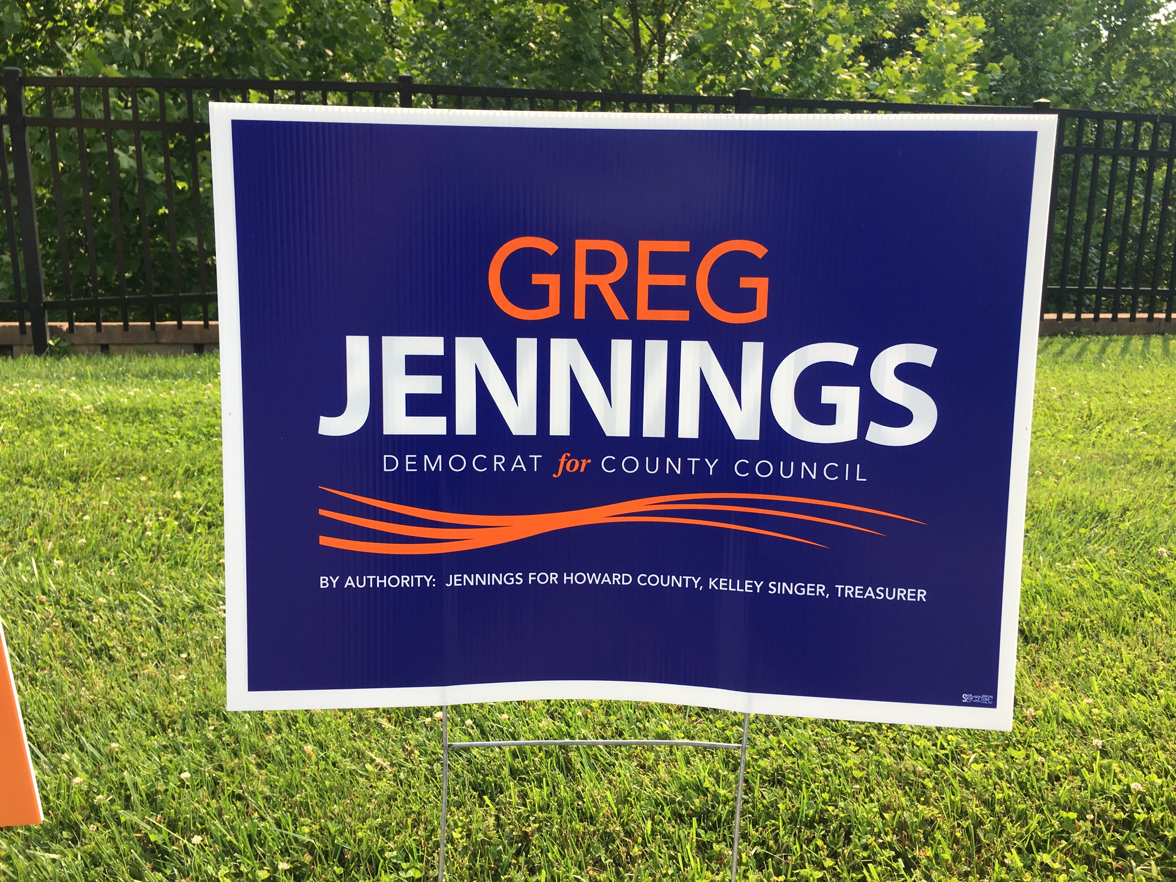
Greg Jennings, Democratic candidate for Howard County Council, District 3. (Click for a higher-resolution version.)
Here’s an example of the opposite phenomenon to what I just discussed: a sign that is quite elegant from a design perspective, but has I think one significant problem as a campaign sign: The “Democrat for County Council” text is not much larger than the authority line at the bottom, and I suspect it will not be that readable from a distance or when driving by.
Otherwise this sign is a winner: The typography is quite nice, and the white on blue contrast for “Jennings” makes it stand out well, while the orange on blue text for “Greg” is a nice combination that’s pleasing to the eye. Two other little touches I really liked: the contrasting orange/italic/serif type for the word “for,” and the “wave” design element below that line. Those are the kinds of things that from a design perspective take a good sign and make it great.
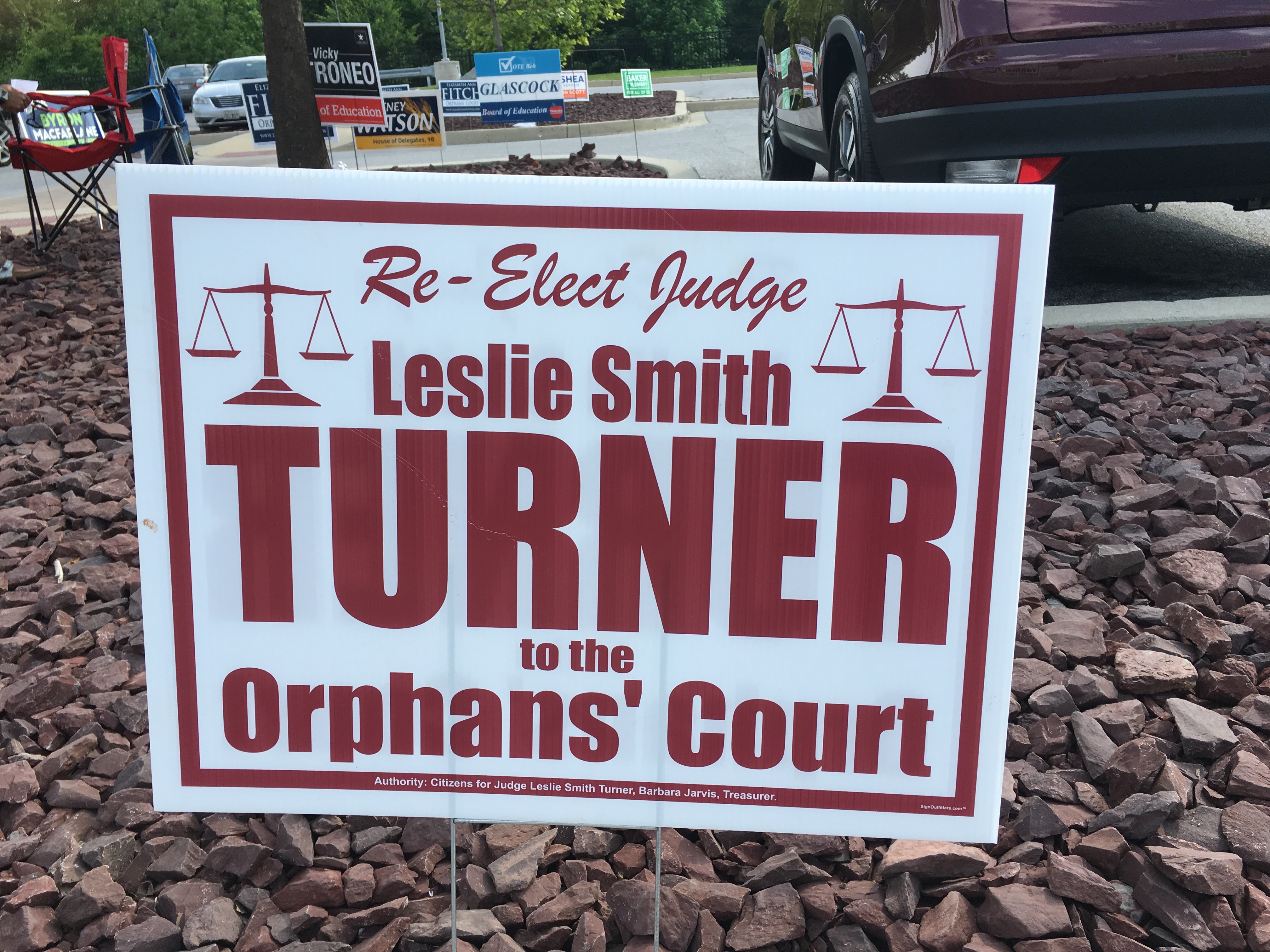
Leslie Smith Turner, candidate for Howard County Judge of the Orphans’s Court. (Click for a higher-resolution version.)
As far as I can tell this is the exact same sign Leslie Smith Turner used in the 2014 campaign, so I’ll just repeat my previous comments:
This sign does a nice job of highlighting the candidate’s last name and the position being sought; it also highlights the fact that she’s an incumbent, which many voters might not know given that this is a relatively obscure courthouse race. I’m less enthusiastic about the burgundy color used for the text, and I’m not a big fan of the script used for “Re-Elect Judge.”
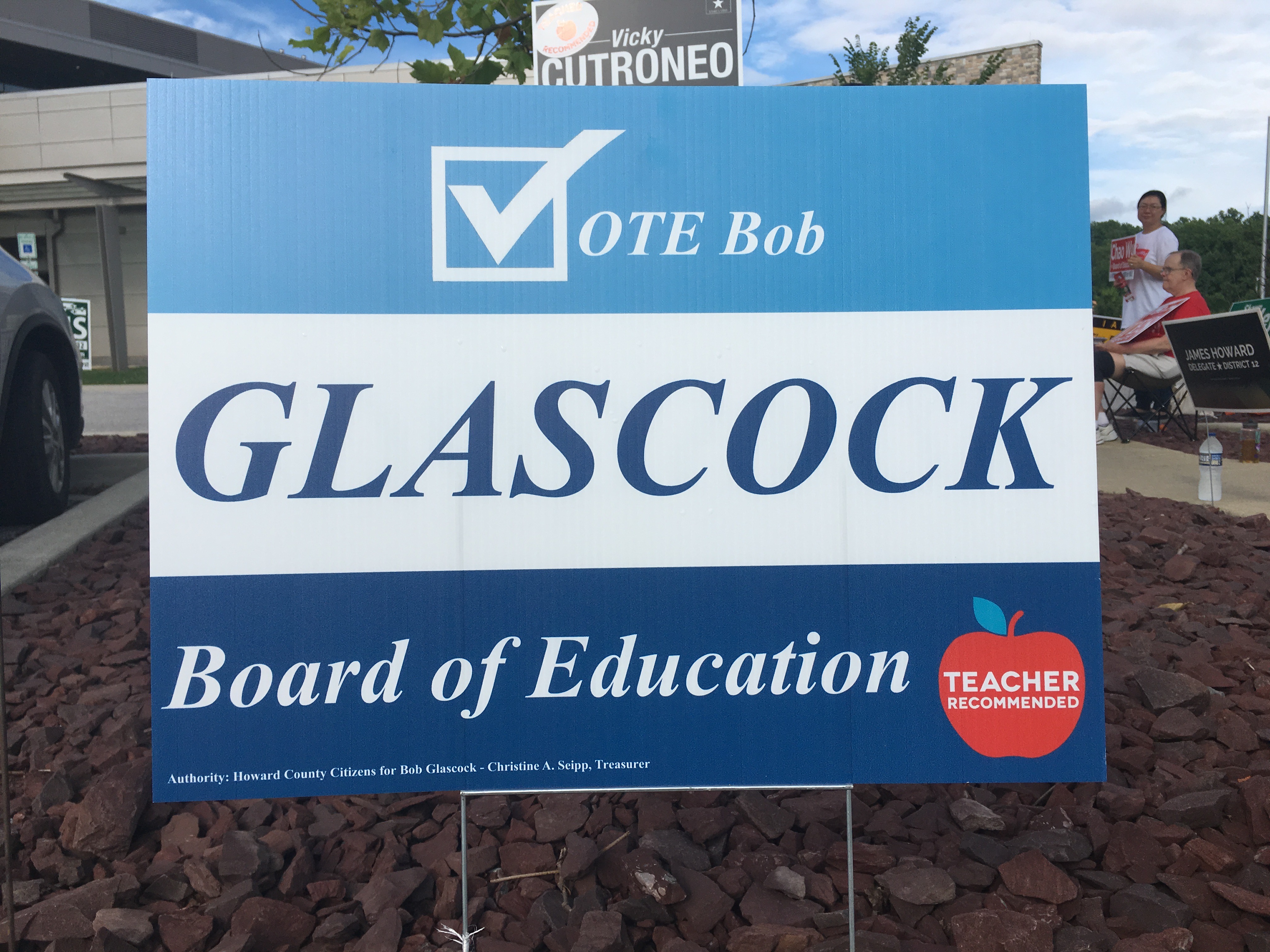
Bob Glascock, candidate for Howard County Board of Education. (Click for a higher-resolution version.)
This is a good but not great sign, in my opinion: The candidate’s last name is quite readable, but his first name looks too small compared to the last name and (especially) the “Vote” design element. I think it might have looked better just omitting the first name and making the “Vote” element slightly larger. I’m also not overly fond of the typography: I think having three pieces of text in a serif typeface and italics is a tad monotonous.
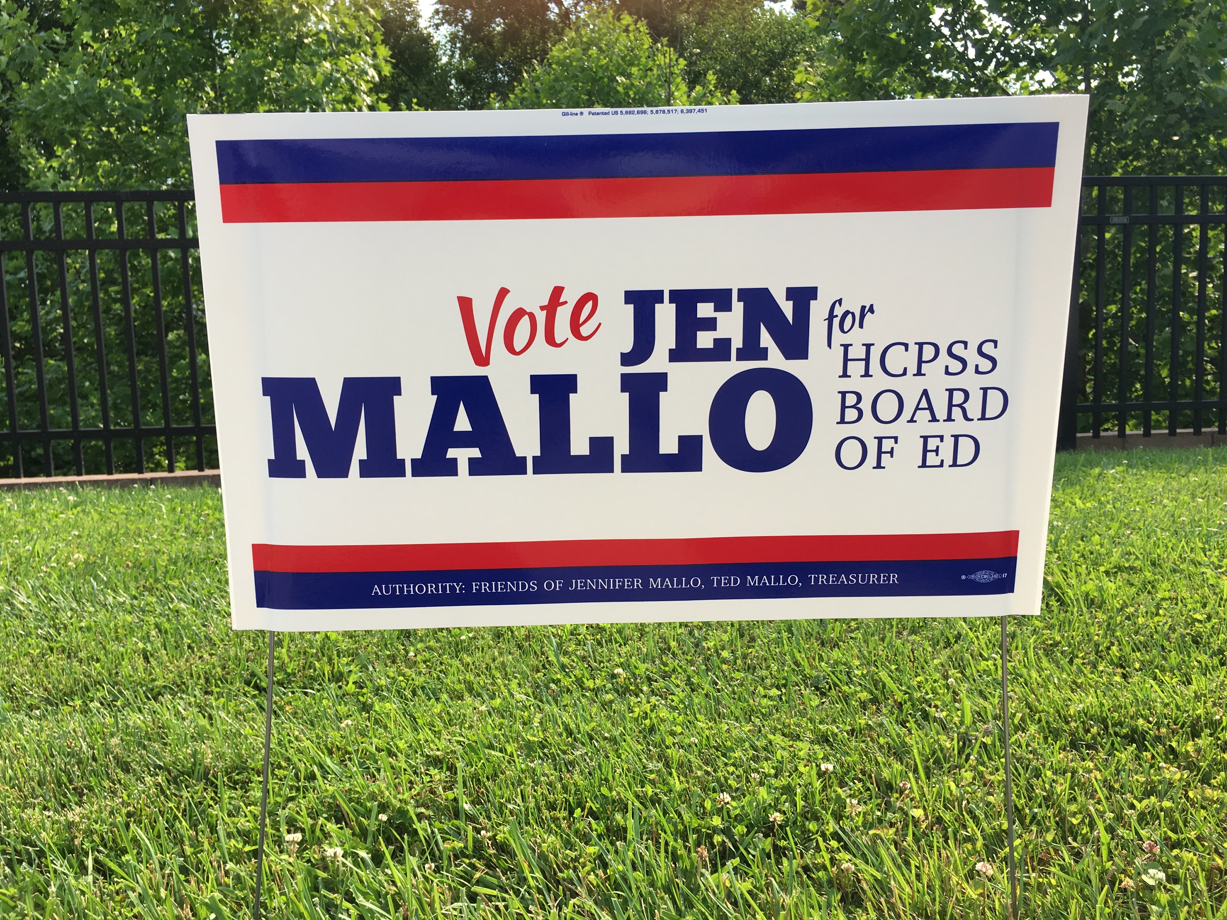
Jen Mallo, candidate for Howard County Board of Education. (Click for a higher-resolution version.)
The main problem I have with this sign is that “HCPSS Board of Ed” seems both awkwardly worded and a bit small and hard to read. The word “Board” in particular looks like the letter spacing is a bit too wide, with the “B” and “A” needing to be a bit closer to the “O.”
Otherwise the sign has no major problems. I do find the choice of red, white, and blue a bit odd though for a Board of Education race, as that color scheme is mostly used for partisan races, and in particular is a favorite of Republican candidates. Is this the design equivalent of a dog whistle? (I have no idea what Jen Mallo’s party affiliation is.) (UPDATE: Jen Mallo emailed me to say that the color choice was made by the graphic designer and that no dog whistle was intended.)
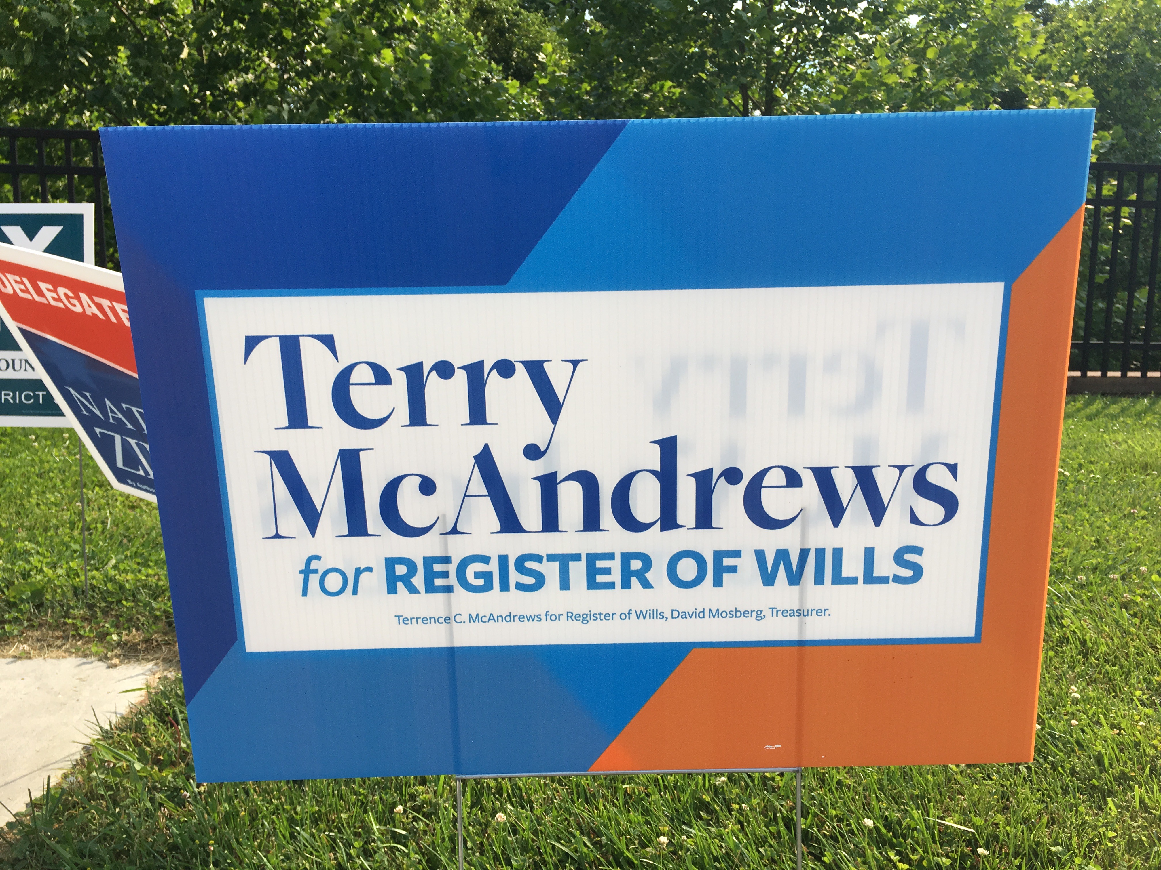
Terry McAndrews, Democratic candidate for Howard County Register of Wills. (Click for a higher-resolution version.)
This sign, like some others past and present, tries to enliven the design by doing more interesting things with the sign background. That goal is accomplished here, with the only downside being that the actual sign part of the sign (that is, the part with the candidate’s name and office sought) seems like it’s just a smaller (and thus less visually prominent) sign within a sign.
Also, using mixed upper and lower case serif text is an unusual choice for the candidate’s name, most signs use all upper case sans serif for that. That choice may have been made because “McAndrews” is in CamelCase (as the programmers say) and doesn’t seem to read as well in all caps as “MCANDREWS.”

Kim Oldham, Republican candidate for Howard County State’s Attorney. (Click for a higher-resolution version.)
Every election year there are one or two signs that stand out from the pack and make me stop and do a double-take. Kim Oldham’s sign is one of those this year. (There seems to be something about the State’s Attorney races that brings out good sign design; Dario Brocollino’s sign was a standout in 2014.) The bold white type on a yellow background really pops out, and the design element at the top based on the Maryland flag is done quite well. The red text reading “State’s Attorney” is just a tad small for maximum readability, but I think it’s balanced nicely with the larger text of the name.
One interesting design decision was to place the first name “Kim” at the left rather than centering it above “Oldham”. I actually tried my hand at changing the design in an image editor, and found it’s a tough call as to whether left justification or centering looks better. What swayed me toward left justification is that there’s a slight asymmetry in the Maryland flag design element at the top, caused by keeping the yellow and black bars of equal width. Putting “Kim” to the left seems to balance off the asymmetry a bit.
That’s it for today’s group of signs. More critiques should be coming your way soon in part 2. In the meantime I’m trying something new by giving you the opportunity to vote on your favorite signs, starting with this first group: just click on the link to the part 1 SurveyMonkey survey and then pick which of the signs above you like best. It’s completely anonymous.
UPDATE: Voting is closed. See part 7 for all the signs that advanced to the final round.