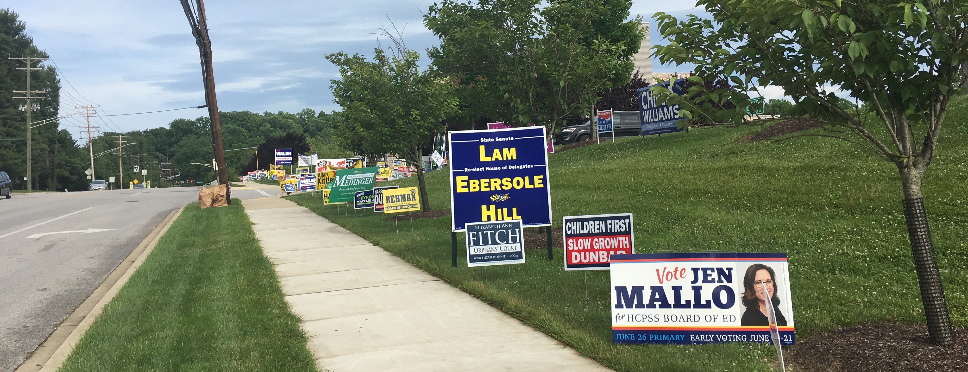
More campaign signs along Frederick Road at the Miller Branch library. (Click for a higher-resolution version.)
tl;dr: I continue my look at 2018 campaign signs in Howard County with signs from Melanie Harris, Janet Siddiqui, Shahan Rizvi, Reid Novotny, Scott Berkowitz, Deb Jung, Larry Pretlow, Vicky Cutroneo, Raj Kathuria, and Jim Walsh.
No rest for the weary, as I continue looking at 2018 campaign signs for local Howard County races. (“Local” here means not statewide and not for Federal positions.) This time I step up the pace a tiny bit and review ten different signs, again in random order. For more on this series see part 1.
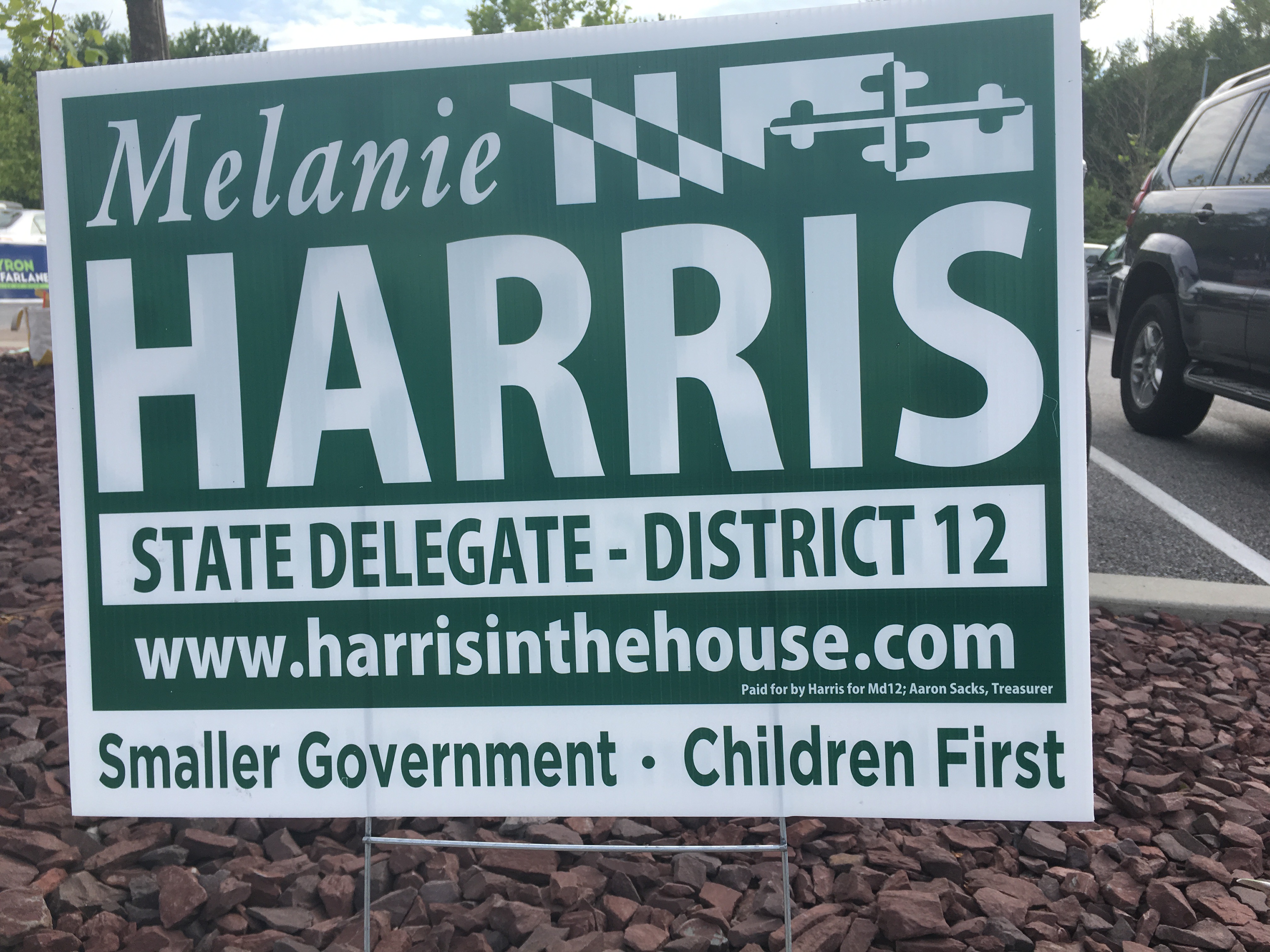
Melanie Harris, Republican candidate for Maryland House of Delegates, District 12. (Click for a higher-resolution version.)
This is a reasonable looking sign, albeit somewhat dense and crowded in terms of the amount of information it tries to fit in. However the candidate’s name is quite readable, and the sign makes it clear what office she’s running for. Though busy the design is also relatively clean, with good use of the Maryland flag and some variation in the typefaces across the multiple lines of text.
Regarding the amount of information, I can see in a way why she included her website name on the sign: “Melanie Harris” is a fairly common name, and an Internet search for it returns a lot of irrelevant results. Also, the obvious website choice of “melanieharris.com” seems to be taken by someone else, with the site not even loading properly. Thus presumably the desire to highlight the candidate’s website “harrisinthehouse.com”—which I admit is a clever domain name.
But was it necessary to add a slogan too? One point to note is that the slogan is somewhat at odds with the sign design: “Smaller Government” is of course a standard Republican slogan, but the sign colors are green and white, colors traditionally associated with Democrats. I can’t help thinking this sign would have been more internally consistent in its messaging if it were in red, white, and blue.
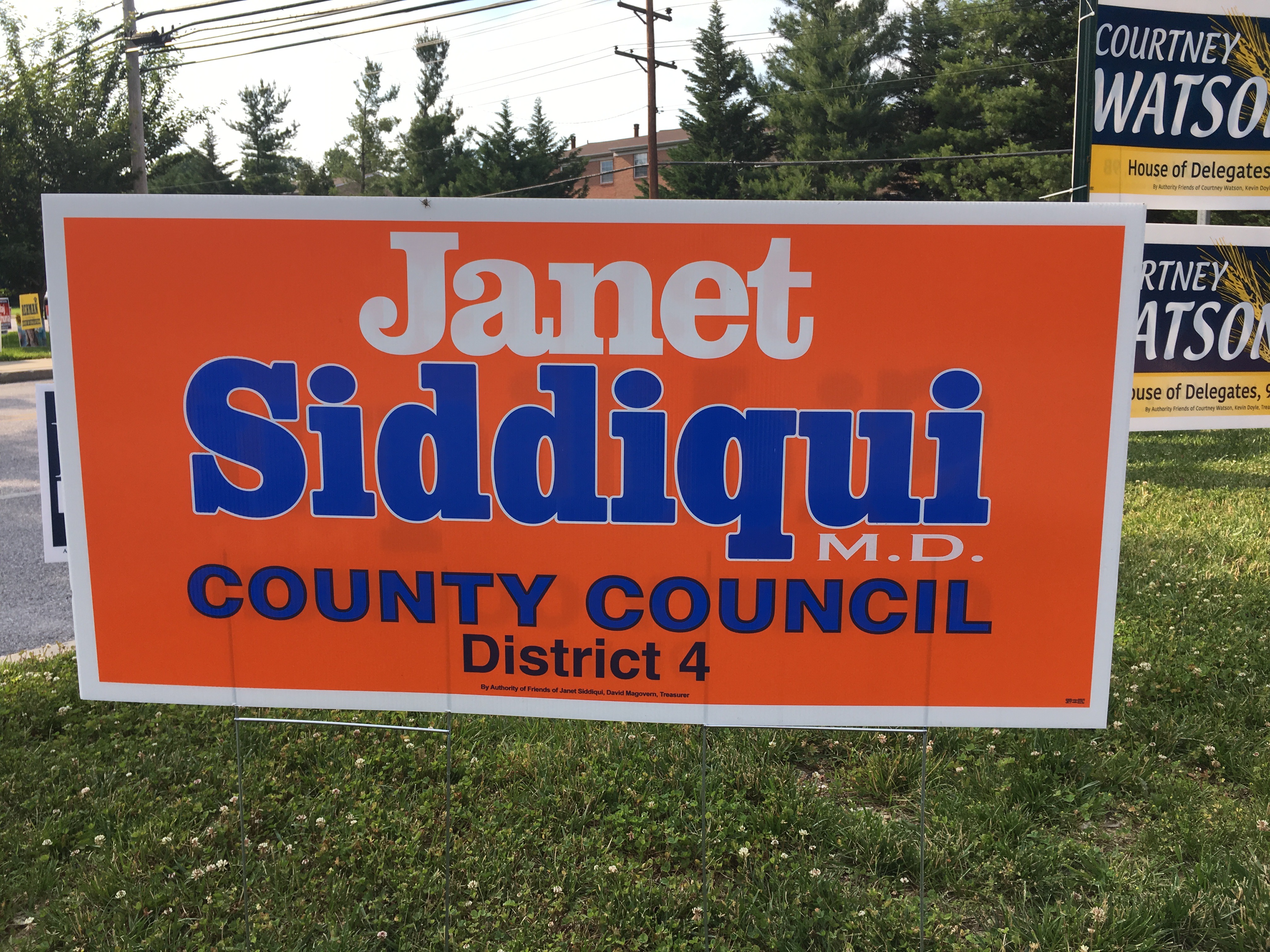
Janet Siddiqui, candidate for Howard County Council, District 4. (Click for a higher-resolution version.)
Another example of a candidate, or more precisely, the candidate’s family, having a favorite color: orange was also prominently featured in Nayab Siddiqui’s 2014 sign, although in his case it was orange with black rather than orange with blue (as here).
This sign uses a particularly bright orange that really stands out. The white outlines around the letters in ”Siddiqui” also helps readability, as can be easily seen if you compare them to the letters in “County Council”. The text of ”Janet” and “Siddiqui” is in a good bold serif typeface that makes an impact without being too chunky. Unfortunately the text for “County Council” doesn’t quite go with it; I’m not sure if it’s the typeface, the lack of outlining, or the use of blue for the text color. (Would white have been better?)
Finally, why include the “M.D.” under Siddiqui? I can see this for a Board of Education race, but would anyone voting for a County Council candidate really care that Janet Siddiqui is a physician?
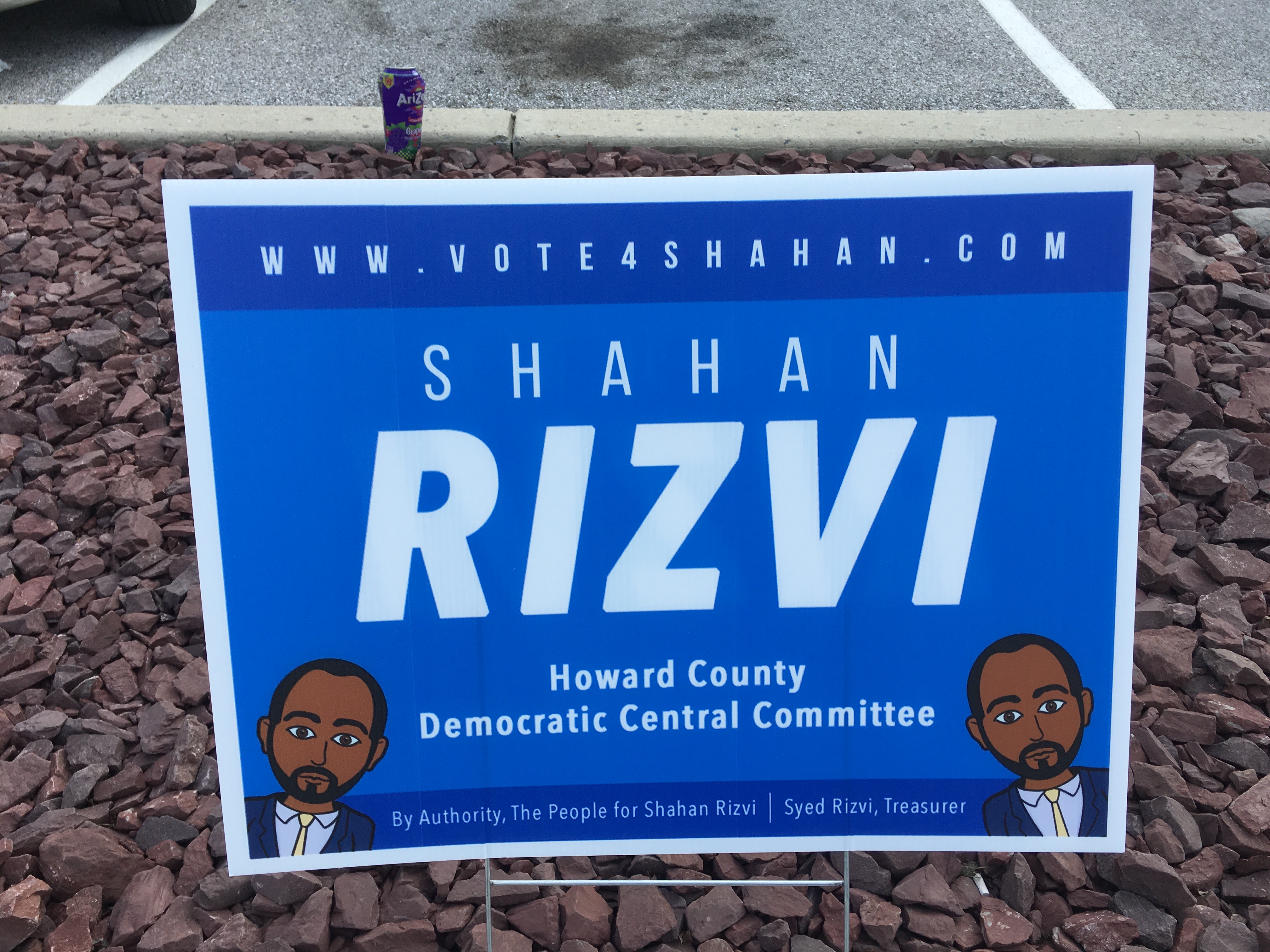
Shahan Rizvi, candidate for Howard County Democratic Committee. (Click for a higher-resolution version.)
This is the first of several examples of a phenomenon I don’t recall seeing in 2014: campaign signs for Central Committee candidates. (Or, to be more specific, male Democratic Central Committee candidates; I haven’t seen any signs for female Democratic Central Committee candidates, nor for Republican Central Committee candidates.) I find it interesting that Shahan Rizvi would undertake the expense of making campaign signs, especially given that he’s a member of the “HoCo Forward” slate, and thus would presumably benefit from any promotion of that slate.
As for the sign itself, the colors are attractive, and the main thing is that the name “Rizvi” is both prominent and legible. However the typeface for “Shahan” seems a bit thin in comparison, as does the typeface used for the website name. In fact, the website name isn’t really all that readable. I wonder if it would have worked better in lower case.
Finally, the little cartoon is cute and lends an air of whimsy to the sign, but including two of them almost makes me think Rizvi is running as a pair of twins.
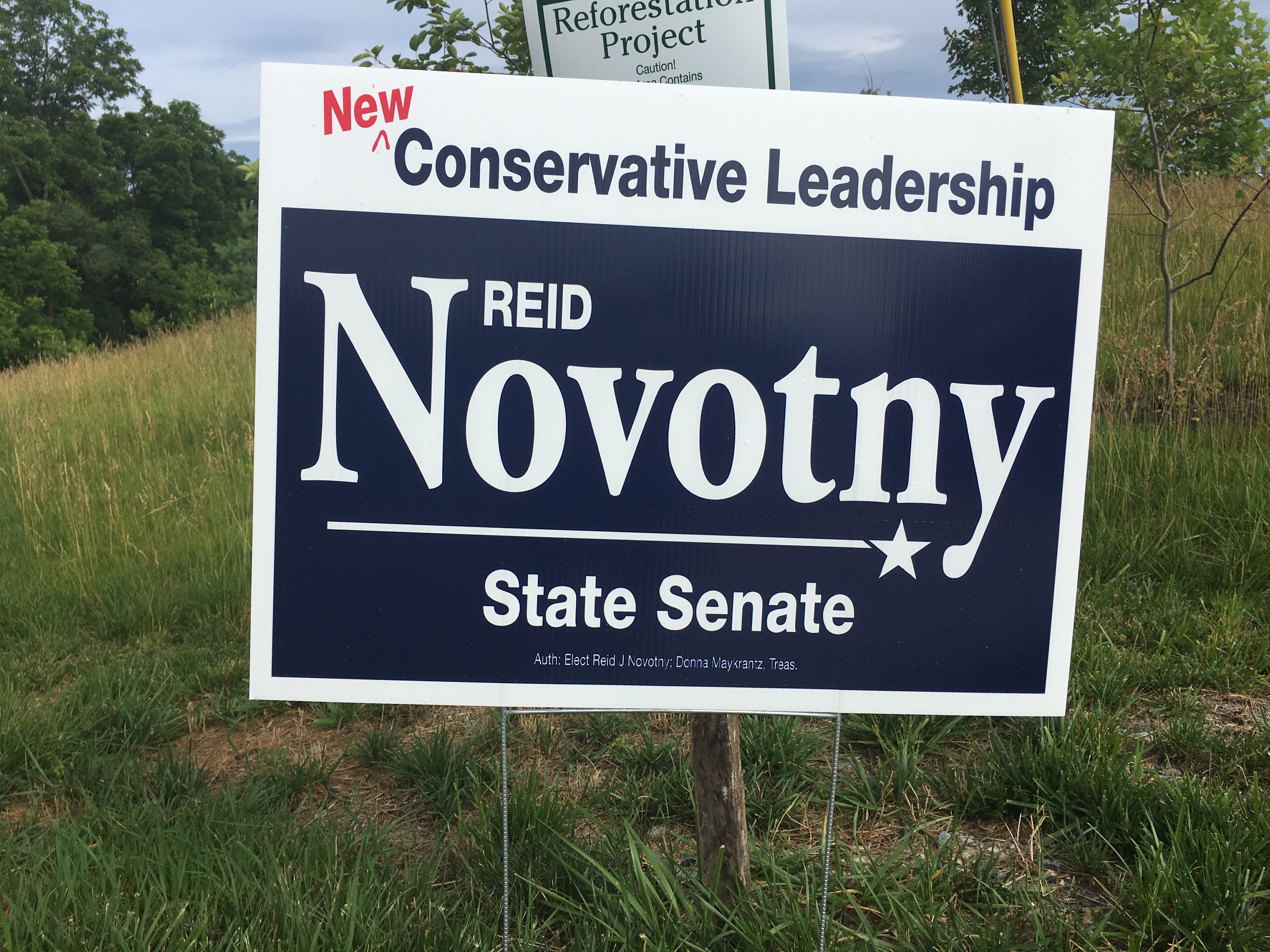
Reid Novotny, Republican candidate for Maryland Senate, District 9. (Click for a higher-resolution version.)
This is a solid sign—which is good, since Reid Novotny seems intent on plastering my section of Route 40 with these. The overall blue and white scheme has good contrast, and the spot of red in the upper left livens up the design and prevents it from being too monotone.
The typefaces are legible, and I like the strategy of placing “Reid” in the space opened up by the capital “N”. It’s mirrored by the design element with the star, which not only helps separate “Novotny” from “State Senate” but also fills the space opened up by the descender in the letter “y.”
Finally, since the design is pretty clean and uncluttered I don’t mind the addition of a slogan at the top. The slogan also helps contrast—in a relatively subtle way—Novotny’s candidacy from that of his primary opponent, incumbent Gail Bates.
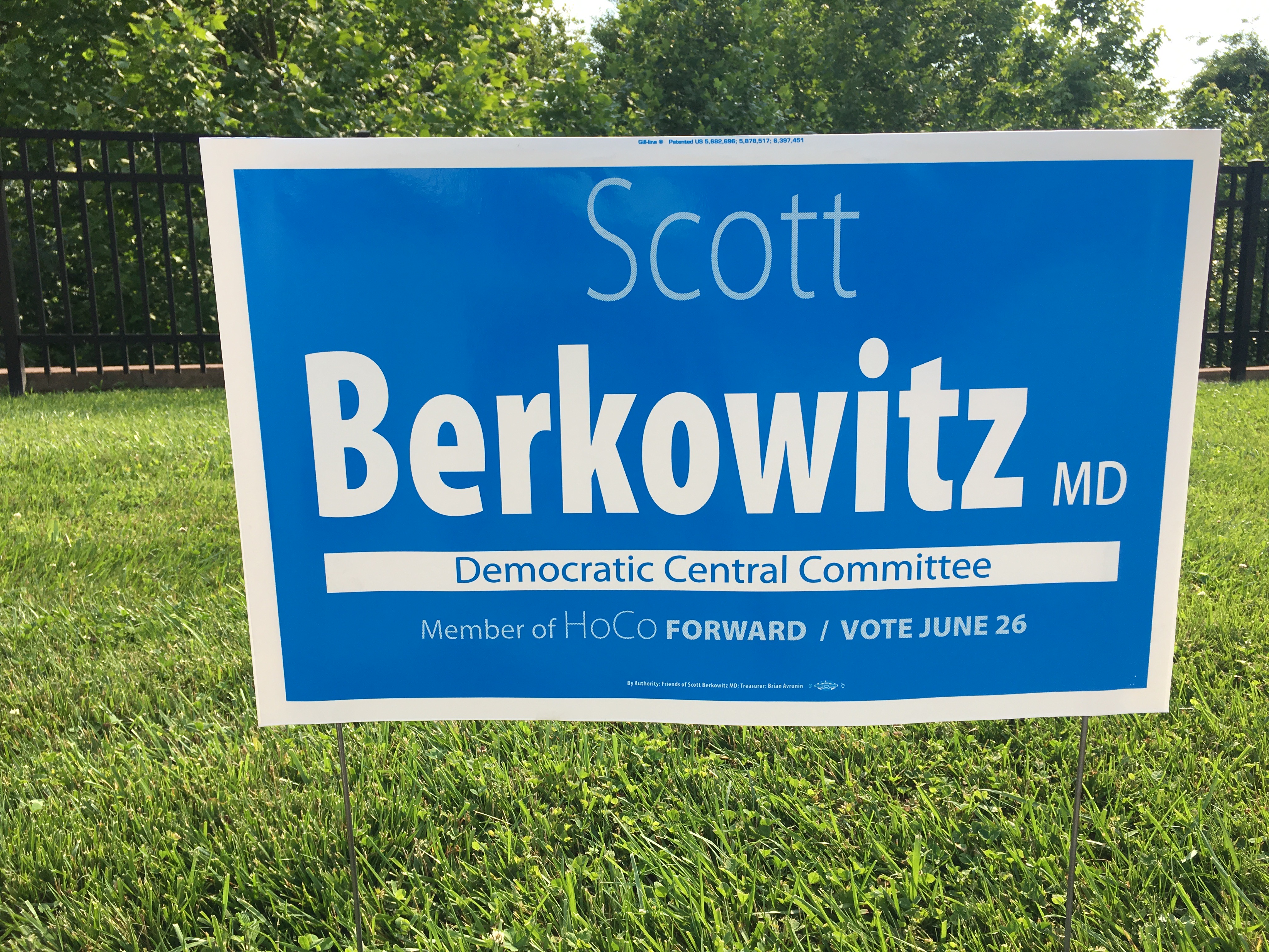
Scott Berkowitz, candidate for Howard County Democratic Central Committee. (Click for a higher-resolution version.)
Here’s another example of a campaign sign for the Democratic Central Committee race—and for another member of the HoCo Forward slate. It’s an attractive sign, with good legibility for the last name and a nice shade of blue.
But again I have to ask: Is it really necessary to include the fact that you’re a doctor, especially for a Central Committee race? I wouldn’t be so down on this except that I think the “MD” in small letters throws off the rest of the design.
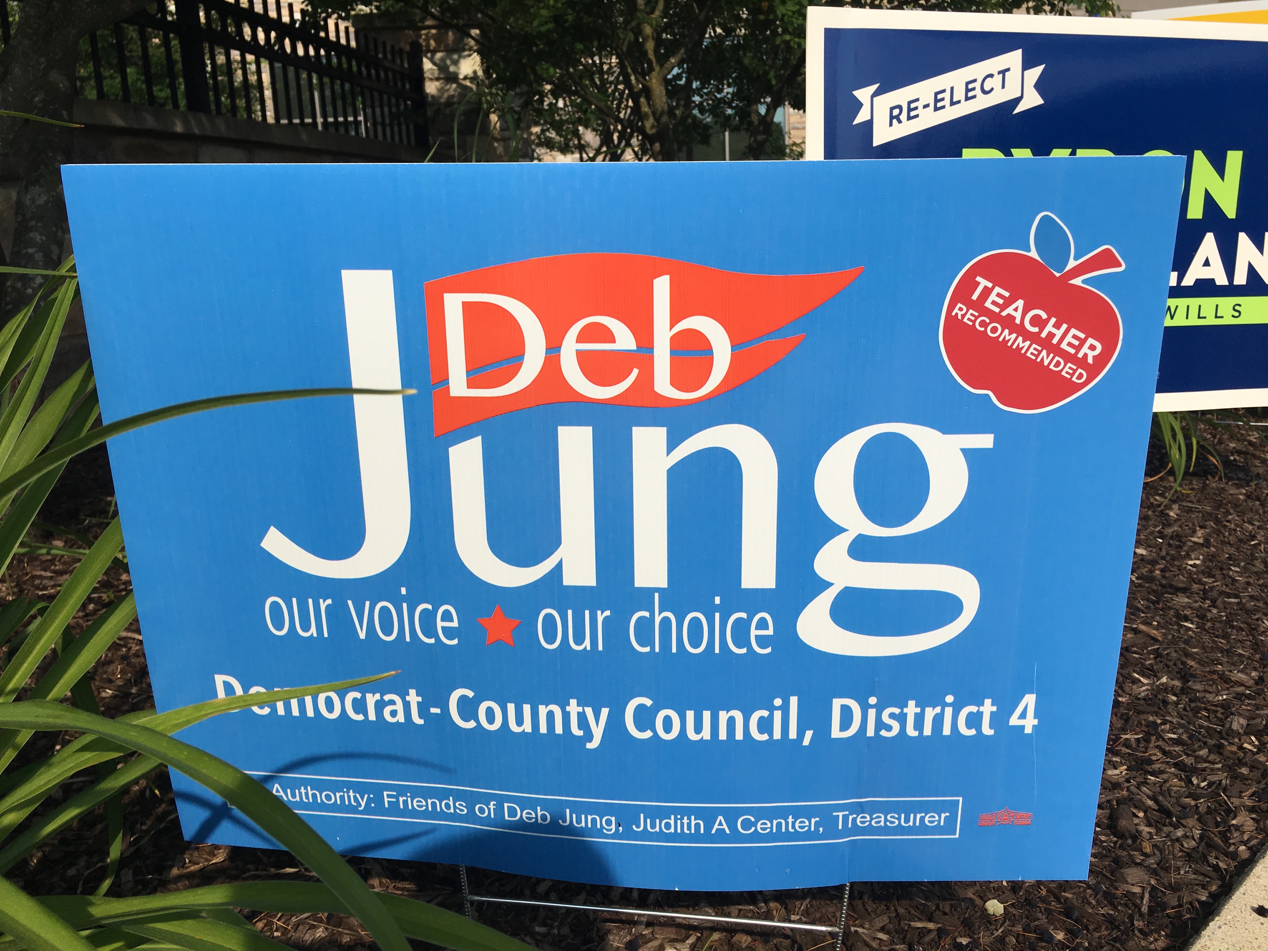
Deb Jung, Democratic candidate for Howard County Council, District 4. (Click for a higher-resolution version.)
There are a lot of things to like about this sign, including the typeface used for the names, so I was wondering why I found it a bit offputting. Then I figured it out: there’s no white border around the sign. Maybe it’s just me, but I find including a border helps frame the sign and highlight its content.

Larry Pretlow, Democratic candidate for Maryland House of Delegates, District 13. (Click for a higher-resolution version.)
I have to admit, my first thought upon seeing this sign was, “Who is Larry?” Then I saw the slogan “Break the Slate!” and thought, “Oh, maybe this has to do with the Central Committee election and the HoCo Forward slate.” But I couldn’t remember seeing any Larrys on the ballot when I voted last Sunday. Then I looked more closely and saw “for Delegate” and the “13” on the donkey’s shirt, and finally figured it out: he’s running against the candidates of “Team 13.”
This is not really Larry Pretlow’s fault: I completely missed the “for Delegate” part in the lower part of the sign, which is in a larger font size than the “Break the Slate”. But it does illustrate the potential for confusion when voters see signs that don’t include all the relevant information about a candidate. (Before anyone comments, I’m aware that Krish Vignarajah also has signs that read simply “Krish for Maryland”. But as a gubernatorial candidate she has a higher media profile and thus presumably better name recognition.)
Sorry about the detour, now back to the sign itself: First, it’s a somewhat unusual shape relative to other signs. Other than that it’s a perfectly good looking sign. Blue or black text on a white background makes for high contrast, and the typeface is readable. I’m not a big fan of cartoons on signs, but this one is perfectly fine and doesn’t overshadow the rest of the sign.
I do wonder though about including “June 26th” on the sign. It makes the sign more crowded and I’m not sure it adds anything: if you know who “Larry” is, wouldn’t you also know when to vote?
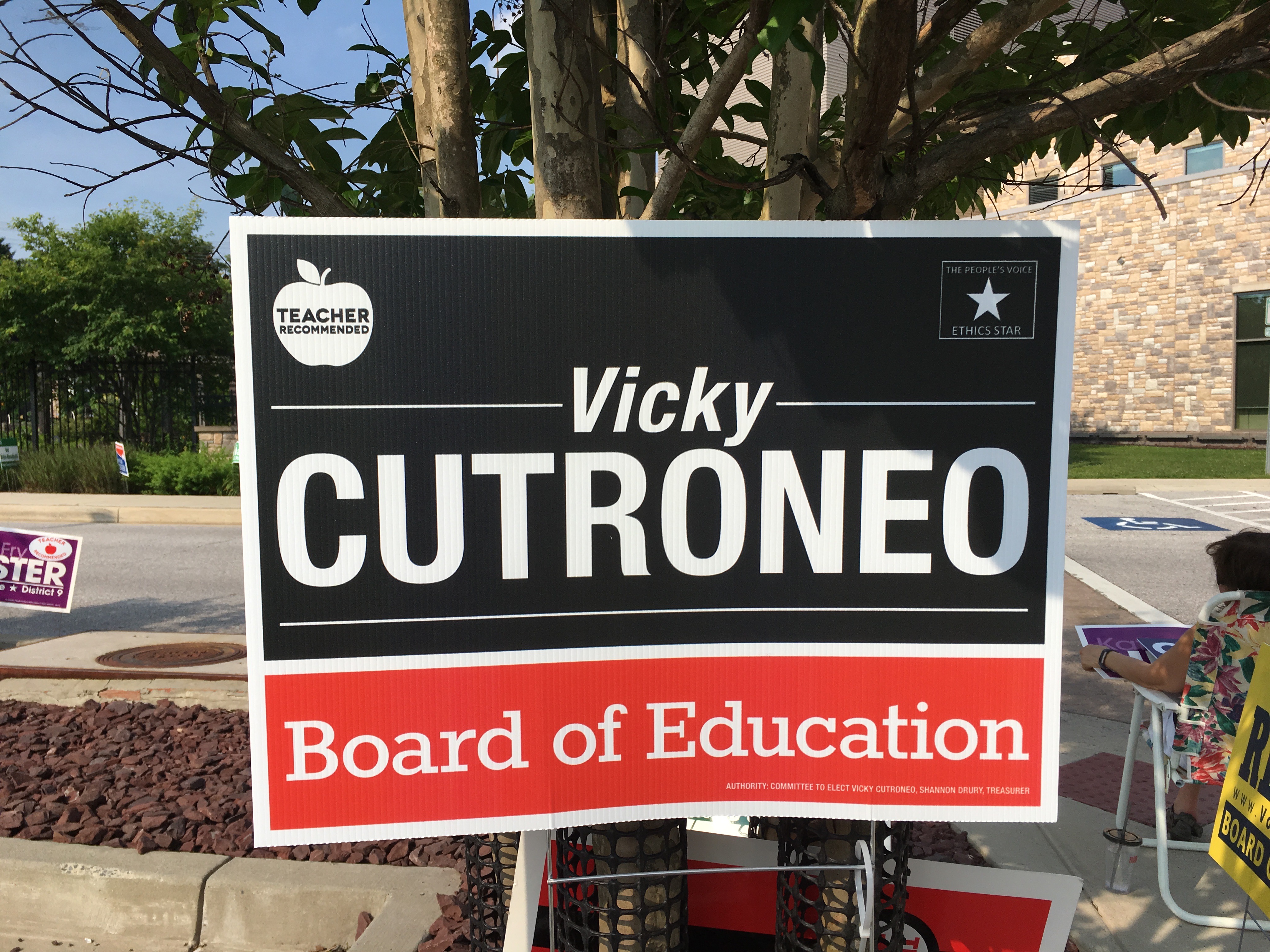
Vicky Cutroneo, candidate for Howard County Board of Education. (Click for a higher-resolution version.)
Things to like about this sign: It has good legibility and impact for the candidate’s name, and I like the contract between the sans serif typeface used for the name and the slab serif typeface used for “Board of Education”. I like the two colors and the division of the sign’s area between them. I like including the endorsement logos within the sign itself, as opposed to slapping on stickers after the fact.
Things I don’t like: The two thin horizontal lines on either side of “Vicky” I think are necessary, but I’m not persuaded that it was necessary to include a similar thin line below “Cutroneo,” especially since there’s already a white area dividing that section of the sign from the lower part. I tried editing out the bottom line in an image editor and I think the sign looks better and (dare I say) more impactful without it.
Finally, it bothers me that the “Teacher Recommended” and “Ethics Star” logos aren’t quite at the same height. (Yes, I’m picky.)
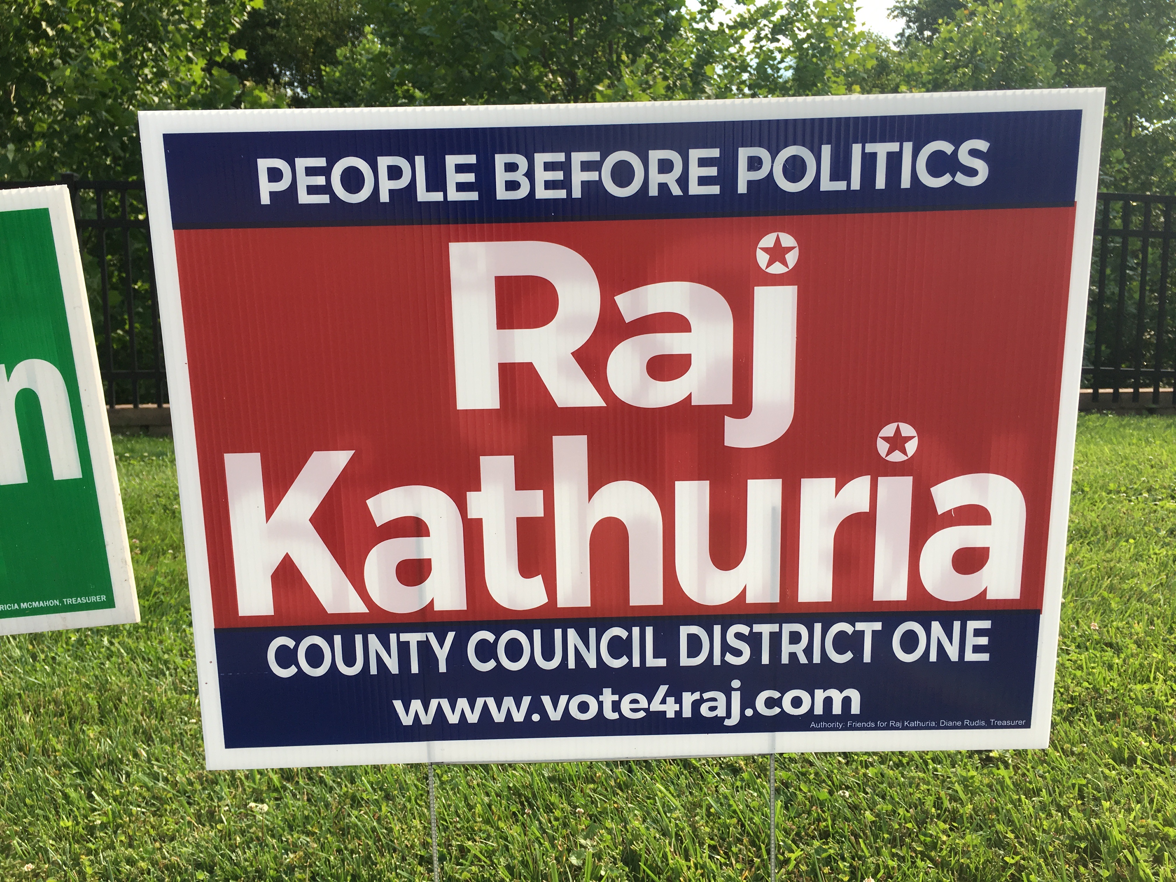
Raj Kathuria, Republican candidate for Howard County Council, District 1. (Click for a higher-resolution version.)
This sign seems overly dark to me, with all white text against colored backgrounds. It also doesn’t help that the red is a relatively dark red. (Raj Kathuria may want to look to fellow Republican Warren Miller, whose signs have really good shades of red and blue.) Otherwise the sign has good legibility for the candidate’s name, but seems overly crowded with the secondary text at the top and bottom.
Finally, I could take or leave the little star-in-circle design elements used in dotting the “j” and “i”. I used my trusty image editor to change those elements to plain white circles; I think the sign looks quite fine without the stars.
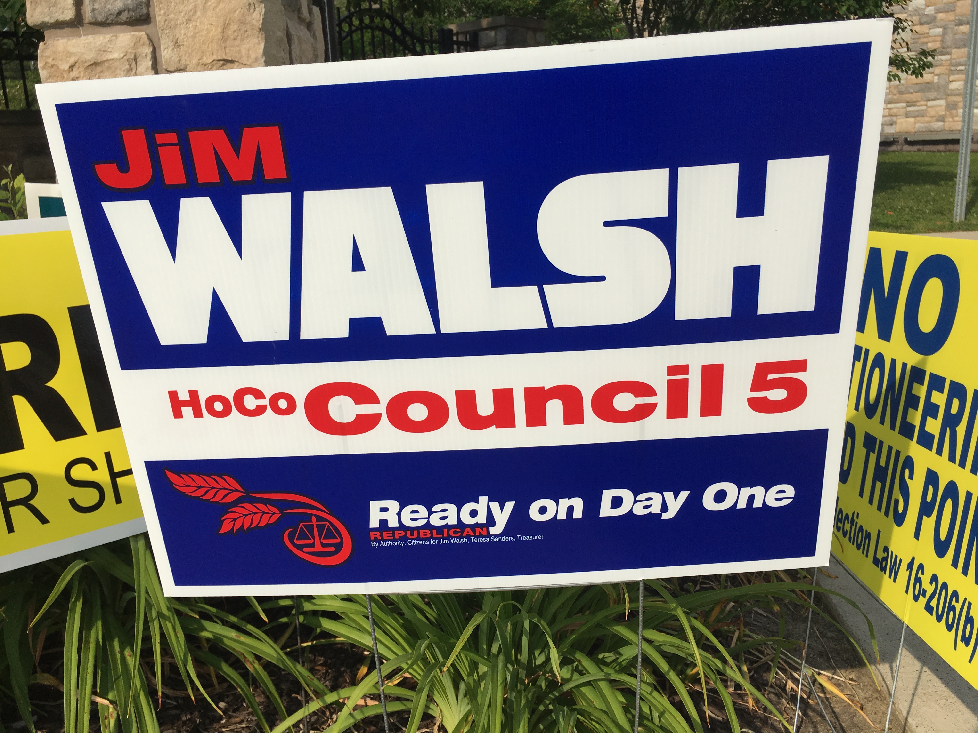
Jim Walsh, Republican candidate for Howard County Council, District 5. (Click for a higher-resolution version.)
This is far from being a bad sign, but I feel compelled to nitpick it a bit: The typeface for “Walsh” is bold, perhaps too bold: I feel the letters run together a bit too much, in a way that threatens to impair readability.
Also, I’m curious about the design elements in the lower left. The element that looks like two stalks of wheat is defensible enough: assuming that it is supposed to represent stalks of wheat, it’s a symbol of Howard County (especially the farms of Council District 5) and echoes similar elements on past signs for Courtney Watson and Bob Flanagan (among others). But what’s a set of scales doing on this sign? Walsh is running for County Council, not for Judge of the Orphans’ Court.
That’s it for today’s crop of signs. Keep an eye out on Twitter and Facebook for the next crop. In the meantime, vote for the best sign of those discussed in this article. If I get enough votes I’ll have a final runoff to determine the winner among all signs; otherwise you’ll just have to accept my choice.
UPDATE: Voting is closed. See part 7 for all the signs that advanced to the final round.