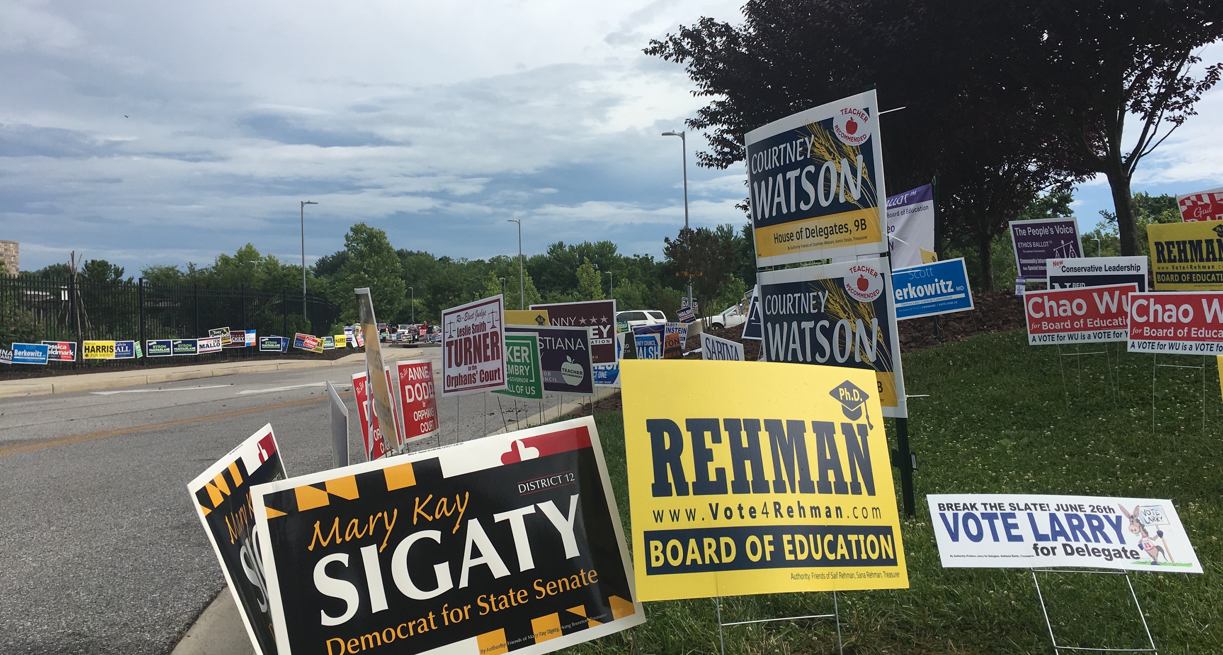
Campaign signs at the entrance to the Miller Branch library. (Click for a higher-resolution version.)
tl;dr: I’m now at the halfway point in my reviews of 2018 campaign signs in Howard County. This post features signs from Christiana Rigby, Carleen Pena, Calvin Ball, Nicole Bormel Miller, Danny Mackey, Harry Dunbar, Guy Guzzone and fellow Team 13 members Vanessa Atterbeary, Shane Pendergrass, and Jen Terrasa, Courtney Watson, Steve Hunt, and Anita Pandey.
As in the last post I review ten different signs, again in random order. For more on this series see part 1.

Christiana Rigby, Democratic candidate for Howard County Council, District 3. (Click for a higher-resolution version.)
This sign has a couple of interesting aspects. First, it features the candidate’s first name more prominently than her last name: the type size is the same and her first name is in a bolder version of the same typeface used for her last name. Is Rigby trying to build name recognition for herself based primarily on her first name (like “Krish for Maryland”), or is it just a fluke of the design?
Either way, that causes a problem for the design, since now “Rigby” looks relatively unbalanced on the left side. The large “Teacher Recommended” helps rebalance the design, but it also (at least to me) makes the sign look more like a Board of Education sign than a County Council sign—especially since “Democrat for County Council” is on a lighter background that provides less contrast for the text and impairs readability a bit.
Don’t get me wrong: I think this is overall an attractive and professional sign. I just wonder about the decisions that went into this particular design.
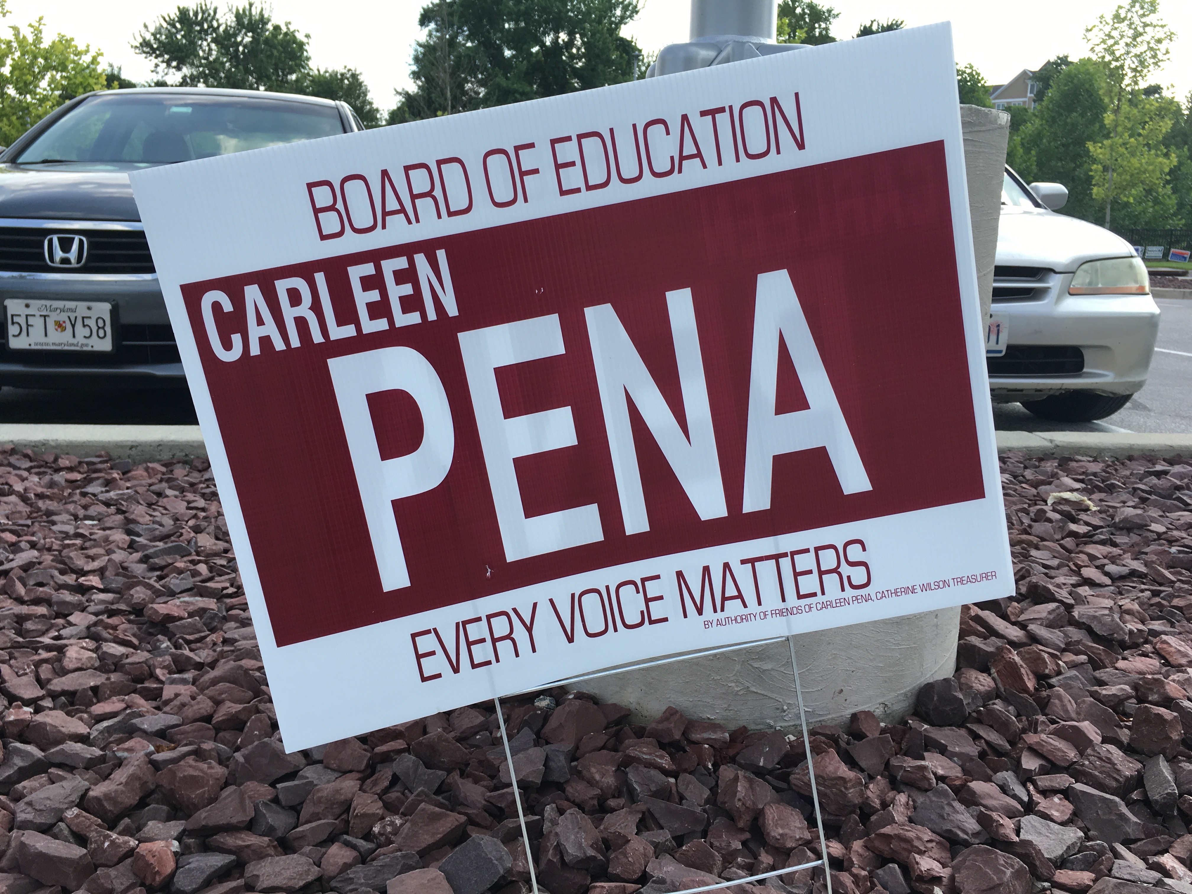
Carleen Pena, candidate for Howard County Board of Education. (Click for a higher-resolution version.)
Every election cycle sees its share of what I’ll call “utilitarian” signs. These are basic signs with a white background and one other color, typically divided into three sections with the text and background colors reversed on the middle section, with the same plain sans serif typeface used on all three sections.
For a past example of this type of sign in its purest form see Kay Hartleb’s plain 2010 sign. This one varies the formula a bit by having four lines of text, so the middle section includes both “Carleen” and “Pena.”
Critiquing the design of a sign like this is somewhat beside the point. It does the job of putting the candidate’s name out there, and that’s about it. (Although I will say that I think the typeface on the top and bottom lines of text seems a bit thin for best readability, and putting “Carleen” on the left rather than centered makes the sign unbalanced.)
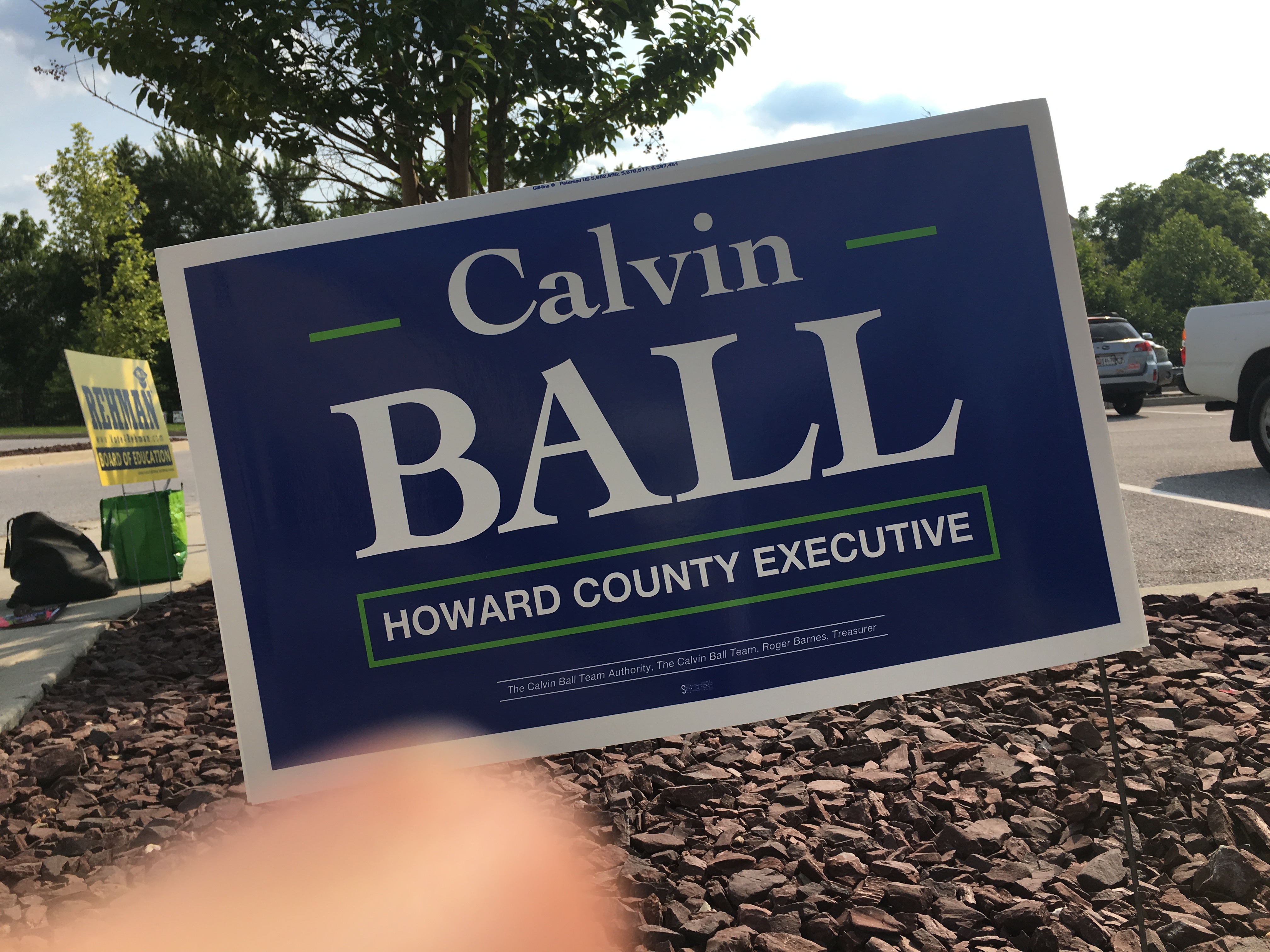
Calvin Ball, Democratic candidate for Howard County Executive. (Click for a higher-resolution version.)
A good solid sign, professional looking but not flashy. The color scheme is good and somewhat reminiscent of that on Byron Macfarlane’s sign (to be reviewed in a future post), but it doesn’t “pop” quite as much. There’s also a nice contrast in the typography: lower case serif for the first name, upper case serif for the last name, then upper case san serif for the office.
Note the subtle green design elements on either side of “Calvin”: they’re a nice touch, helping the name visually balance against the larger last name, and echoing the green rectangle around “Howard County Executive.”
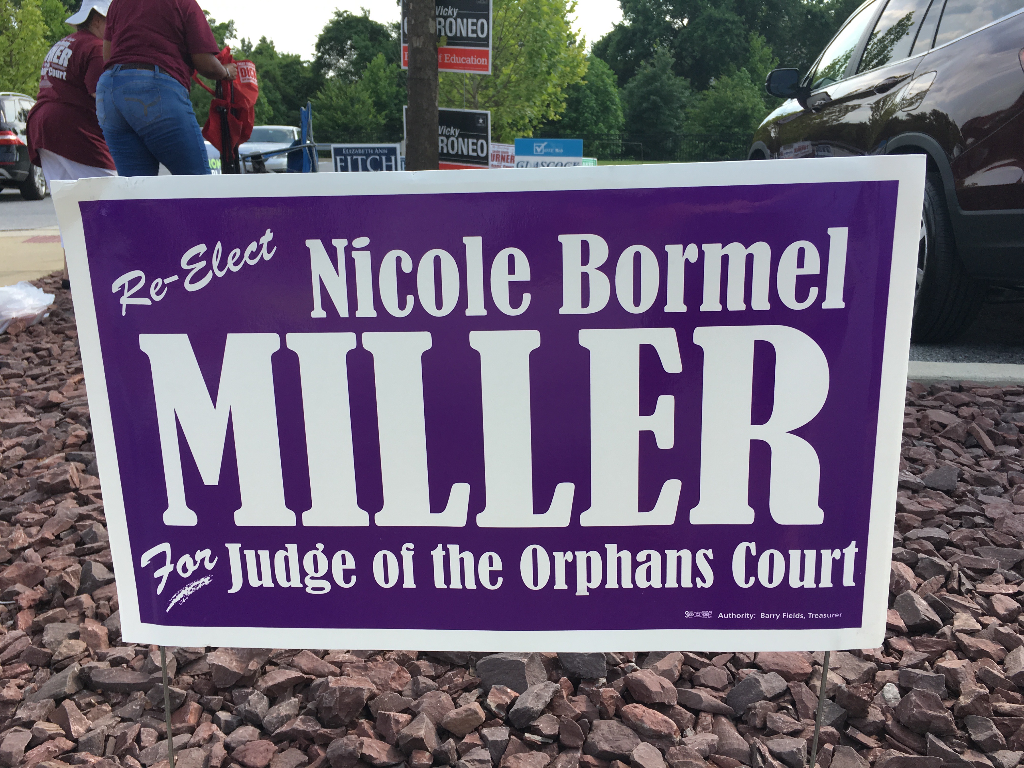
Nicole Bormel Miller, Democratic candidate for Judge of the Orphans’ Court. (Click for a higher-resolution version.)
Like fellow Judge of the Orphans’ Court candidates Leslie Smith Turner and (as we’ll see) Anne Dodd, Nicole Bormel Miller is reusing the basic design from her 2014 sign. Here’s what I wrote about it in the last cycle:
This sign has a nice purple background color (a break from the usual yellow or red), a good balance between the white foreground and purple background, and an interesting serif typeface. As with the [Shari] Chase sign, I take points away for not spelling “Orphans’” properly.
The major change for this year’s sign is the addition of the “Re-elect” text in the upper left corner, since (unlike 2014) she’s running as an incumbent. That in turn forces the “Nicole Bormel” text to be smaller and further to the right. It’s still an attractive sign, but it now looks just a tad unbalanced.
I should add that Miller’s last name is quite common—in fact, it’s shared by two other candidates in this cycle, Warren Miller and Robert Miller—and she apparently always uses her middle name. Thus she has a lot of text to fit on a sign. I think using lower case on the top and bottom lines of text, with only “Miller” in upper case, helps lighten the look of the sign and make it look less dense.
Finally, not to be pedantic, there’s still no apostrophe on “Orphans’.”
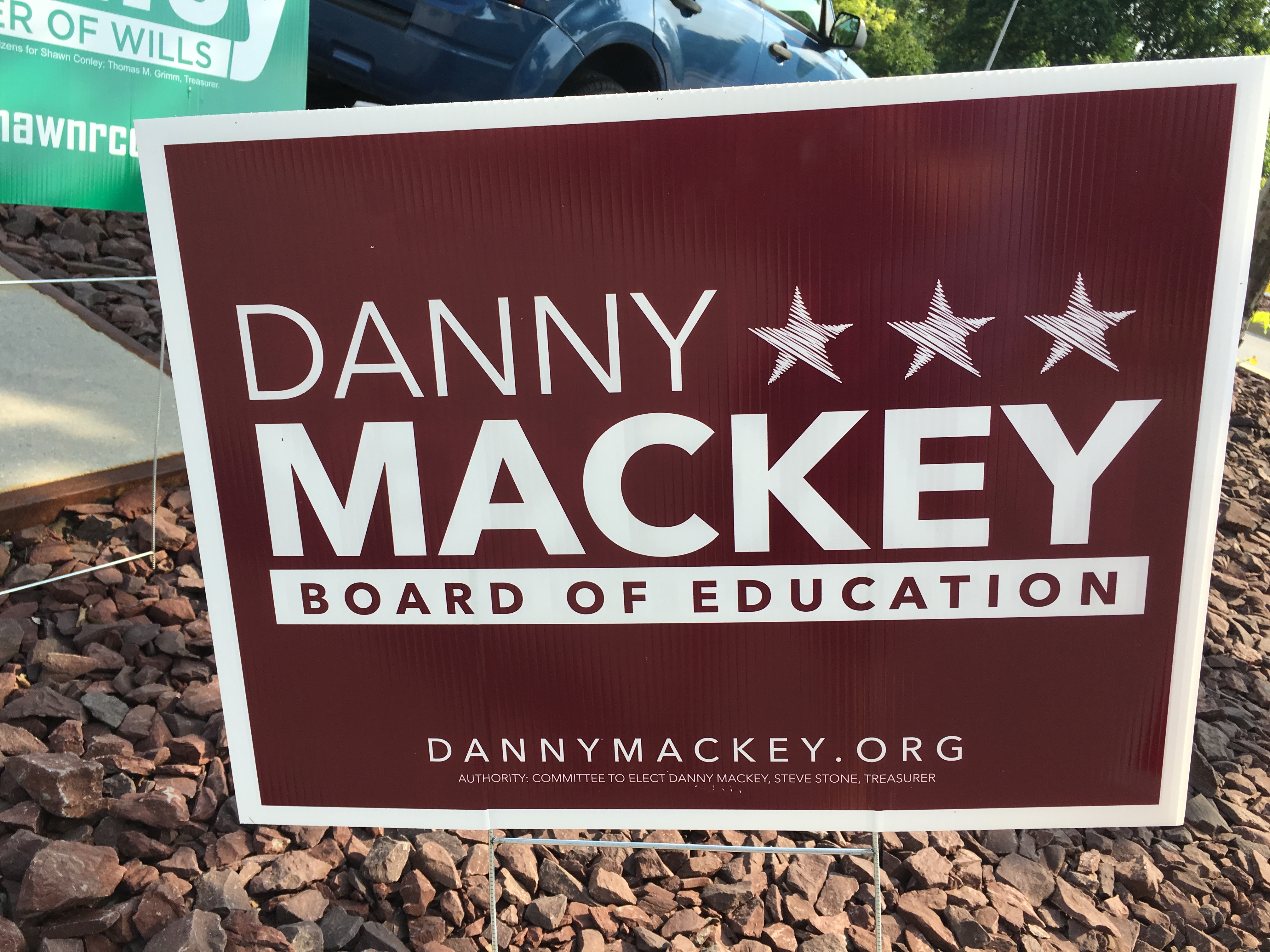
Danny Mackey, candidate for Howard County Board of Education. (Click for a higher-resolution version.)
This is a good sign. I was originally going to write that I wasn’t a fan of the background color, but in looking at the sign again I think it’s quite handsome—and because there’s no yellow in the sign it doesn’t remind me of the Washington Redskins. (This has nothing to do with my attitude toward the football team, I just don’t like their team colors, especially when the burgundy tilts to the bright side.)
The “Mackey” is quite visible and impactful, and the text size and condensed typeface on “Danny” matches it well. In fact, all the text on this sign looks good and has variety, despite all of it being in upper case and using variants of the same sans serif typeface.
A further nice subtle touch is shown on the stars to the right of “Danny”. The stars (or some other design element) are needed to balance out the left-justified “Danny,” but if the stars were solid white then they would pull focus from the candidate’s name. (I tried this out in an image editor to gauge the effect.) Instead the stars look like they were hand-drawn in scribbles, which both lets some of the background through, lightening the look of the stars, and also provides some informality in an otherwise fairly formal sign. (Folks, this is why you hire graphic design professionals.)

Harry Dunbar, Democratic candidate for Howard County Executive. (Click for a higher-resolution version.)
This sign does a good job of putting the candidate’s name front and center, as well as highlighting the office being sought. The colors are good as well, especially the red. Normally I don’t like to see red design elements directly on a blue background, because the contrast can be problematic. (We’ll see some other signs where this is true.) In this case though the brightness of the red and the white text within the red rectangle provide improved contrast and alleviate this concern.
It’s an open question whether it would be worth adding a design element in the upper left to balance the left-justified “Harry”. I tried something like this in an image editor and I’m not sure it was worth it.
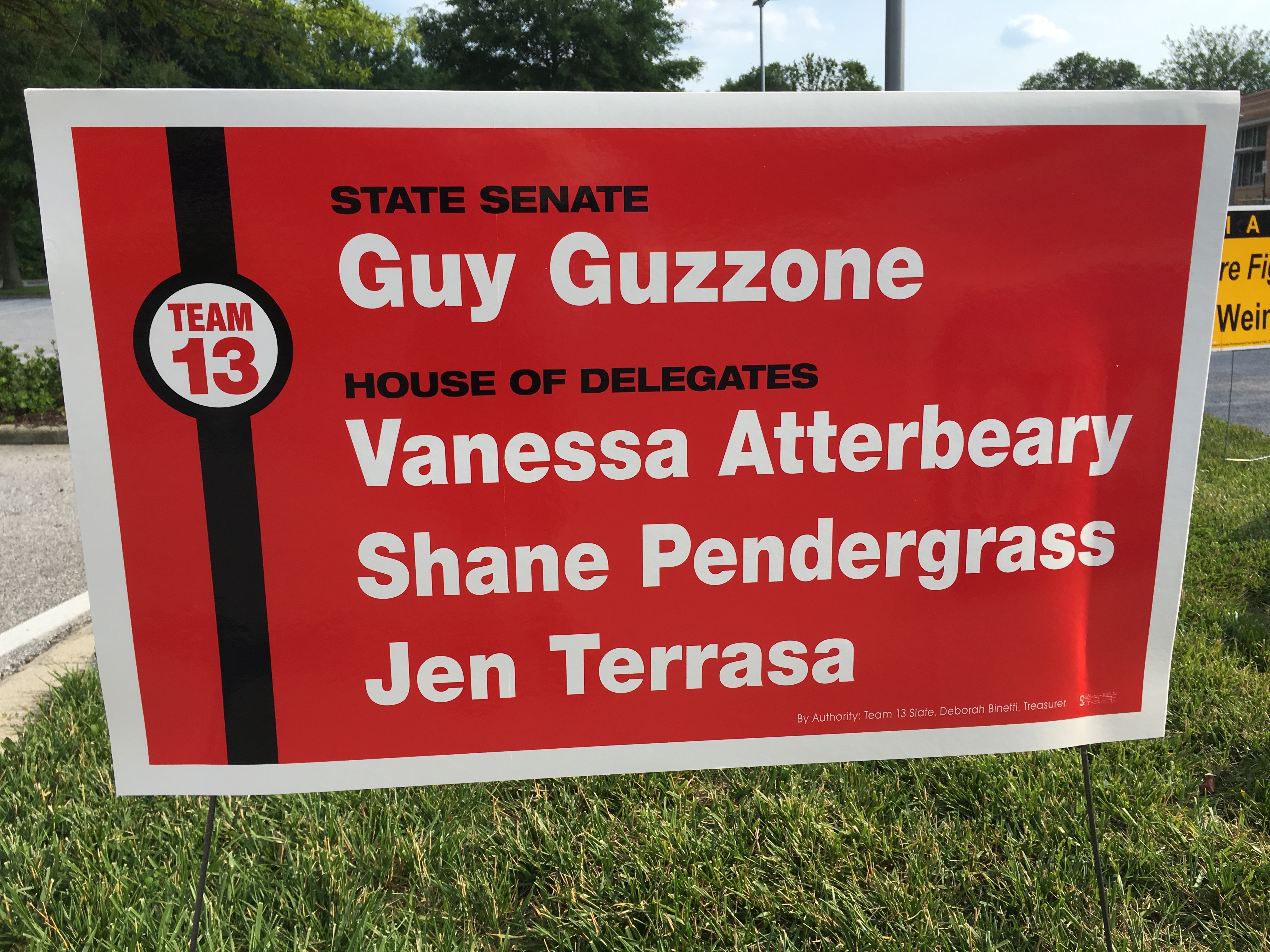
Guy Guzzone, Democratic candidate for Maryland Senate, District 13, and his fellow Team 13 Democratic candidates for Maryland Hose of Delegates, Vanessa Atterbeary, Shane Pendergrass, and Jen Terrasa. (Click for a higher-resolution version.)
I previously referred to Team 13’s 2014 sign as “bare-vanilla minimalism,” since it consisted of red text on a white background with only very minimal design elements.
This sign is less minimal, introducing as it does a new color (black) and a non-trivial design element that also serves to identify the candidates as ”Team 13”. I don’t think the black text is all that readable against the black background, but the sign accomplishes its purpose, namely to associate the names of the candidates in your mind as members of a slate. The text for those names looks good and has good contrast with the background.
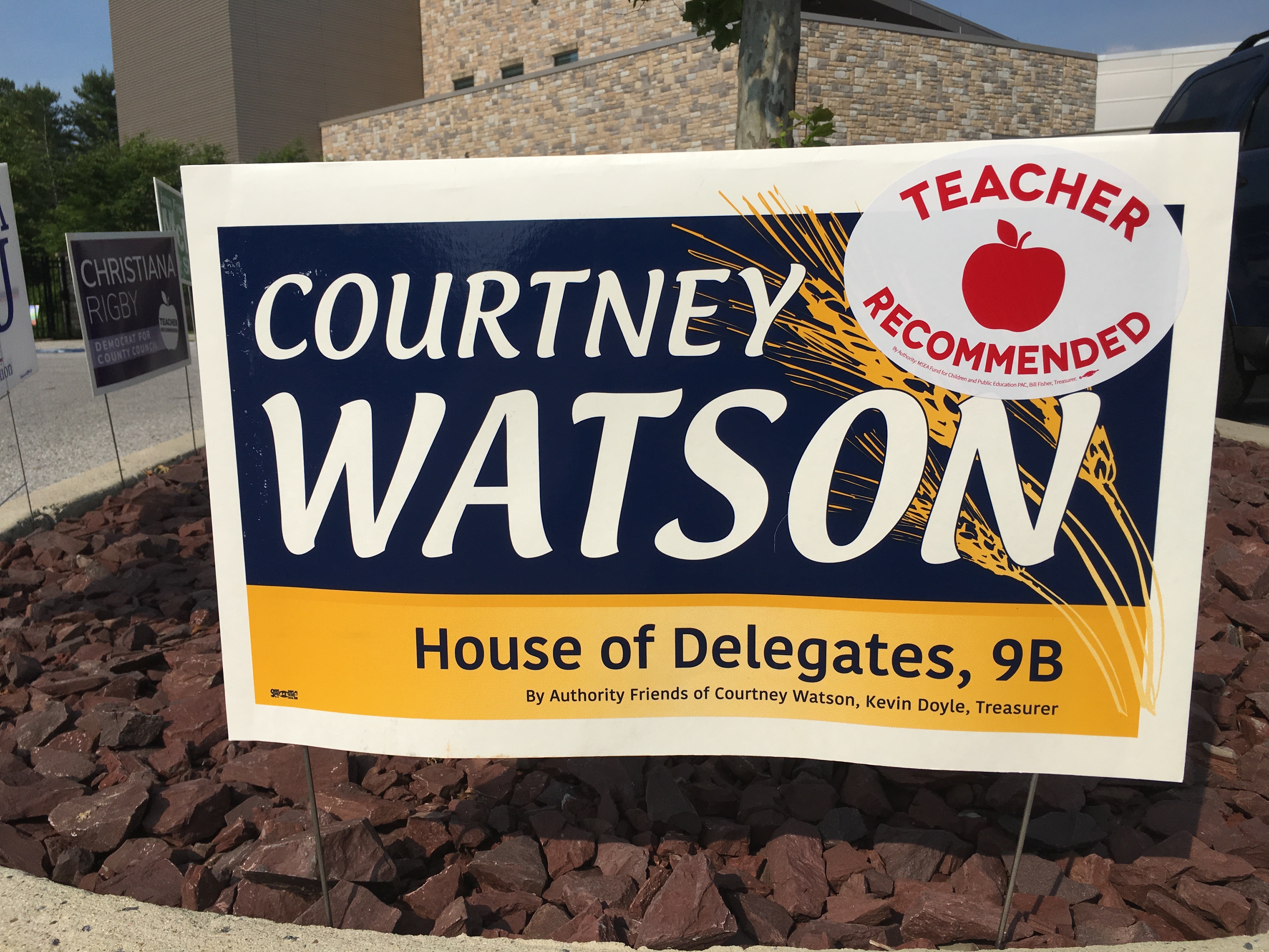
Courtney Watson, Democratic candidate for Maryland House of Delegates, District 9B. (Click for a higher-resolution version.)
Another blast from the past, this time from Courtney Watson, as she updates the sign design she used in 2010 in her (successful) race for County Council, abandoning the 2014 design she used in her (unsuccessful) race for County Executive. A bit of superstition, perhaps?
Here’s my review of the 2010 sign:
Large text that conveys only the basic information needed, nice contrasting typefaces (with the top one lending an air of liveliness to the sign), a unique choice of complementary colors (including a subtle gradient on the bottom half), and good balance in the design between the top half, the bottom half, and the white border. But what really takes this design from good to great is the stand of wheat to the right: it adds visual interest, ties back to the official Howard County seal, and evokes the rural past of the country in a way calculated to appeal both to conservative older residents and more liberal newcomers concerned about environmental issues. This one got my vote for the best Howard County campaign sign of 2010.
The new sign adds her first name (in the same case and typeface as her last name) but otherwise retains the virtues of the 2010 sign, with one exception: I think the white border on this sign is too wide, especially at the top.
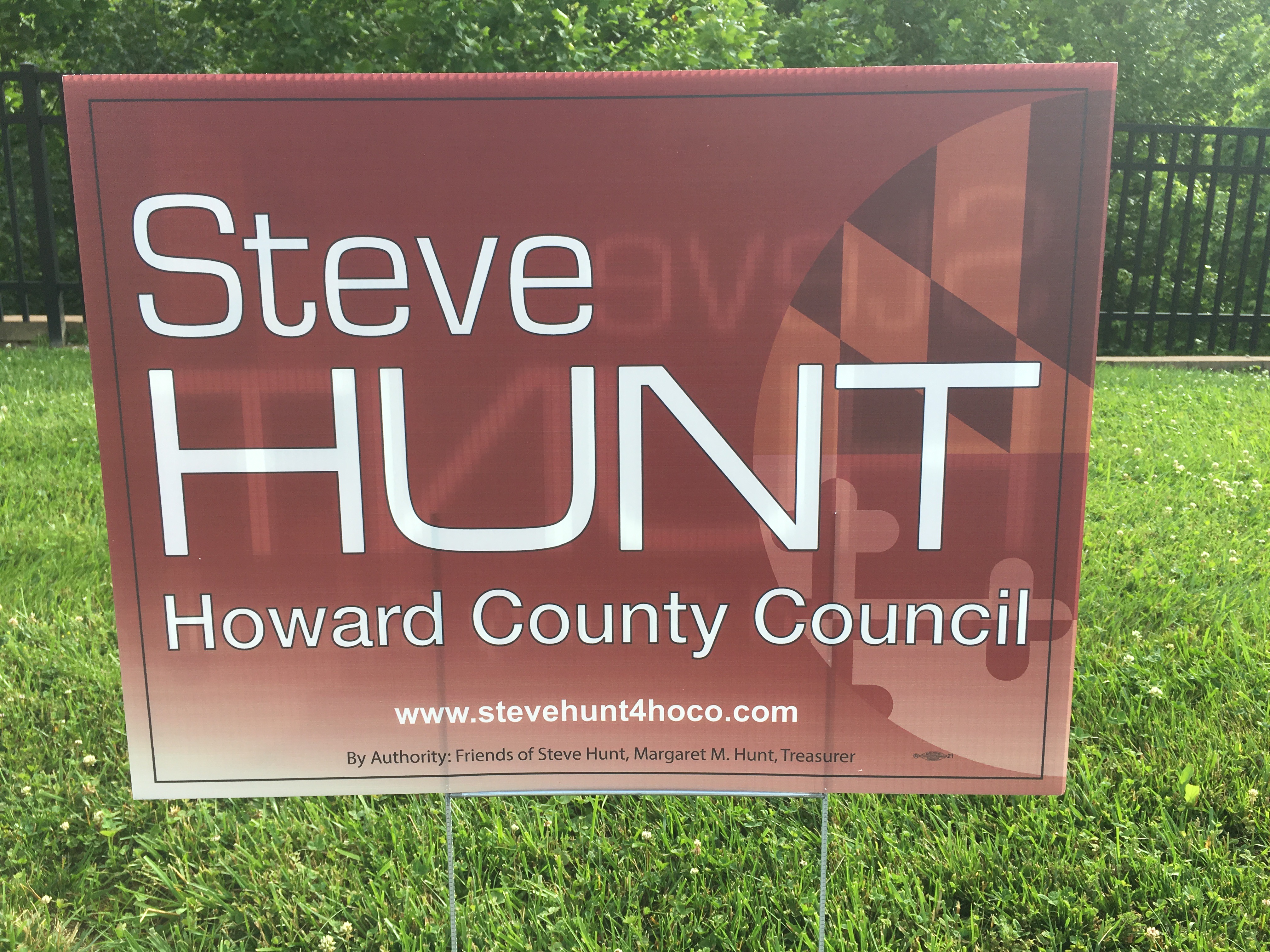
Steve Hunt, Democratic candidate for Howard County Council, District 3. (Click for a higher-resolution version.)
I think the typeface on this sign is too thin, and the Maryland flag design element on the right may be too subtle, but this sign has a problem that has nothing to do with the design itself: Apparently the material of which the sign is made is so thin/transparent that parts of the other side of the sign show through in reverse. It’s both disconcerting and makes the sign less readable.
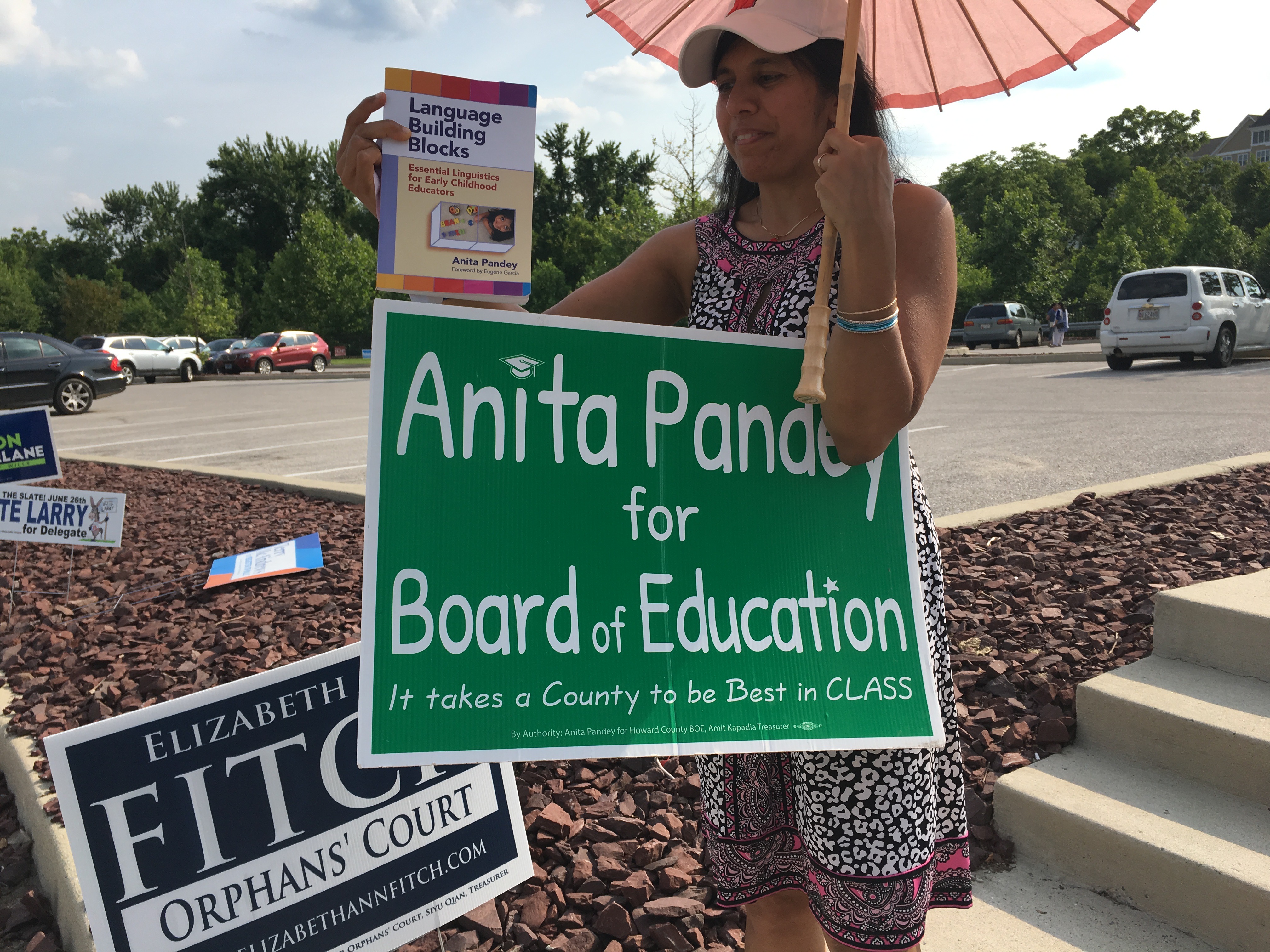
Anita Pandey, candidate for Howard County Board of Education. (Click for a higher-resolution version.) I was able to get a photo featuring Dr. Pandey herself (and her book).
This is the classic “chalk on blackboard” theme for a sign for a Board of Education race, a design last used by Bob Ballinger in the 2010 election, if I remember right. This version is a bit busier than Ballinger’s, mainly due to the slogan at the bottom, but otherwise it’s a good example of this particular type of sign, legible with an attractive color.
I’m not a big fan of slogans on campaign signs, but I have to admit that “best in class” is a good pun. I also like the little mortarboard design element taking the place of the “i” in “Anita.”
Note that on Facebook Anita Pandey pointed me to an alternate design for this sign. I couldn’t see it too well because the image was small, but it looked like the alternate version replaced the “i” in “Anita” with a more extensive design element that combines a scroll (representing a diploma, presumably) and mortarboard, both drawn in a more cartooney fashion. In my opinion the original version is preferable; its version of the mortarboard design element is more subtle and doesn’t pull focus from the candidate’s name.
I’ve now commented on 29 signs out of a total of almost sixty for which I have pictures. Hopefully it will be all downhill from here. Check Twitter and Facebook for the next article, and don’t forget to vote for the best sign of those discussed in this article.
UPDATE: Voting is closed. See part 7 for all the signs that advanced to the final round.