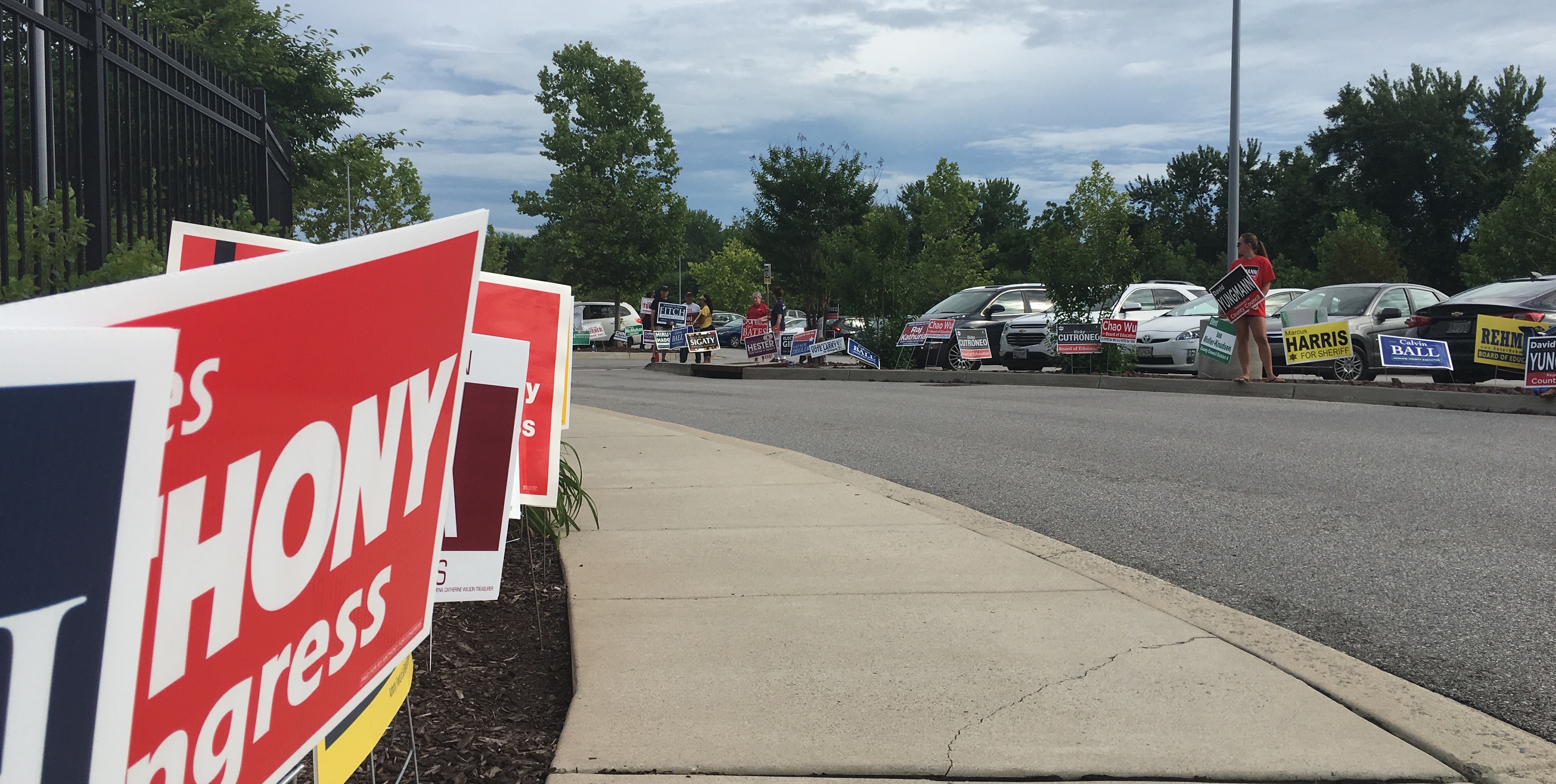
Campaign signs and canvassers at the Miller Branch library. (Click for a higher-resolution version.)
tl;dr: I’m in the home stretch now in the race to review Howard County 2018 campaign signs. This post features signs from Hiruy Hadgu, Natalie Ziegler, Jessica Feldmark, John Francis McMahon, Clarence Lam, James Howard, Liz Walsh, Ian Moller-Knudsen, Marcus Harris, and Jeremy Eldridge.
You should know the drill by now: ten signs, ten reviews, order is random, survey link at the end, more background at part 1.
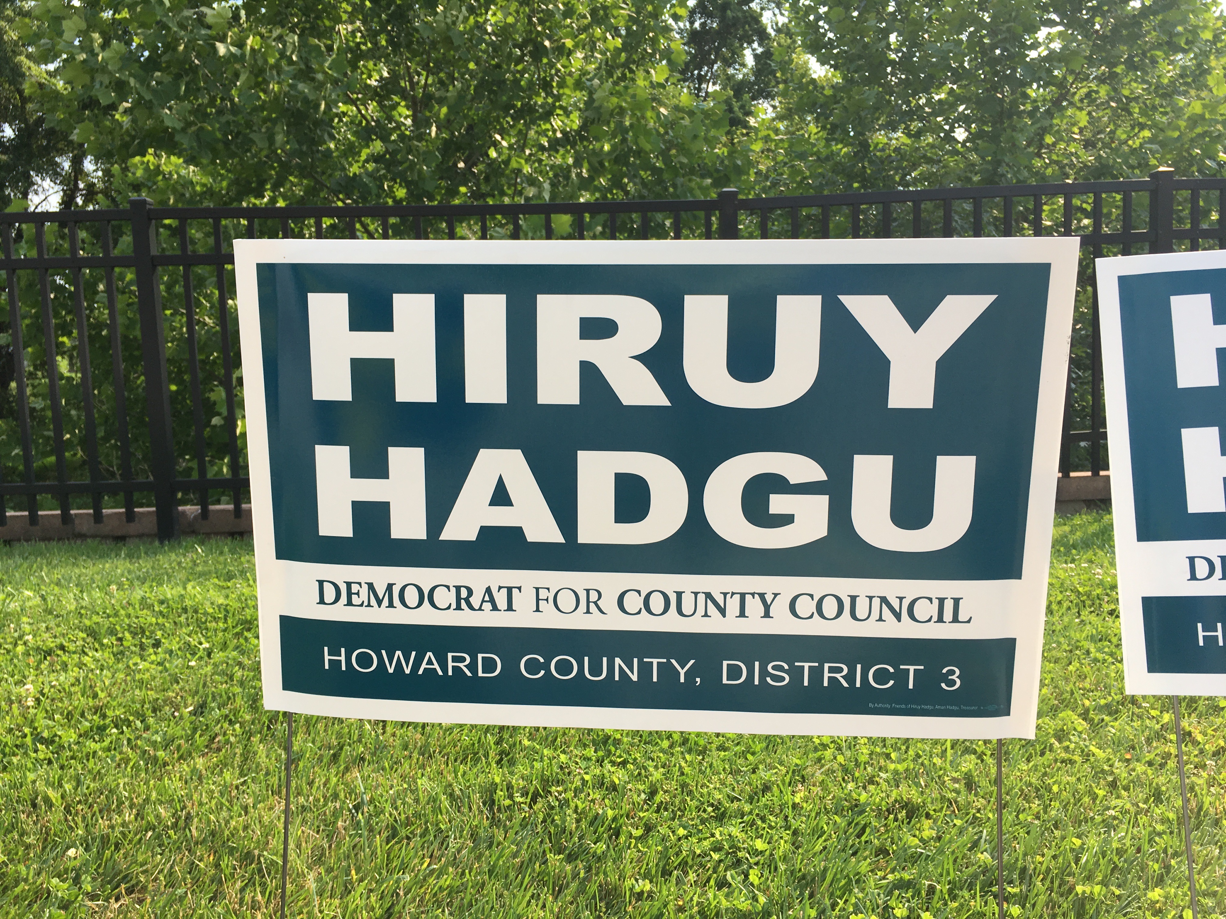
Hiruy Hadgu, Democratic candidate for Howard County Council, District 3. (Click for a higher-resolution version.)
The color is an unusual choice relative to other political signs, but I think it works well and gives a good contrast with the white lettering. You also certainly can’t fault the prominence and legibility of the candidate’s name—helped here by the fact that both first and last names have only five characters each.
The first name actually looks slightly larger than the last name. This appears to be due to the first name having an “i” rather than an “a”. Since all the other characters in each name are the same or of similar width, setting both names to the same overall width forces the last name to be slightly smaller to fit, since the letter “i” is narrower than the letter “a.”
The only thing I would question on this sign is the treatment of the “for” in “Democrat for County Council,” which is just set in a lighter version of the same typeface used for the rest of the line. It might have been better to set it in lower case and italics, a strategy used on other signs.
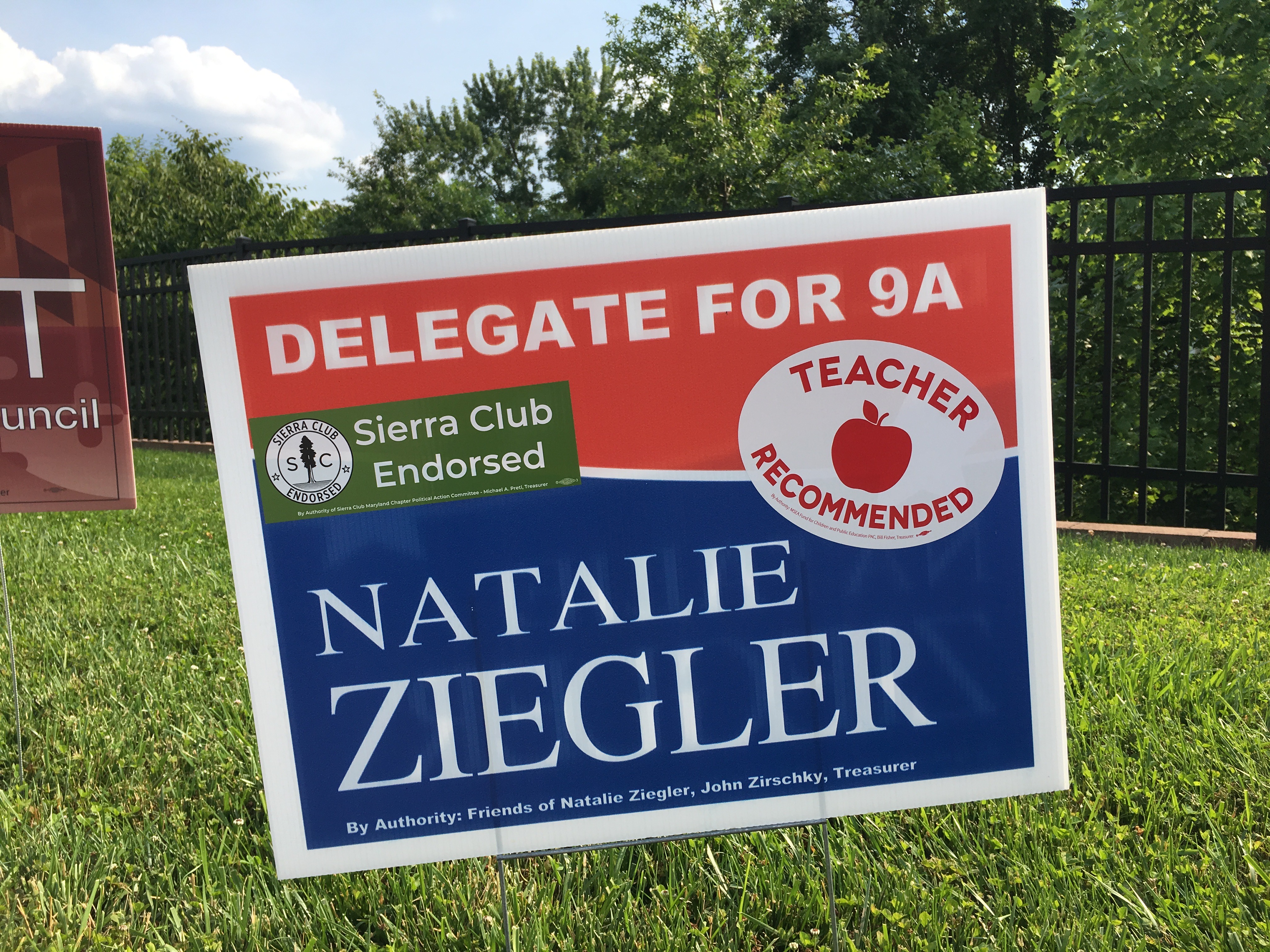
Natalie Ziegler, Democratic candidate for Maryland House of Delegates, District 9A. (Click for a higher-resolution version.)
Candidates love endorsements, but fans of candidates’ signs like me hate them because they often result in endorsement logos being slapped on signs and obscuring the design. That’s the case here, with the Sierra Club green in particular clashing greatly with the red and blue color scheme.
Although it’s interesting: if the endorsement logos weren’t there it looks like there’d be a lot of space between “Delegate for 9A” and “Natalie”. It’s almost as if the sign were designed to leave sufficient space for the logos.
Otherwise the sign looks fine. Note the inclusion of a thin white strip between to the red and blue parts of the sign to avoid directly juxtaposing those two colors and give the sign more of a “red, white, and blue” feel.
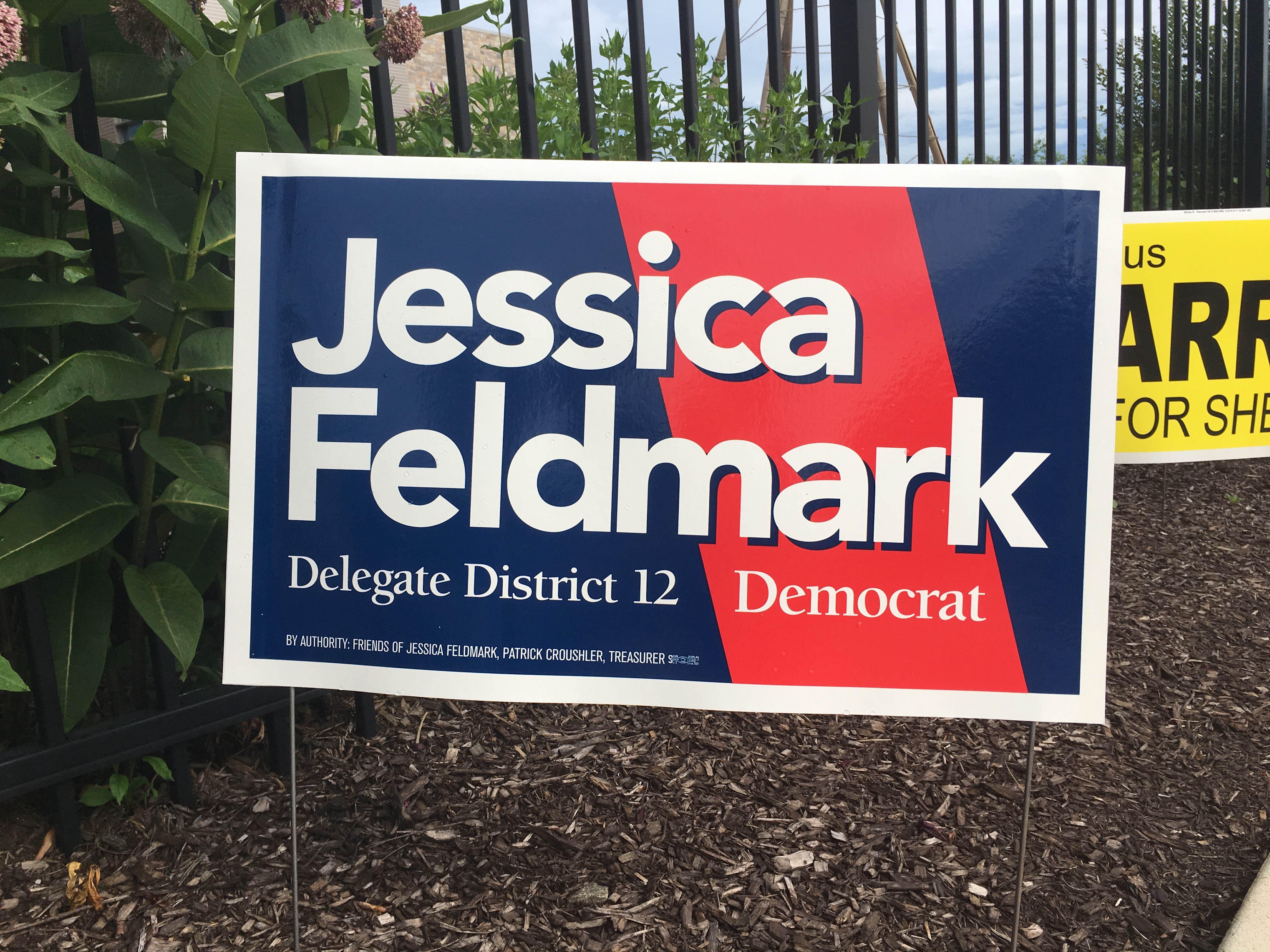
Jessica Feldmark, Democratic candidate for Maryland House of Delegates, District 12. (Click for a higher-resolution version.)
This sign takes a different approach, boldly interrupting a blue background with a diagonal slash of bright red. It also uses drop shadows on the text for “Jessica Feldmark,” a unique choice among 2018 signs, making the text seem to float above the blue and red background.
The overall result is a sign that looks good and stands out from the crowd.

John Francis McMahon, Democratic candidate for Howard County Sheriff. (Click for a higher-resolution version.)
There’s not a whole lot to say about this sign. The green background is common among Democratic candidates here and elsewhere, and the main typeface is legible and looks professional. The only design element is the badge icon within the letter “o”. Candidates for sheriff (almost?) always include some form of badge in their signs; this one is well-integrated into the overall design.
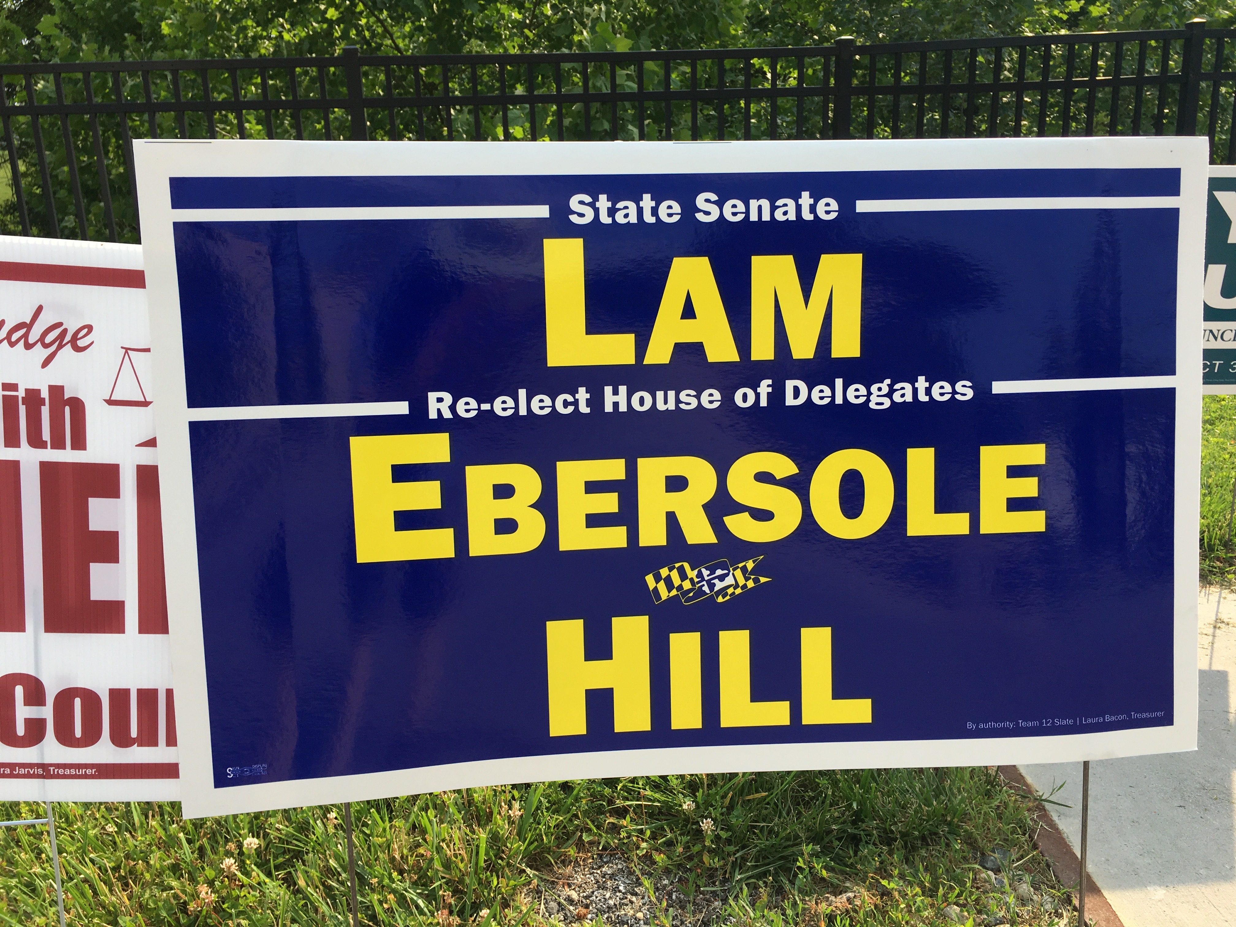
Clarence Lam, Democratic candidate for Maryland Senate, District 12, and Eric Ebersole and Terri Hill, Democratic candidates for Maryland House of Delegates, District 12. (Click for a higher-resolution version.)
This sign is very reminiscent of Clarence Lam’s 2014 sign: bold yellow text in the same sans serif typeface, a dark background to provide high contrast, and a small horizontally-centered banner-like design element to add some visual interest but not detract from the candidate’s name.
It’s worth noting that the 2014 signs for Eric Ebersole and Terri Hill were somewhat quirky and visually busy. Now that they’re on a slate with Clarence Lam they’ve adopted his philosophy of stripped-down “get it done” minimalism when it comes to signs. As with Lam’s 2014 sign, I don’t think this philosophy produces signs that are particularly attractive or interesting from a design perspective, but they are undeniably effective when it comes to the basic job of promoting the candidates’ names.
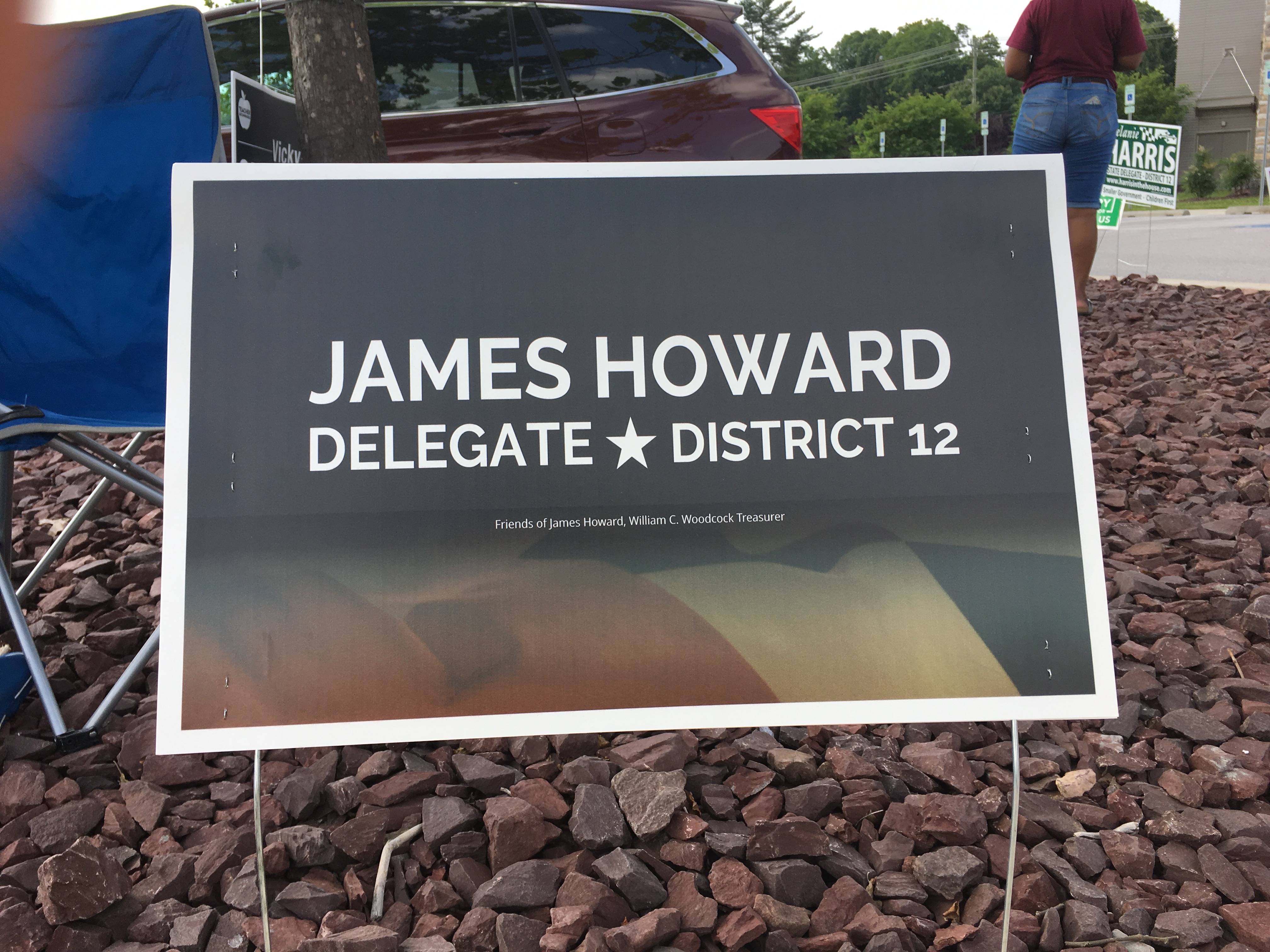
James Howard, Democratic candidate for Maryland House of Delegates, District 12. (Click for a higher-resolution version.)
This sign is in many ways the opposite of the Lam/Ebersole/Hill sign, and shows that there is such a thing as being too subtle from a design perspective. First, why is the candidate’s name so relatively small? There’s a lot of unused area on this sign that could have been devoted to text.
Second, what is the image on the bottom of the sign supposed to be? At first glance I thought it was an American flag. At second glance I thought it was a Maryland flag. Now I’m doubting even that.
If you’ve read this series thus far you’ll know that I like to see design sophistication and even elegance in signs. But I also think that to be effective as signs they need to be more “in your face” than this one is.
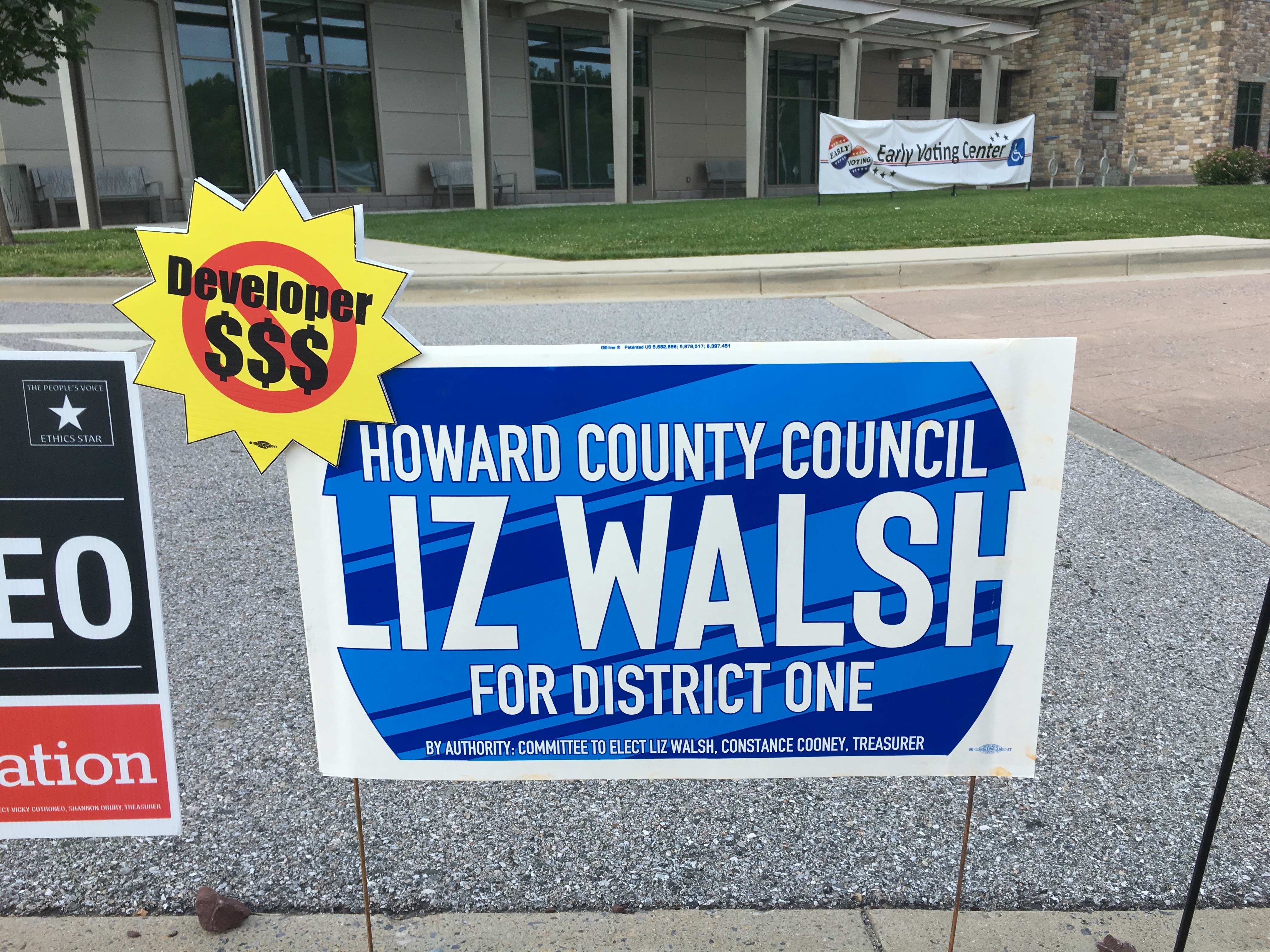
Liz Walsh, Democratic candidate for Howard County Council, District 1. (Click for a higher-resolution version.)
I chose the order of these signs randomly (or rather, my computer did it for me), but it’s almost as if the order were designed to help me make certain points. Here’s a good example of a sign that employs sophisticated design in the service of highlighting the candidate.
There are at least four separate design “tricks” in the sign. The first and most prominent is the use of a light blue background with dark blue diagonal stripes (or a dark blue background with light blue stripes, depending on how you look at it). This is very attention-grabbing, almost looking like a glossy metallic surface over which the white text floats.
The second is the rounded corners on the background, reminiscent of an old-style TV set. By leaving the actual corners of the sign blank, this focuses attention on the middle of the sign where the candidate’s name is located.
The third is having the vertical stems of the letters “L” and “H” flow into the white border. (This was made possible in the first place because of the particular forms of those letters, and because “Liz Walsh” is a short enough name to fit on one line.) This impairs readability of the name just a tad, but produces a striking effect.
Fourth (and most subtle) is the thin black (?) outline on the white letters of the text. This helps to separate the letters from the light blue/dark blue background and make them “pop.”
Finally, the sign shows a good strategy for handling endorsement logos and other ancillary sign elements: don’t put them on the sign itself, but attach them to a corner where they’re prominent but don’t obscure the main part of the sign.
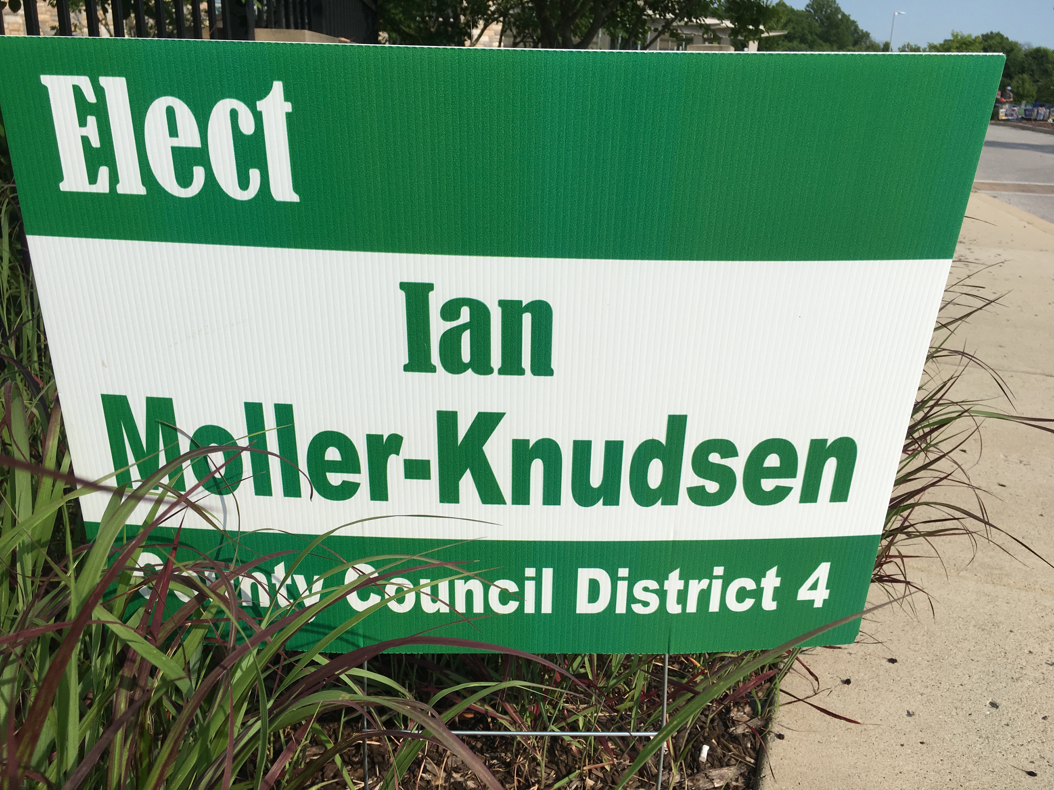
Ian Moller-Knudsen, Democratic candidate for Howard County Council, District 4. (Click for a higher-resolution version.)
We’re now back to relatively plain signs. The sign designer here faced the problem that “Moller-Knudsen” is a long name that’s hard to fit on a sign without making the text relatively small. Some signs address that problem by breaking the name at the hyphen and splitting it across two lines—see for example the 2014 sign for Renée McGuirk-Spence.
I think a similar strategy could have been followed for this sign, especially since “Moller” and “Knudsen” are almost the same length. The extra line required could have been compensated for by removing the “Elect” text in the upper left corner. As it is that text sits all by itself and occupies space and visual attention that could instead go to the candidate’s name and office sought.
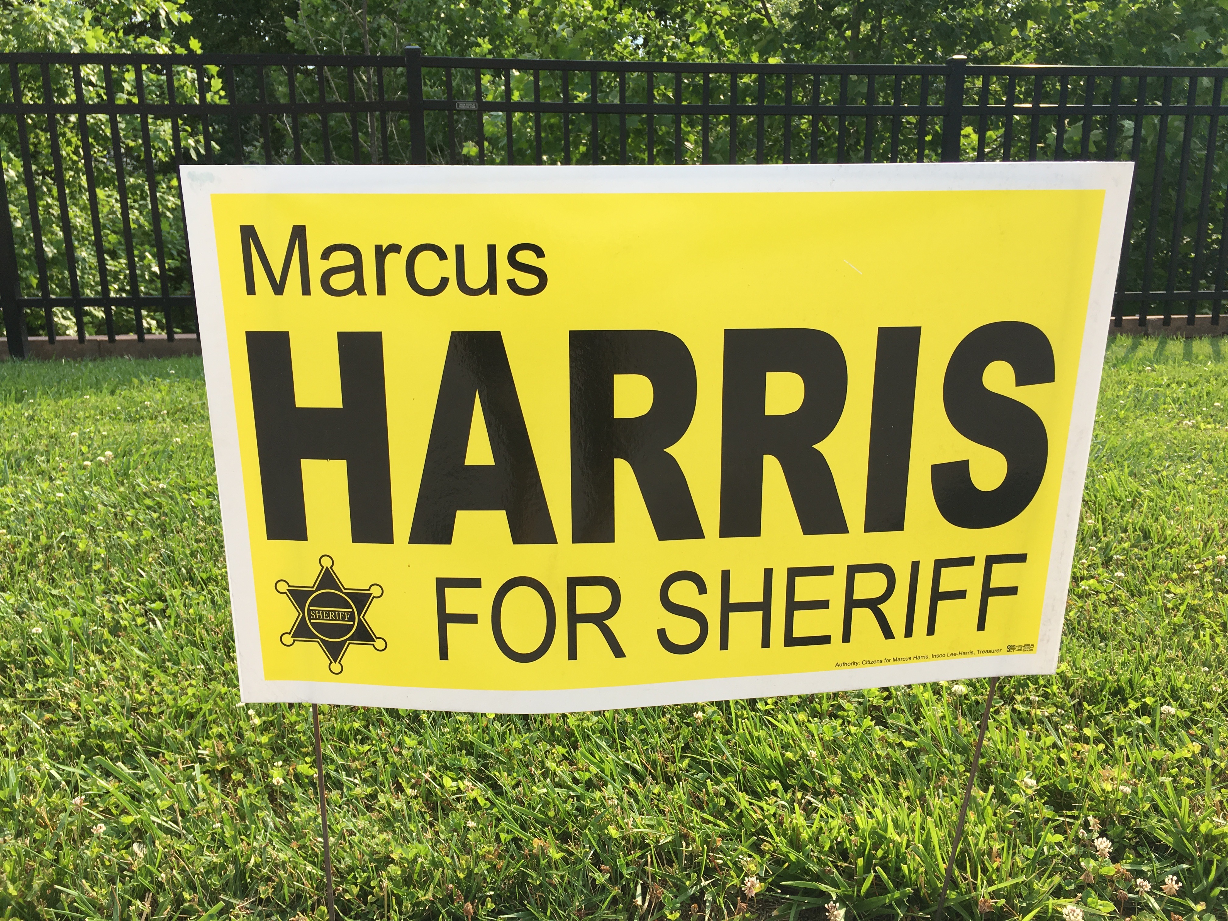
Marcus Harris, Democratic candidate for Howard County Sheriff. (Click for a higher-resolution version.)
There seems to be an unwritten rule that candidates for Howard County Sheriff should use signs that consist of black text on a yellow background with a sheriff’s badge. Jim Fitzgerald had signs like this both in 2010 and 2014. (John Newnan had one in 2014 that reversed the scheme and used yellow on black.)
In this cycle the tradition is continued by Marcus Harris and (as we’ll see in the next post) Bill McMahon, while John Francis McMahon goes his own way (as seen above). Harris’s sign has the key elements, with the name displayed prominently and legibly in a conventional san serif typeface. The yellow is bright and not muddy, and the sign also has a white border, which I think always helps the main part of the sign stand out more. (At least one of Jim Fitzgerald’s signs didn’t have such a border, and I think suffered for it.)

Jeremy Eldridge, candidate for Howard County Democratic Central Committee. (Click for a higher-resolution version.)
The last sign for today is another sign for a Central Committee Candidate. I think the design for this sign flows from the candidate’s name being relatively long at eight characters and the choice to use all caps for the text. That means that the area for the name on the sign has to be relatively small (unless the letters were stretched vertically) and the designer has to fill the rest of the sign with other elements.
In this case the chosen strategy was to divide the sign horizontally into three areas of equal height, with the office sought and authority line in the bottom section and “Vote for” in the top section. It’s a reasonable approach, with my only nit being that the sign looks a little bottom-heavy because of the large amount of text in that section relative to the middle and (especially) top sections.
Otherwise the sign looks fine: the colors are attractive and the typography looks clean and readable.
49 signs reviewed thus far, and 9 to go; the next post should cover
all the rest of them. Check Twitter and Facebook for the next article, and don’t forget to vote for the best sign of those discussed in this article.
UPDATE: Voting is closed. See part 7 for all the signs that advanced to the final round.