The RStudio Cloud service provides a web-based alternative to installing the RStudio desktop software, and includes tutorials for using the R statistical language and the Tidyverse set of functions. (Click for a higher resolution version.)
tl;dr: Everyone can now work with data and visualize it. Should you?
NOTE: This article was originally published in my Civility and Truth Substack newsletter. I have republished it here without changes.
I haven’t had time yet to look at the detailed median household income data for Howard County (for which I’m going to try to do some maps of income by census tract), so that will have to wait for a future post. In the meantime I wanted to talk a bit about how I do these visualizations, how you can do them too if you have the time and interest, and what I’ve learned in the process.
Easy data analysis and visualization for free
Once upon a time anyone wanting to do serious statistical analysis and graphic visualization of data needed to purchase a license for proprietary software products like SAS or SPSS that cost hundreds or even thousands of dollars per user. The traditional alternative for most users was Microsoft Excel, which included at least a basic set of statistical functions and graphing operations. However it was still not exactly cheap, especially for home users, and given its origin in accounting spreadsheets it was not really that suitable for advanced statistical and data visualization work.
R and the tidyverse
What has changed from then until now? First, noncommercial alternatives arose to SAS, SPSS, and similar products, most notably the R statistical programming language and its associated runtime environment. Unlike SAS and SPSS, R was developed through an open collaborative process in which anyone could participate, and the resulting software was distributed in both binary and source form at no charge. R relatively quickly gained many users, and today it is pretty much the most popular language (along with Python) for so-called “data science” projects.
Unfortunately as a programming environment R is relatively difficult to use, especially for people coming to it as a first language. The second advance was to simplify the use of R by dictating a particular way of programming in it. This was accomplished by the statistician Hadley Wickham and his colleagues, who developed a set of R extensions or “packages” known colloquially as the “Hadleyverse” and now renamed as the “tidyverse.”
The tidyverse packages implement a simplified philosophy for working with data, basically treating all data as sets of tables whose rows and columns can be manipulated in various ways, with the output of each manipulation producing a new table used as input to the next manipulation. The tidyverse packages also include an accompanying set of functions (“ggplot” and others) to graph data in various ways, again adhering to a particular philosophy of how to transform data into visuals.
Data analysis and visualization as a service
So-called “free and open source” software products like R and the tidyverse packages are a godsend for people like me who can’t or don’t want to pay for expensive proprietary software. But to paraphrase a former colleague of mine, free software is only free if your time has no value: the time and effort spent downloading, installing, and configuring software can be daunting, especially for a casual user who just wants to do a basic data plot. This is especially true if you want to do more advanced things, like displaying data on maps.
To address this issue Hadley Wickham and his colleagues founded a startup, RStudio, to lower the barriers to widespread use of R and the tidyverse packages. Their first product, also called RStudio, provides a web-based interactive development environment (IDE) to simplify creating R-based data analyses. In its RStudio Server version it allows an organization to stand up a central web site to which users can connect and use R, the tidyverse packages, and other R-based capabilities without having to install software on their own PCs.
However, RStudio Server removed a burden from end users only to place it on the people charged with standing up the server system with all its necessary software. That was fine for larger organizations, but a problem for small businesses, not to mention individual users.
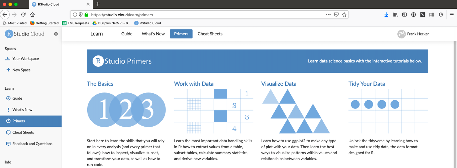
To address that issue RStudio is now developing a new service, RStudio.cloud, currently being made available for testing by the public. With RStudio.cloud all you need is a browser: the R and RStudio software is already pre-installed for you, with additional packages easily installable on the service if and when you need them. RStudio.cloud also includes a full set of interactive tutorials (see the graphic above), so that anyone who’s familiar with (say) working with Excel spreadsheets, formulas, and macros can learn to do basic data analyses and visualizations.
(If you want to try RStudio.cloud yourself, you can sign up for a free account. and work through some of the interactive tutorials. If you want to explore a non-trivial project, I’ve shared a version of my “hocodata” project on RStudio.cloud for others to access.)
Public data for public use
Of course, it’s not enough to know how to do data analyses and visualizations. You also need some actual data to work with. Here, as in other areas, government (local, state, and Federal) has come to the rescue—though not always, and not always completely.
Government’s “data exhaust”
Governments by their nature generate a lot of data about the jurisdictions over which they hold sway. The most notable (and ancient) example of this is the census, which has gone from being a simple count of people to collecting all sorts of relevant demographic, economic, and other data about populations.
Governments also collect a lot of other data in the course of their operations, for example about crimes both serious and petty, building permits and zoning decisions, the locations of fire hydrants and streetlights, and so on. Traditionally this data was generated and kept as paper documents, but now it is almost always generated and stored as digital files or as entries in a digital database—a sort of “data exhaust” that is emitted by the day-to-day running of governments.
Having generated this data, it’s natural for governments to consider giving citizens access to it. In some cases this is part of an overarching strategy to improve visibility into the workings of government. A good example is the “HoCoStat” system proposed by former Howard County Executive Allan Kittleman during his successful 2014 campaign.
In other cases government just takes data and makes it available without an overall strategy—after all, the data is being produced in digital form already, whether that be as Excel spreadsheets or in some other form, and the incremental work to make it publicly available may not be that large. For example, although the full HoCoStat system was never deployed, under Allan Kittleman Howard County did stand up a new OpenHoward site that collected data produced by various Howard County agencies. Somewhat confusingly, there is also a separate site data.howardcountymd.gov that also hosts a variety of data provided by the Howard County GIS division—another project that appears to have been done as an incremental effort.
However, governments do not always make data available, or make it available only in inconvenient ways, for a variety of reasons. For example, some government agencies release data only in the form of PDF documents, the electronic equivalent of traditional paper reports. These can be relatively difficult to extract data from. In other cases data may be displayable on a public web site, but with no way to download it in a more convenient form.
But even here people have created automated ways to access data even in odd formats, whether that be extracting tables from PDF files or “scraping” it off of web sites. The result is yet more data to add to that available from more convenient sources.
The downside of data
So with all this data available, and free ways to analyze it, are we living in utopia (at least as far as data analysis and visualization are concerned)? I don’t really think so: there are downsides to having lots of data to analyze just as there are downsides to not having it.
First, we tend to think that data is more accurate and reflective of reality than it actually is. For example, take the median household income estimate for Howard County and comparable estimates for other counties. In 2017 the estimate for Howard County median household income was $111,473 while the estimate for Stafford County, Virginia, was $112,795, or $1,322 more. This difference was enough to propel Stafford County into the list of top ten counties by median household income, and knock Howard County out of it.
But the margins of error for these estimates were $2,666 for Howard County and $5,081 for Stafford County. There’s therefore a good possibility that Howard County and Stafford County had pretty much equal median household incomes for 2017, and a fair chance that Howard County’s median household income was actually higher than Stafford County’s.
This failure to take margins of error into account is ubiquitous in people’s treatment of data (and I’ve been guilty of it myself). It’s not that significant an issue with respect to median household income estimates, but it can be a big deal indeed when it comes to data measurements that drive funding and personnel decisions, as with student test scores. It’s quite possible that many if not most of the reported test score increases and decreases that are alternatively lauded or derided are actually just random year-to-year fluctuations that don’t reflect any underlying change in students’ ability to learn or teachers’ ability to teach.
School test scores provide another reason not to put too much faith in data: When data measurements are used to drive rewards and punishments, the temptation to game the measurements in various ways can be irresistible. With school test scores such gaming can range from “teaching to the test” up to outright fraud, as shown by scandals around the US. We now have to account not only for the possibility of random fluctuations, which are relatively benign in origin, we also have to assess to what degree the data might be fraudulently measured or reported.
Finally, in many cases we should question ourselves as to whether some data is actually useful, or should be used. For example, do student test scores actually tell us anything useful? Would it be better not to do student testing at all, or to restrict it to certain narrow purposes? One benefit of working directly with raw data, as opposed to consuming pre-cooked graphs and tables prepared by others, is that it can give you a good sense of the limits to what data can tell us.