Click for a higher-resolution version. Graph by Frank Hecker, made available under the CC 1.0 Universal Public Domain Dedication.
tl;dr: I look at median household income within Howard County, Maryland, and how it has changed.
I’m continuing my look at median household income, in pursuit of my ultimate goal of learning more about the issues around housing affordability in Howard County.
After my previous post about Howard County median household income compared to other local jurisdictions, I now turn my attention to looking at median household income within the different parts of Howard County. Unfortunately data at the census tract level (the next level below county level as far as the US Census Bureau is concerned) doesn’t go back very far, and has some issues that make analysis more difficult.
First, median household income estimates for census tracts are not available before 2009, at least for Howard County. Second, the boundaries for Howard County census tracts changed from 2009 to 2010 (presumably as part of the work on the 2010 census). (Fortunately, the census tract boundaries have been stable since then.)
Also, figures for median household income for census tracts are available only in the American Community Survey 5-year estimates. There are no 1-year estimates available as there are for counties and cities. This means that the 2010 median household income estimates published for Howard County census tracts actually reflect income surveys in the years 2006–2010, the 2011 estimates reflect surveys in the years 2007–2011, and so on. For this reason the US Census Bureau recommends not comparing 5-year estimates from overlapping sets of years, for example comparing 2011 5-year estimates to 2010 5-year estimates.
I’ve therefore chosen to compare only the 2010 and 2017 5-year estimates, in order to get both the earliest and latest comparable data.
Next, the margins of error for median household income at the census tract level are very high, typically 10–20% or even higher relative to the base income figures. That means that ranking individual census tracts based on their median household income doesn’t really make sense, given that the relative positions of tracts on the list will in large part reflect random measurement errors.
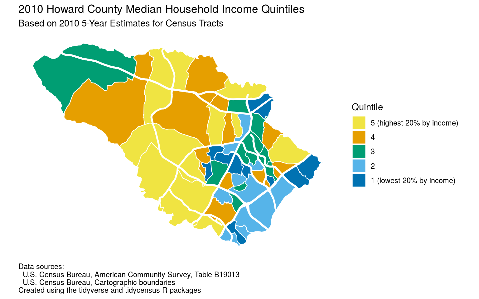
Finally, there are 55 census tracts in Howard County, one for every 6,000 people on average. (The 2018 ACS population estimate for Howard County is about 323,000 people.) Graphing information on individual census tracts makes for a cluttered graph, unless you either plot data on a map or group census tracts together in some way.
In the map above I did both: I took the 55 census tracts and divided them into 5 groups or “quintiles” of 11 census tracts each, based on their median household income 5-year estimates for 2010. Quintile 1 contains the 11 census tracts with the lowest median household incomes and quintile 5 contains the 11 census tracts with the highest median household incomes, with the other quintiles containing tracts with income values intermediate between the lowest and highest.
I then plotted the census tracts on a map of Howard County, with each tract colored according to the quintile it’s in.1 The results are as one might expect: the census tracts with the lowest median household incomes tend to be in eastern Howard County and/or in Columbia, while the tracts with higher median household incomes tend to be in western Howard County.
Click for a higher-resolution version. Graph by Frank Hecker, made available under the CC 1.0 Universal Public Domain Dedication.
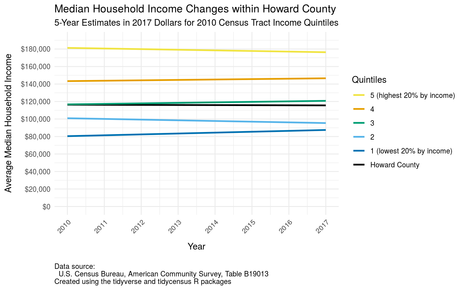
How did the median household income for the various census tracts in Howard County change from 2010 to 2017—or, more correctly, from the 2006–2010 timeframe to the 2013–2017 timeframe?
The graph above shows one way to look at this: I took the income quintiles from above, computed the averages of the inflation-adjusted median household incomes for the census tracts in each quintile, and graphed the results for 2017 compared to 2010. Thus, for example, for the census tracts in quintile 1 (the lowest-income quintile) I computed the average from the 2010 5-year estimates of inflation-adjusted median household income for all of those 11 census tracts. I computed similar averages for the other quintiles, and then repeated the process using the 2017 5-year estimates.
As a side note, averaging the median incomes in this way is not strictly speaking correct. The correct method would be to aggregate all the individual household incomes for all the tracts in a quintile, and then compute a median household income for the quintile overall. However this is not possible because the US Census Bureau does not release data for individual households within a census tract. Averaging the median household incomes for the tracts is the next-best thing.
There’s another subtlety here as well: Many graphs showing changes between income quintiles over time actually reflect different sets of people, households, or geographies between the different timeframes. For example, if in the graph the 2010 figures were to reflect the quintiles as they exist in 2010, and the 2017 figures were to reflect the quintiles as they exist in 2017, then we would not necessarily be comparing like to like. That’s because a given census tract may have moved from one quintile to another over time.
To avoid this problem I had the 2017 values in the graph reflect the income values for the same sets of quintiles as for the 2010 values: if a census tract were in, say, quintile 3 in 2010 then it was counted as part of the same set of tracts for 2017.
Take-aways from this graph (and the underlying data, not shown here) are as follows:
- The Howard County census tracts in the lowest quintile in 2010 (i.e., those with the lowest median household income) had a substantial increase in average (real) median household income between the 2006–2010 and 2013–2017 time frames, amounting to about a $7,000 increase in real terms or a 9% increase in percentage. This was actually the largest increase of any of the quintiles in both absolute and percentage terms.
- On the other hand, the census tracts in the next-to-lowest quintile in 2010 (quintile 2, just above quintile 1) experienced the largest decline in average (real) median household income between the two time frames in both absolute and percentage terms, about $6,000 or 5%.
- The census tracts in the highest quintile in 2010 (quintile 5, the 20% of census tracts with the highest median household income) had a slight decrease in average (real) median household income between the two time frames, about $5,000 or 3%.
- Finally, the census tracts in the other higher-income quintiles (quintiles 3 and 4) had slight decreases in average (real) median household income.
The first item above is somewhat counterintuitive: does it mean that relatively less affluent people in Howard County actually did better income-wise between 2006–2010 and 2013–2017 than more affluent people? That’s one possible interpretation, but not the only one, and I suspect not the most likely one.
Remember that even though the census tracts may not have changed between the 2010 and 2017 5-year estimates graphed above, the people living within those census tracts did not necessarily remain the same. In particular, it’s possible that many people living in the least affluent census tracts experienced a decline in household income so severe that they could no longer afford to live in Howard County.
Under this hypothetical scenario the people who left would presumably then be replaced by people with slighter higher incomes who could afford to live in Howard County. As a result of this turnover the median household income of these least affluent census tracts would then increase, because the least affluent residents of those tracts would have moved to other counties.
This hypothetical scenario would also explain the difference between the experiences of the quintile 1 census tracts vs. the quintile 2 census tracts: Unlike those in quintile 1, the people in the quintile 2 tracts were presumably not “on the bubble” in terms of their being able to afford to live in Howard County. They may have suffered declines in household income between the two time frames, but those declines were not so large as to force them to leave the county.
Click for a higher-resolution version. Graph by Frank Hecker, made available under the CC 1.0 Universal Public Domain Dedication.
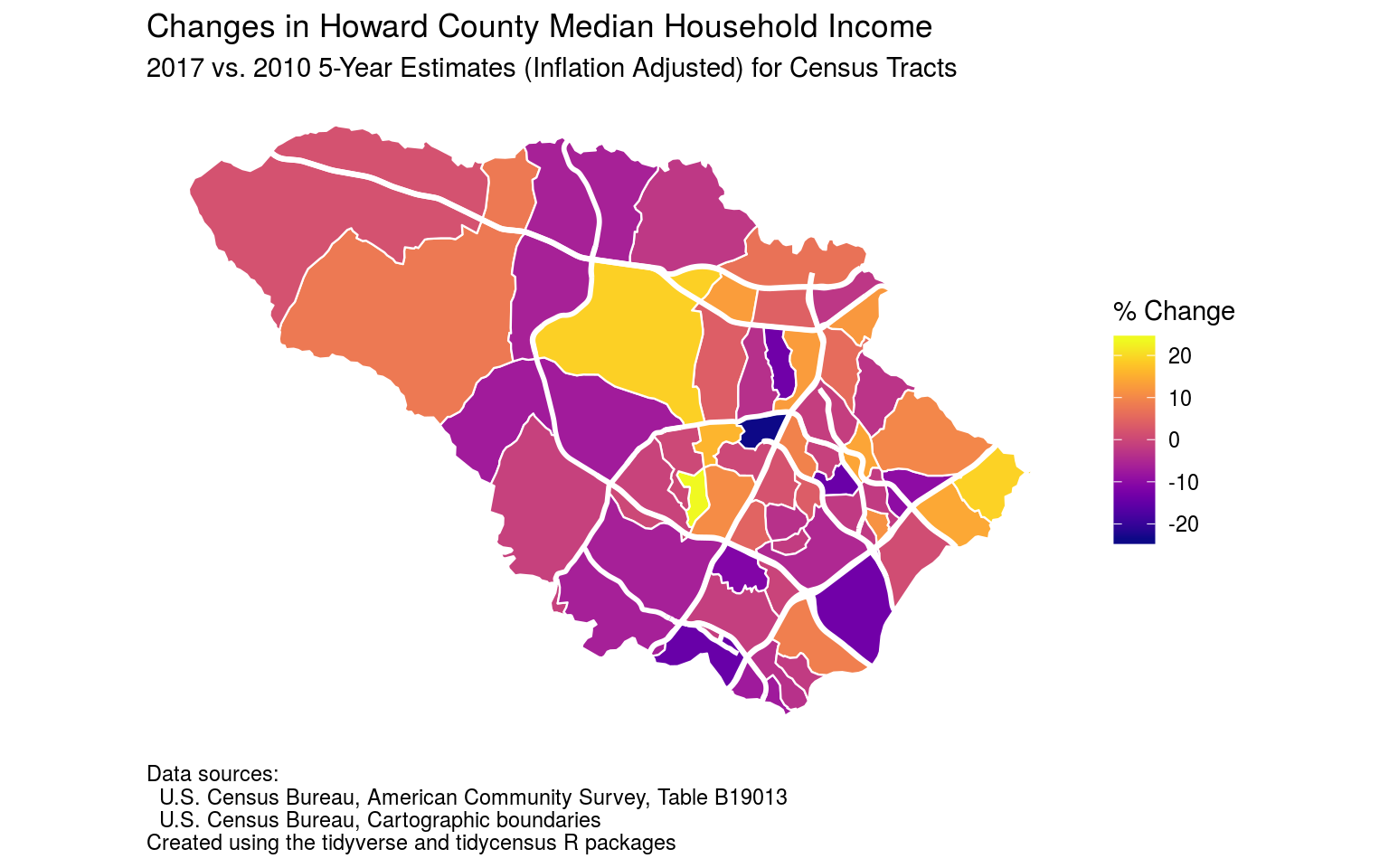
This next map shows changes in median household income between the 2010 and 2015 5-year estimates for each census tract, expressed in percentage terms. Again the calculated changes are based on median household incomes in constant 2017 dollars, so they reflect real changes rather than changes due to inflation.
Harking back to the discussion above, note that two of the census tracts with increases in median household income were those in Elkridge east of I-95 and north of MD 100. These were in quintile 1 (lowest 20% of all tracts by income) in 2010. On the other hand, the census tract east of I-95 between MD 32 and MD 175, which was in quintile 2 in 2010, experienced one of the largest declines in median household income.
Click for a higher-resolution version. Graph by Frank Hecker, made available under the CC 1.0 Universal Public Domain Dedication.
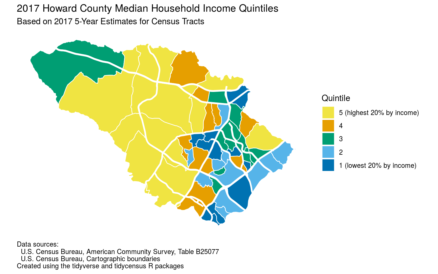
This final map, like the first map above, shows Howard County census tracts in the different income quintiles, this time based on the 2017 ACS 5-year estimates for median household income instead of the 2010 estimates.
Note that of the three census tracts discussed above, the first two moved up from quintile 1 (as measured by the 2010 estimates) to quintile 2 (as measured according to the 2017 estimate), while the third moved down from quintile 2 to quintile 1.
I’m done with looking at median household income, at least for now. In my next post I’ll turn my attention to median home values.
Further exploration
For more on how I created the graphs above, see the following:
- “Howard County median household income trends by census tracts” shows the R code used to produce these and other graphs.
- My hocodata code repository includes copies of the R Markdown files for this and another analyses. (Look in the “affordability” subdirectory.)
- If you sign up for a free account on the Rstudio.cloud service you can open and make a copy of my hocodata project for this and other analyses, and try your hand at it yourself. (Again, look in the “affordability” subdirectory, and check out the RStudio primers to learn how to use the system.)
I included some major Howard County highways on the map to help readers orient themselves. However to reduce clutter I included only highways that are also census tract boundaries along part or all of their length. That’s why highways like US 1 and MD 97 are not displayed. ↩︎