A selection of online comments referencing the alleged 5,000 missing affordable housing units in Howard County, Maryland. In the center is the original paragraph that presumably inspired these comments. Click for a higher-resolution version.
UPDATE 2024/01/04: This post originally appeared on my Civility and Truth Substack newsletter. I’ve moved it to my main site in an effort to collect all of my writing in one place.
tl;dr: The story behind the claim that Howard County needs 5,000 more affordable units.
If you’ve been following Howard County matters you’ve probably heard someone claim that there’s a shortage of over 5,000 (sometimes 5,500) affordable housing units in the county. Have you ever wondered where that number came from? What it means? How it was calculated? If so, I am here to (I hope) shed some light on these questions.
To answer the first question, this estimate is from the 2018 Howard County Rental Survey commissioned by the Howard County Housing Commission. (Thanks go to Tom Coale of the Elevate Maryland podcast for indirectly providing me this clue.) More specifically, it’s from pages 81–82 of that document, which is worth quoting at length:
There are 1,250 multifamily subsidized rental units and another 1,886 multifamily rental units that are rent-restricted. Additionally, Howard County administers approximately 1,350 tenant-based Housing Choice Vouchers (HCV) of which 800 are county vouchers and 550 are Port-In vouchers from other jurisdictions. Assuming the unlikely scenario that no vouchers are used at tax credit communities, a combined 4,486 units are available to support the 9,545 low to moderate-income renter households in the county, leaving a gap of over 5,000 units, which provides a context for the county’s HCV waiting list of a comparable length.
So there you go. This appears to be the definitive number that’s bandied about (although I’ve also seen the number 5,500 used a couple of times): 1,250 plus 1,886 plus 1,350 adds up to 4,486 (affordable rental units), and 9,545 (households) minus 4,486 equals 5,059, the size of the claimed gap. (I’m not sure where the number 5,500 comes from. It may just be someone misremembering the report’s conclusion.)
Two additional points: First, the figure of 9,545 low to moderate-income renter households is from Table 11 on page 19, and comes from adding 2,524, 1,870, and 5,151, the numbers of rental households earning less than $15,000, between $15,000 and $25,000, and between $25,000 and $50,000 respectively. (In comparison, the number of rental households earning more than $50,000 is 22,813.)
Second, the 5,000 figure is buried in the conclusion of the housing survey analysis, not highlighted in the introductory summary. If you didn’t have the patience to read through the previous 80+ pages of very number-heavy text you would have missed it. That’s pretty casual treatment for a number that’s since received so much attention from politicians and activists.
You can stop reading here if you want to. But if you’re interested in exploring more of the story, including the “penetration rate” analysis discussed in the rental survey and whether or not the market for housing looks like the market for other goods and services, read on.
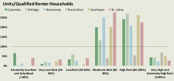
Let’s start with this graph, Figure 12 on page 80 of the survey, part of section D, “Penetration Rate Analysis.” (It’s also duplicated on page viii of the Executive Summary.) To quote from the beginning of that section,
By dividing the number of units in a specific affordability classification by the number of renter households that can afford or qualify for a unit at that price point, the penetration rate can tell us the extent to which renter households at particular income bands are adequately served by the existing supply.
For example, according to the graph, there are few “low rent” units targeting families earning 50-60% of the area median income, relative to the number of such families. In contrast, there are lots of “moderate rent” units targeting families earning 60-80% of the area median income, again relative to the number of such families. The former income range is said to have a low penetration rate (under-supplied), and the latter income range to have a high penetration rate (over-supplied).
(The survey divides Howard County into multiple sections and presents penetration rates for each one. Also, the “area” in “area median income” refers to the general Baltimore metropolitan area, not to Howard County specifically. Thus a household making less than 60% of the area median income actually makes significantly less than that compared to the Howard County median household income.)
There are several factors and assumptions associated with this analysis. Let’s explore this a bit more, moving from housing to other goods and services. As I see it, the penetration rate analysis used in this survey and elsewhere rests on one fact—that households vary in their income—and two assumptions: that in a free market profit-seeking businesses (but not necessarily the same businesses) will produce goods affordable to all households no matter their income range, and that in a free market the supply of goods targeted to households of a particular income range should at least roughly match the number of households in that income range.
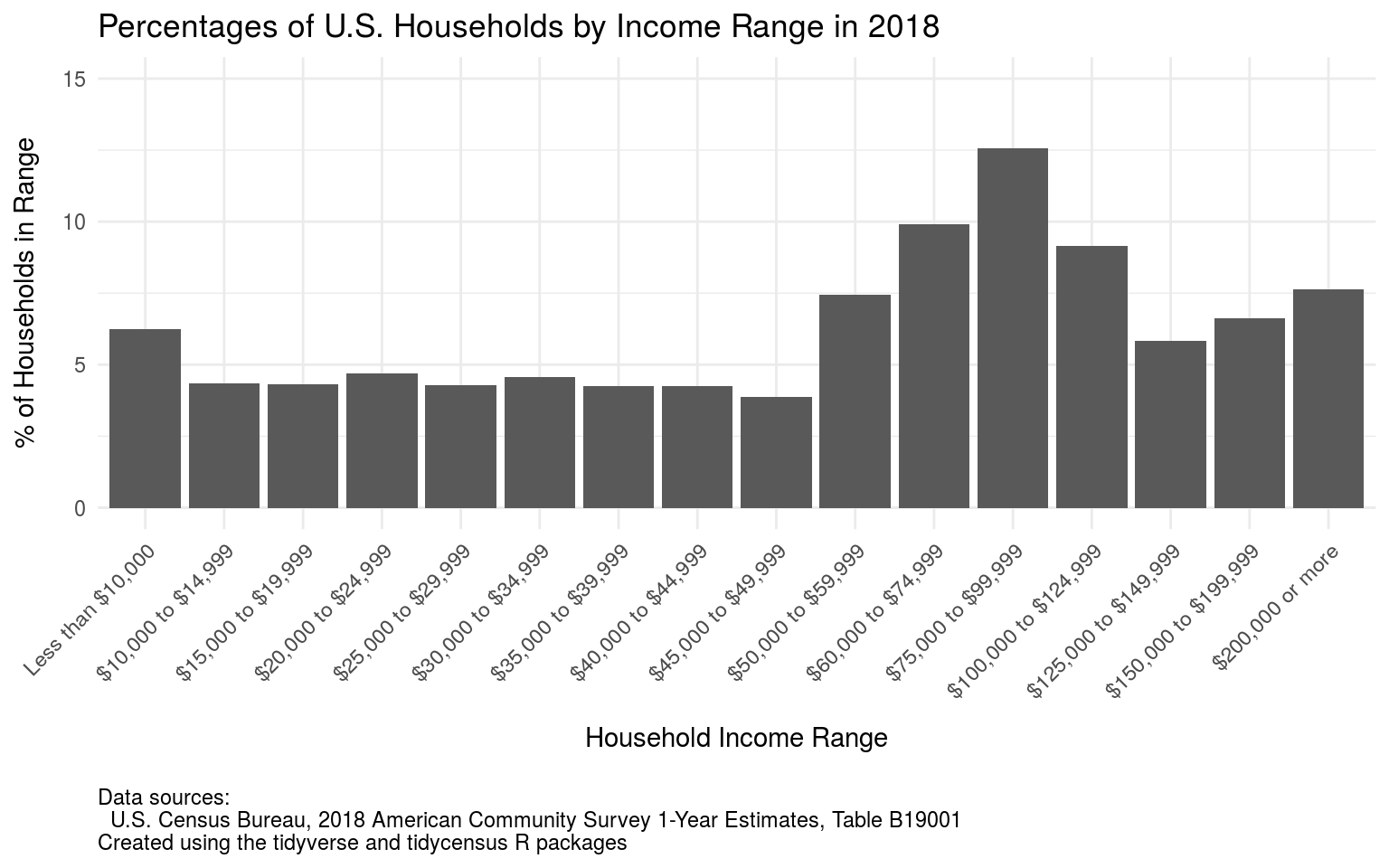
Clearly households have a wide range of household incomes, as shown by the graph above, which displays the percentage of US households that have household incomes in certain ranges. (The definitions of the various income ranges are from the US Census Bureau, and reference household income before taxes.) As for the potential market for goods and services targeted to lower-income households, almost half of all US households have household income of less than $60,000 (the US median household income is about $62,000), and based on the graph it looks as if 20-25% of households have incomes of less than $30,000.
These are fairly large markets, and in a market economy it seems as if some businesses somewhere would find profitable ways to serve them. In the case of products like clothing that’s exactly what happens: we see retailers like Ross and TJ Maxx coexist with retailers targeting middle-income and upper-income households, like Macy’s, Nordstroms, Saks Fifth Avenue, and so on. All these are in turn supported by a global apparel industry capable of producing clothing at a wide range of price points, including relatively low ones.
The result is that households of all income ranges are reasonably adequately served by the products offered in the clothing market. Lower-income households might not be able to spend a lot on clothes, but there’s a reason we don’t see headlines about the “clothing affordability crisis.”
However we shouldn’t necessarily expect to see an exact matching of clothing of different prices to households of different incomes—that lower-income households buy only cheap clothes and upper-income households buy only expensive clothes. Some lower-income people want or need to present a more fashionable appearance, and will stretch their budget to do so. At the other end of the income scale, higher-income individuals do not typically spend every day dressed in haute couture.
The result is that a penetration rate analysis for clothing would likely not show 100% penetration rates across all income ranges, even in a completely free market. Instead we should expect to see higher penetration rates in the middle income ranges, and lower penetration rates at the extremes: relatively more mid-price clothing will be sold because there are lower-income households dressing up and higher-income households dressing down.
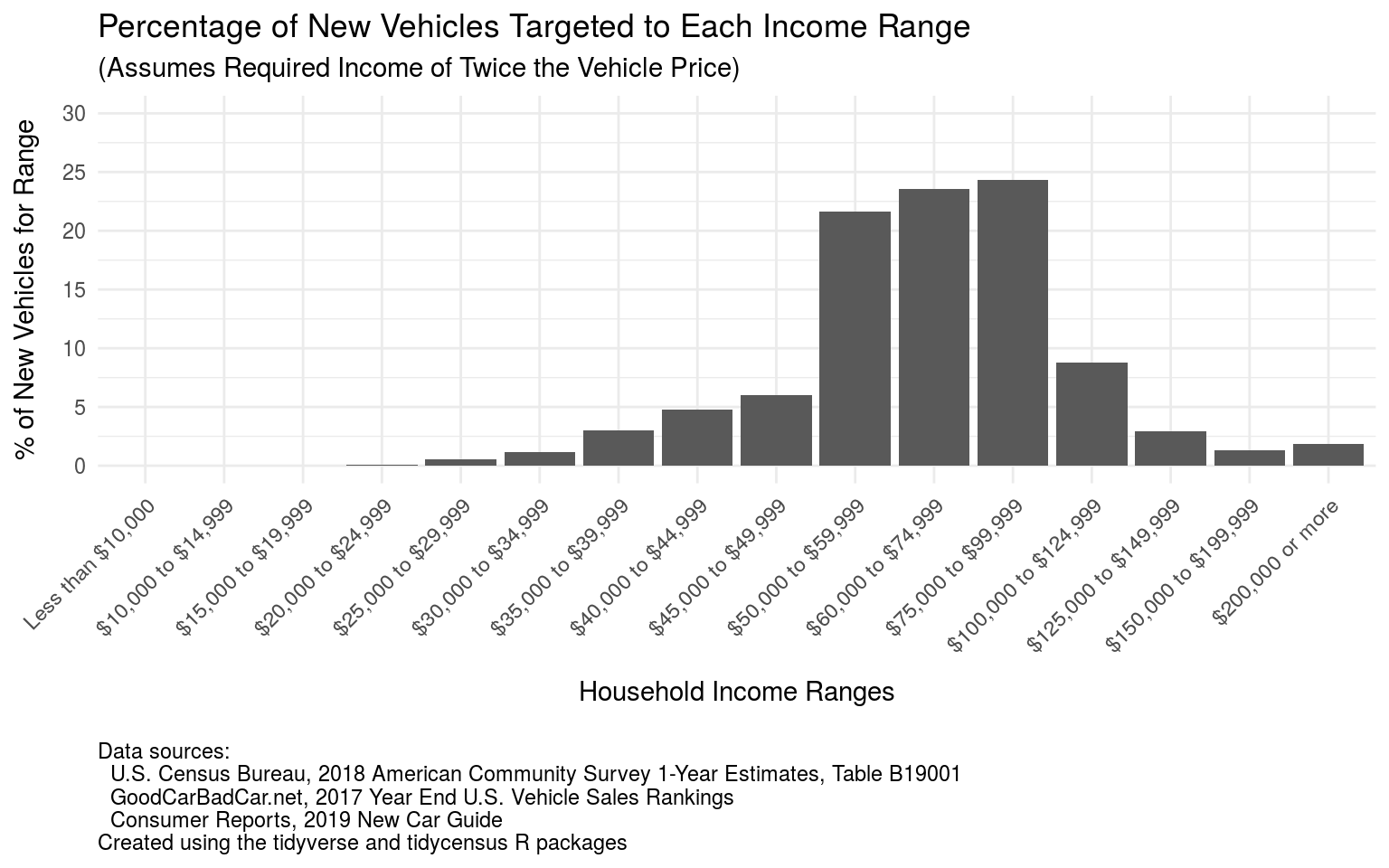
Let’s turn to a penetration rate analysis for another important class of goods, namely cars and light trucks. I was able to find the number of new vehicles sold for each model in 2017 along with price ranges for each model for the 2019 model year, and combined those to produce the graph above, which shows the percentages of vehicles sold that are targeted to each of the income ranges in the previous graph.
In creating this graph I had to make two key assumptions. The first was how to account for sales of vehicles where there was a large difference between the minimum price and maximum price. I tried to distribute sales for a given model across the price range in a reasonable manner, accounting for the fact that relatively few buyers purchase either the lowest price base model or the most expensive “loaded” model. See the full penetration rate analysis for details.
The other assumption, which also comes up in the penetration analysis in the rental survey, is how to decide what income range a particular vehicle is targeted at based on its price. Put another way, how do we measure vehicle affordability? After looking at various recommendations of the form “how much should I pay for a car”, I decided to use the following criterion: a new vehicle is affordable to a given household if its price does not exceed 50% of the household’s before tax income. Thus, for example, a household with an income of $60,000 should be able to afford a vehicle costing $30,000.
Put another way, given a vehicle offered for sale at a given price, a household’s income must be at least twice that price in order to afford the vehicle under this criterion. As it turns out, the typical (mean/median) price for new vehicles is around $35,000, so under this criterion we’d consider a typical vehicle to be targeted to households making around $70,000 a year before tax.
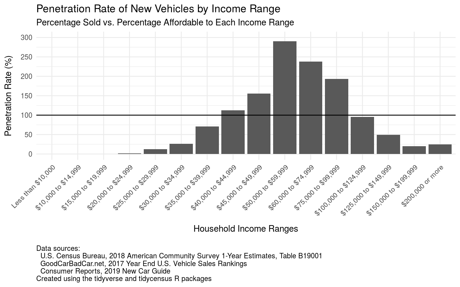
Combining the previous graph with the graph on the number of households in each income range produces the graph above, which shows the new vehicle penetration rates for each income range.
There are several points worth making about this graph. First, the details of the graph are obviously dependent on the assumptions made about vehicle affordability. If the criterion for affordability, i.e., a vehicle price no more than 50% of household income, were changed then the penetration rates for the various income groups would also change.
However the overall shape of the graph should remain the same, with under-penetration in the lowest and highest income ranges, and over-penetration in the middle income ranges. This general shape can be explained as follows:
In the higher-income ranges there are fewer vehicles sold than one might expect. For example, a household in the income range “$200,000 or more” should be able to afford a vehicle costing $100,000 or more, but relatively few such vehicles are sold (about a 25% penetration rate). This is probably due to two factors: 1) as with clothes, there’s an upper limit on how luxurious a vehicle a given household wants or needs, and 2) higher-income households almost certainly have multiple vehicles, for example buying two vehicles for $50,000 each instead of one vehicle for $100,000.
In the lower-income ranges there are also fewer vehicles sold than one might expect. Again this is likely due to two factors: 1) auto manufacturers find it difficult to sell truly low-cost vehicles in the US market, due both to government regulations and lack of market demand for small vehicles with limited or no amenities; and 2) some households buy vehicles that are more expensive than what they could supposedly afford, due to need (for example, a truck for work or an SUV to transport a large family) or simply the desire to have a nicer vehicle.
The flip-side of under-penetration in the lowest and highest household income ranges is then over-penetration in the middle income ranges: many more vehicles are sold into the middle part of the market than one might expect given the number of households in those income ranges.
What lessons, if any, does the market for cars and trucks have for the rental housing market?
At the top of the market truly expensive luxury apartments are as rare as exotic supercars, at least in Howard County. Just as wealthy families have the option of buying multiple lower-priced vehicles rather than one super-expensive vehicle, wealthy families in Howard have an alternative to renting expensive apartments, namely purchasing expensive single-family homes on large lots. For example, a household that could spend $5,000-6,000 or even more in monthly rent could just as easily purchase a house worth $1-2 million somewhere in west Howard.
(However, that’s not to say that there is no market at all for expensive apartments in Howard County: If listings at Apartments.com are any indication, there appears to be strong demand relative to supply for large 3-bedroom apartments at the Metropolitan development next to the Mall at Columbia. That demand will presumably be tested as more luxury apartment buildings open in downtown Columbia.)
The more interesting comparison in the context of affordable housing discussions is what happens at the lower ends of the vehicle and housing markets. There are at least three possible approaches to serve lower-income households looking for transportation services:
The first is for manufacturers to make and sell lower-priced new vehicles. For an example of what’s possible, a typical model of the manufactured-in-India Maruti Suzuki Alto hatchback sells for the equivalent of about $5,000 in that country, two to three times less than the Nissan Versa, apparently the lowest-price car currently available in the US market. Based on the affordability guideline above, such a vehicle would be affordable to a household with annual income of $10,000.
However, US and state government standards for vehicle safety, emissions, etc., make new vehicles more expensive than they otherwise might be. Government decisions also distort the new vehicle market in other ways: Relatively low taxes on gasoline in effect subsidize the sales of larger more expensive vehicles, while land use and highway construction policies that encourage sprawl also discourage the use of smaller under-powered vehicles like the Alto that are more suited to city driving.
The result is that lower-income households wanting a personal vehicle turn to the used vehicle market, where they can pay lower prices in exchange for accepting a vehicle with perhaps significant wear and tear. (As a comparison, a quick spot check of Howard County used vehicle dealers finds the lowest-price options are in the $6,000-$8,000 range, all vehicles with over 100,000 miles. A quick check of craigslist.org finds several vehicles in the $3,000-$6,000 range, typically with even higher mileage.)
Finally, lower-income households who can’t afford personal vehicles rely primarily on public transit, which in a Howard County context means buses.
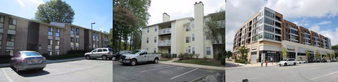
The perceived housing equivalent of public transit is public housing for which renters are directly subsidized, for example, the relatively new Monarch Mills development in Columbia or the renovated Forest Ridge apartments (shown above, left), also in Columbia. Such housing is often stigmatized (e.g. as “the projects”) and in suburbs like Howard County new public housing construction is typically strenuously opposed by nearby homeowners.
The housing equivalent of used vehicles are older apartments (or, in some cases, single-family houses) that have deteriorated to the point where they can no longer command typical market rents—what in extreme cases is pejoratively called “slum housing.” However, unlike vehicles, which have no real value once they reach a certain point of decay, deteriorated apartment complexes have an intrinsic value due to land and location. In an economically vibrant area like Howard County they will likely be replaced with new construction or heavily renovated, at which point they will no longer be affordable to their former tenants.
Finally, the housing equivalent of low-priced new vehicles is low-priced new (or renovated) housing designed to be profitable for its developers with at most indirect subsidization (for example, housing for which the developer gets tax credits, analogous to the tax credits provided for electric vehicles). Profitability here depends on at least two factors:
First, developers may incur certain costs directly as a result of government laws and regulations. For example, requirements to go through an extended legal process for approvals (e.g., the 16-step process required for development in downtown Columbia) impose direct costs on developers as well as indirect costs, for example to fight legal action by development opponents or to gain their assent by paying for community amenities or reducing the scope of a project.
Second, government action (or inaction) distorts the market in various ways that make it more difficult to profitably offer lower-priced housing. For example, zoning regulations that allow only single-family homes, or government’s declining to offer water and sewer service in certain areas, reduce the ability of developers to offer lower-priced multi-unit housing in areas that otherwise might be a good fit for it.
So, what’s the take away from all this? First, the claims about Howard County needing 5,000 more affordable housing units need to be understood in the context of the assumptions behind this number. Change the assumptions and the number will change. (For example, it would be smaller if we relax the criteria for affordability.)
Second, the penetration rate analysis used in conjunction with calculating this number itself has a major problem: it implicitly assumes that all income ranges should have a 100% penetration rate for a given type of good, and that any deviation from that figure indicates a problem. But as we saw from the example of the market for clothing, such deviations might just be the result of people’s preferences, relatively undistorted by any other factors.
However, the fundamental point remains: It is possible for markets in some goods to do a better job in serving lower-income households than they do. The market for clothing does a better job in serving lower-income households than the market for vehicles, and the market for vehicles does a better job in serving lower-income household than the market for housing.
There’s therefore a lot of opportunity to improve how the housing market works for lower-income households. Since government is to a large degree responsible for the problems in the housing market, government is equally accountable for addressing those problems.
As discussed above, this need not involve directly subsidizing lower-income households or the housing developments that serve them. There’s also ample scope for reducing the market distortions caused by government action (or, in some case, inaction) in the areas of planning and zoning, provision of essential services, school redistricting, and the like. Anyone who claims to care about housing affordability in Howard County needs to look at all the possible options on the table to make it possible for lower-income income households to lead productive lives as our fellow residents of the county.
That’s all for now. My apologies for the long delay in getting this post out. In addition to my usual work and family duties, I also now want to spend more time revising posts from this newsletter for publication on my main Civility and Truth website, plus I have other unrelated projects I want to work on. The upshot is that I will be posting here much less frequently than my already infrequent schedule. In the meantime, thank you again for your interest and attention.